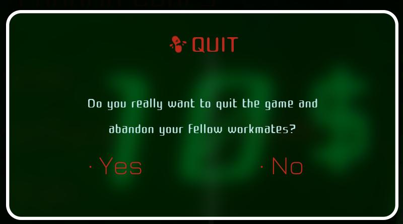
do you really want to abandon your workmates?
Description
The UI dialog presents a clear option for quitting the game, with functionalities and features designed for user interaction.
Labels and Features:
-
Title ("QUIT"):
- Function: Clearly indicates the action the user is about to take.
- Form: Displayed prominently in red, suggesting urgency or importance.
-
Confirmation Message:
- Function: Asks the user if they truly want to quit, reinforcing the significance of the action.
- Form: Written in a straightforward and conversational tone, adding a light-hearted touch to the interaction.
-
Options ("Yes" and "No"):
- Function: Provides two distinct choices for the user, allowing them to either confirm or cancel the action.
- Form: Both options are emphasized, likely with visual differences (like color or formatting) to enhance usability and draw attention to the actions.
-
Background and Aesthetic:
- Function: The dark green background contrasts with the text, making it easy to read.
- Form: The overall design has a sleek, modern look, possibly alluding to a gaming or tech aesthetic.
This combination of labels and features effectively communicates the function of quitting the game while maintaining an engaging visual style.
Software
Murky Divers
Language
English
Created by
 M S
M S
Sponsored
Similar images
Do you want to remove this profile?
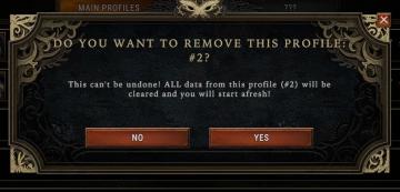
Against the Storm
The UI features a modal window designed to confirm the deletion of a user profile. Title Bar: At the top, it prominently displays the prompt, "DO YOU WA...
do you want to reset your progress?
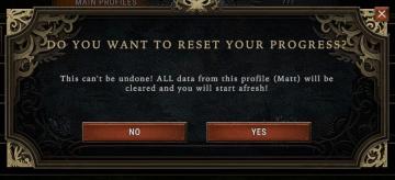
Against the Storm
The UI features a modal dialog box that prompts the user with a question, clearly indicating the purpose of the interaction. At the top, the heading reads “DO...
終了、コンティニュー、設定
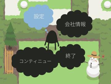
A Good Snowman Is Hard To Build
この画像には、いくつかのUIラベルと機能があります。 設定:バックグラウンドが青色の吹き出し内に表示されています。主にゲームやアプリの設定メニューにアクセス...
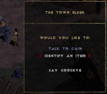
the town elder Cain
Diablo I
The user interface (UI) in the image features a dialogue box associated with a character called "The Town Elder." The box has a dark background, which makes the...
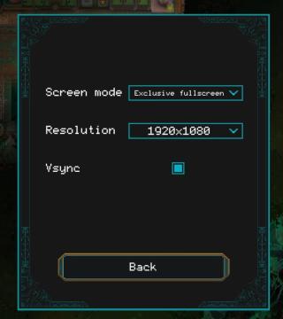
screen mode
Children of Morta
Screen mode: Dropdown menu to select display mode (e.g., exclusive fullscreen). Resolution: Dropdown menu for selecting screen resolution (e.g., 192...
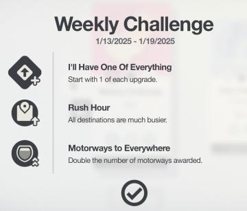
weekly challenge 1/13/2025 - 1/19/2025
Mini Motorways
The interface presents a "Weekly Challenge" section prominently at the top, indicating the dates for the challenge period (1/13/2025 1/19/2025). Below this ti...
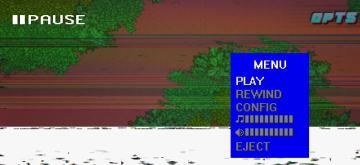
in-game pause menu is stylized as VHS controls
Hotline Miami 2
The user interface features a menu that provides essential functions for media control. At the top, there is a bold "PAUSE" label indicating the current state o...
new game warrior stats
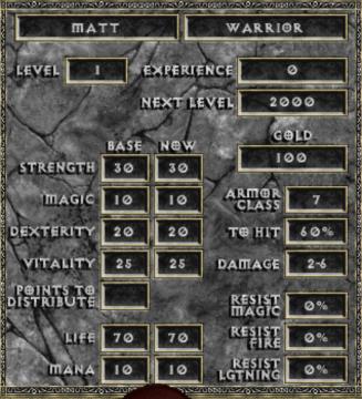
Diablo I
The user interface (UI) in the picture comprises several key elements focused on character statistics for a roleplaying game (RPG), presenting both functionali...