you died, score, how long you survived
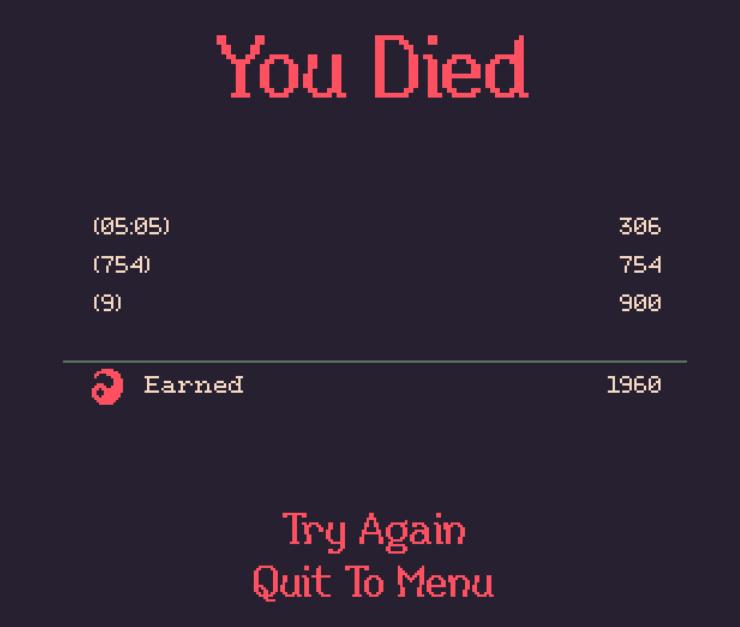
Description
The user interface (UI) in the image primarily features a game over screen with a dark background, which enhances the clarity of the text. Here’s a breakdown of its components:
-
Main Header: At the top, "You Died" is prominently displayed in a bold, vibrant red font. This serves as a clear indication of the game's status and has a dramatic effect, emphasizing the game's context.
-
Statistics Section: Below the header, there are three labels and corresponding numerical values, likely representing gameplay statistics:
- The first set (e.g., 05:05) probably indicates the time spent in the game.
- The second and third sets (e.g., 754 and 9) likely represent other performance metrics, such as points or enemies defeated. Each statistic is clearly aligned for easy readability.
-
Earned Section: There’s an “Earned” label, accompanied by a numerical value of 1960. This suggests the total points or rewards earned during the play session. The use of a simple line above this metric provides a clean division from the other statistics.
-
Action Buttons: At the bottom, there are two interactive options: "Try Again" and "Quit To Menu." They are presented in bold red text for visibility and quick access, encouraging immediate action. The buttons are centered, which enhances user focus and accessibility.
Overall, the form is minimalistic but effective, using contrasting colors and clear fonts to guide the user’s attention to critical information while maintaining an appropriate tone for a game over scenario.
Software
20 Minutes Till Dawn
Language
English
Created by
 M S
M S
Sponsored
Similar images
remove shelter and refund wood, are you sure
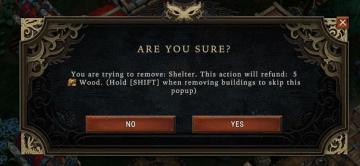
Against the Storm
The user interface (UI) in the image presents a confirmation dialog box with a dark background, which helps prioritize the message content. The main heading, "A...
you can relisten to phonograph

Maid of Sker
The UI in the image features a minimalistic design, dominated by a black background which creates a stark contrast with the text and icons. 1. Alert Icon:...
my clan: you have no invitations, you are currently not in a clan
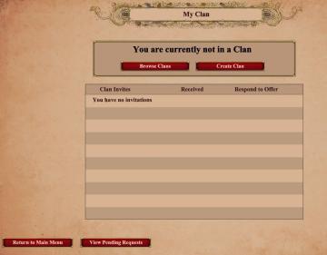
Age of Empires 2 Definitive Edition
The user interface features a clean and structured layout with several key components. At the top, there is a title labeled "My Clan," prominently displayed, in...
your crew
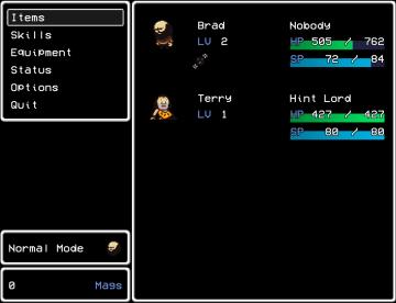
LISA: The Painful - Definitive Edition
The user interface (UI) in the provided picture appears to be for a classicstyle RPG video game. Here’s a breakdown of its labels and features: Left Panel...
congrats! you completed the training mission
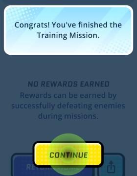
Run Legends
The user interface (UI) in the picture features several key elements designed for user interaction and experience. 1. Message Box: At the top, there’s a m...
you got backpack
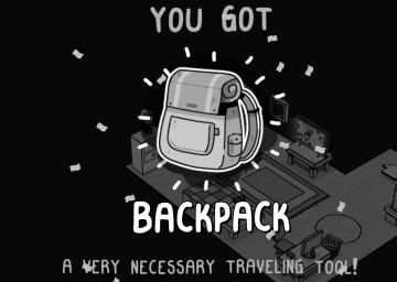
TOEM
The user interface (UI) in the image primarily focuses on celebrating the acquisition of a new item, the "BACKPACK." Key Features: 1. Main Message:...
are you sure? unsaved data will be lost
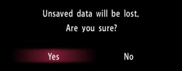
Yakuza 0
The UI features displayed in the image depict a confirmation dialog designed to alert the user about unsaved data. Labels and Function: 1. Title Label...
toggle helmet on your character
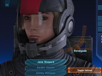
Mass Effect 1
The user interface (UI) features various labels and functions that enhance the gaming experience. 1. Character Display: Central to the UI is a large image...