say yes you should win this easily
Description
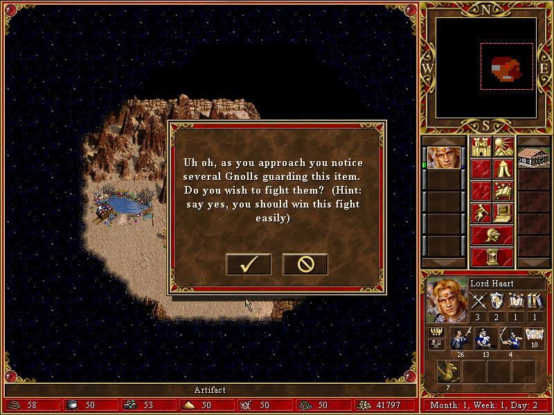
The user interface (UI) in the image showcases a combination of features commonly found in role-playing strategy games.
Main Features
-
Dialogue Box:
- Content: Displays a message to the player regarding an encounter with Gnolls and asks if they want to fight. This is a key interactive element, guiding players on the next steps in their adventure.
- Appearance: The box has a brown, textured background, resembling a parchment, enhancing the game's fantasy theme.
-
Action Buttons:
- Buttons: There are two prominent buttons at the bottom of the dialogue box:
- Checkmark (✓): Indicates a confirmation to engage in battle, facilitating a clear choice for the player.
- Cross (X): Represents a refusal to engage, allowing the player to back out of the fight.
- Design: The buttons are stylized to match the overall aesthetic, making them visually appealing.
- Buttons: There are two prominent buttons at the bottom of the dialogue box:
-
Right Sidebar:
- Character Info: Displays details about the player’s character, "Lord Haart," including stats like health, experience points, and artifacts currently in possession.
- Visuals: Accompanied by a portrait of the character, adding a personalized touch.
-
Bottom Bar:
- Resource Display: Shows crucial game resources such as gold, creatures in the army, and other relevant stats, allowing players to monitor their progress and resources effectively.
- Design Elements: The bar features engraved designs that contribute to the fantasy theme while maintaining functionality.
-
Map Area:
- Foreground: Illustrates the game environment, including a body of water and terrain, providing context for the player's actions.
- Exploration Indicators: This area encourages exploration, linking gameplay mechanics to visuals.
Overall Form
The UI design effectively balances form and function, emphasizing usability while maintaining an immersive fantasy aesthetic. The color palette uses warm, earthy tones for the dialogue area, contrasted with richer colors in the resource bar and character info, allowing users to navigate the interface easily. The layout ensures that vital info is readily accessible, enhancing the gameplay experience.
Software
Heroes of Might and Magic 3: Complete
Language
English
Created by
 M S
M S
Tags
Sponsored
Similar images
codex
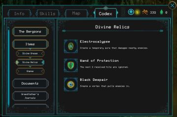
Children of Morta
Tabs: Contains sections for navigating different game elements (Info, Skills, Map, Codex). Codex Header: Indicates the current section is the Codex....
Act Four - Falling
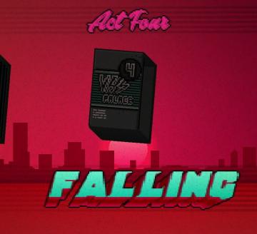
Hotline Miami 2
The user interface (UI) in the image includes distinct labels and features that guide the user through an engaging experience. 1. Act Four Label: Position...
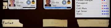
klar, ikke klar, start
Phasmophobia
Bildet viser en brukergrensesnitt med flere etiketter og funksjoner. I den øverste delen er det to kort som viser statuser. Hvert kort inneholder: Bilde...
recruit maximum griffins
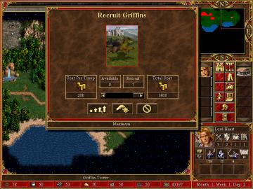
Heroes of Might and Magic 3: Complete
The user interface in the image is focused on the "Recruit Griffins" function in a strategy game, likely a turnbased strategy game featuring resource managemen...
you have a new mail notification
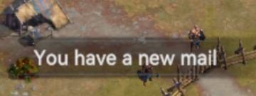
Viking Rise
The UI message displayed in the picture reads "You have a new mail!" This notification serves the function of alerting the user to new incoming messages or corr...
collect sunflower seeds
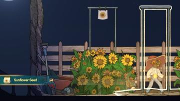
Spiritfarer: Farewell Edition
The UI features a prominent label displaying "Sunflower Seed" alongside a quantity indicator (x4), suggesting the player has four sunflower seeds available for...
Now Loading 読込み中
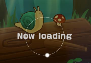
のこのこキノコ
この画像には、シンプルで親しみやすいユーザーインターフェース (UI) のラベルと機能があります。主な要素は以下の通りです。 1. ラベル: 「Now loading」というテキ...
insufficient resources
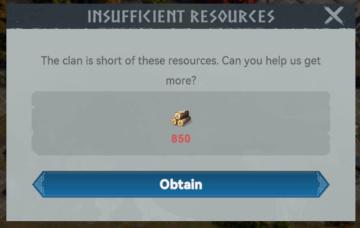
Viking Rise
The user interface (UI) in the image consists of a notification message regarding resource availability for a clan. Here’s a detailed breakdown of its features...