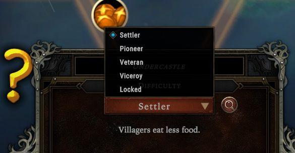
difficulty settings: settler, pioneer, veteran, viceroy and locked option
Description
The UI features a neatly organized dropdown menu for selecting difficulty levels, indicated by a highlighted option "Settler." Each difficulty level—Settler, Pioneer, Veteran, Viceroy, and Locked—is visually distinct, providing users with immediate recognition of their options.
To the left of the dropdown, a small icon, likely representing game progress or achievements, enhances visual appeal. Below the dropdown, there's a descriptive label: "Villagers eat less food," which provides relevant information linked to the selected difficulty.
The design employs a dark color palette with metallic accents, conveying a serious tone suitable for a strategy game. The interactive elements, like the dropdown arrow, invite user engagement while maintaining clarity and ease of use. The presence of a question mark icon hints at potential help or additional information available for players.
Software
Against the Storm
Language
English
Created by
 M S
M S
Tags
Sponsored
Similar images
kupónová aplikace Lidl zobrazit kupónovou kartu
Lidl Plus
Na obrázku vidíme uživatelské rozhraní mobilní aplikace, pravděpodobně související s obchodem Lidl. 1. Hlavní barva a styl: Vizuální styl je moderní a čis...
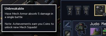
achievement, unbreakable
Into the Breach
The UI in the picture features a notification panel with a sleek, minimalistic design predominantly featuring a dark background that enhances readability. 1....
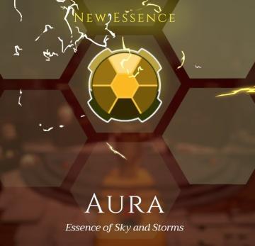
new essence - aura - essence of sky and storms
Mages of Mystralia
The interface features a bold label at the top center reading "NEW ESSENCE," suggesting an interactive element related to the introduction of a new game mechani...
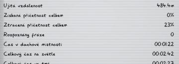
ujitá vzdálenost příčetnost mentální zdraví kroky metry metrů
Phasmophobia
Na obrázku vidíme uživatelské rozhraní, které zřejmě slouží k záznamu a sledování různých statistik. Formát je čistý a přehledný, se zřetelnými odděleními mezi...
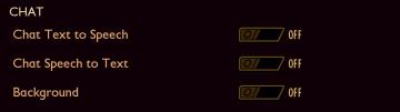
chat text to speech options
Grounded
The UI features a "CHAT" section with three distinct settings. Each setting has a label that describes its function clearly, promoting user understanding. 1. ...
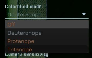
colourblind mode
Murky Divers
The UI features a dropdown menu for selecting a colorblind mode, labeled "Colorblind mode:" at the top. Below this label, users can choose from several options:...
Processing turn, please wait

Civilization V
The user interface (UI) in the image showcases several key features and labels with specific functions: 1. Processing Indicator: At the bottom of the scree...
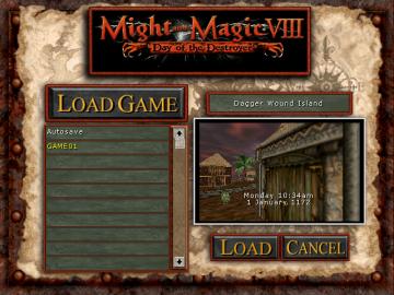
load game
Might and Magic 8: Day of the Destroyer
The user interface (UI) in the image from "Might and Magic VIII: Day of the Destroyer" exhibits a straightforward layout designed for loading game saves. ...