foragers' camp's recipes
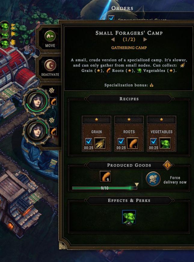
Description
The interface features are structured for clarity and usability, focusing on resource management and production output.
-
Title Bar: At the top, "Small Foragers' Camp" is prominently displayed, along with a status indicator (1/2) for camps. The label provides immediate identification of the selected structure.
-
Description Area: Below the title, a brief description highlights the camp's capabilities, emphasizing its limitations and the types of resources it can gather (Grain, Roots, Vegetables). This area uses concise language to inform users of the camp's purpose.
-
Specialization Bonus: Directly beneath the description, this section indicates any buffs or advantages tied to the structure, enhancing its functionality.
-
Recipes Panel: This section lists the resources that can be gathered. Each resource (Grain, Roots, Vegetables) is accompanied by an icon, a visual marker for easy recognition, and a timer (00:25) indicating the time required to gather each type.
-
Produced Goods: A progress bar shows the quantity of resources produced (9 out of 10), allowing users to track resource accumulation visually. It includes an option to force delivery, represented by an icon and button, facilitating immediate action.
-
Effects & Perks: At the bottom, this panel displays any additional benefits or effects from using the camp, providing strategic information for decision-making.
-
Buttons and Icons: The UI features various functional buttons, such as "Move," "Deactivate," and resource checkmarks, providing intuitive control over actions. The design incorporates thematic elements consistent with the game's aesthetic, enhancing user immersion while maintaining functionality.
The layout effectively balances informational content with user interaction, enabling efficient resource management in the gaming environment.
Software
Against the Storm
Language
English
Created by
 M S
M S
Sponsored
Similar images
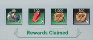
welcome gift rewards claimed
Viking Rise
The user interface (UI) in the image presents a rewards summary, showcasing several collectible items. Features and Labels: 1. Item Display: Eac...
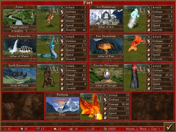
fort units
Heroes of Might and Magic 3: Complete
The image depicts a user interface (UI) for a strategy game, specifically related to a fortress or fort where players can manage various units. Here’s a breakdo...
Do you want to remove this profile?
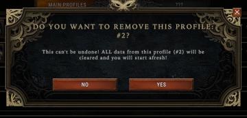
Against the Storm
The UI features a modal window designed to confirm the deletion of a user profile. Title Bar: At the top, it prominently displays the prompt, "DO YOU WA...
ghost present evidence, horror
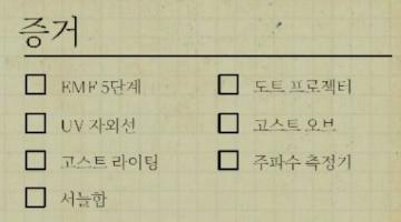
Phasmophobia
UI에 나타난 라벨과 기능을 살펴보면, 목록 형태로 구성되어 있어 각각의 항목을 체크할 수 있는 체크박스가 있습니다. 이 디자인은 사용자가 선택지를 쉽게 확인하고 선택...
buying ammunition cartridge ammo
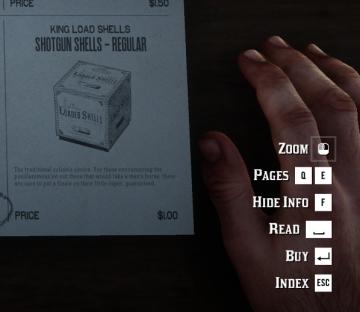
Red Dead Redemption 2
The user interface (UI) in the picture features several labeled actions on the right side, paired with a visual representation of a product on the left. Here’s...
substory end
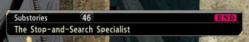
Yakuza 0
The user interface (UI) in the picture features several key elements: 1. Labeling: The top section is labeled "Substories," indicating that this area perta...
completed quest
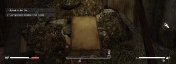
Fallout London
In the provided image, the user interface (UI) includes several key labels and features that enhance gameplay. 1. Quest Information: At the top left, "Spe...
in-game menu
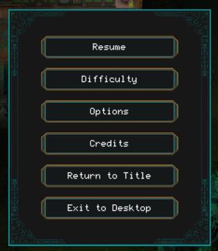
Children of Morta
Resume: Restarts the game from the paused state. Difficulty: Adjusts the game's difficulty level. Options: Accesses game settings (audio, cont...