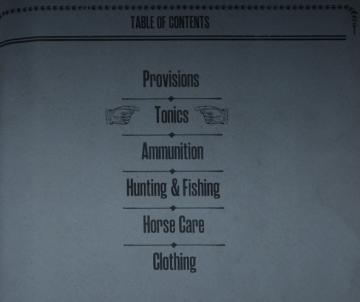
provisions shopping menu canned food, dry food
Description
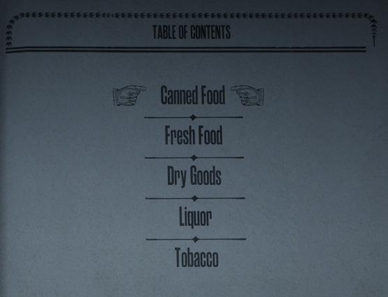
The UI presented in the image features a "Table of Contents" layout that is both functional and visually appealing.
Labels and Features:
-
Title ("TABLE OF CONTENTS"):
- Function: Clearly indicates the section's purpose, allowing users to navigate to various content categories.
- Form: The title is prominently displayed at the top, using capital letters, which enhances legibility and grabs attention.
-
Category Labels:
- Canned Food
- Fresh Food
- Dry Goods
- Liquor
- Tobacco
- Function: Each label acts as a link to corresponding sections of the content, facilitating easy navigation.
- Form: The labels are styled in a classic serif font, which adds a vintage aesthetic, contributing to an overall sophisticated feel.
-
Arrow Indicators:
- Each category is accompanied by an arrow pointing right (towards the content below), implying a flow of information and guiding the user’s eye.
- Form: These arrows have a decorative, slightly ornate style that aligns with the overall retro theme of the UI.
-
Dividers:
- Horizontal lines separate each category, organizing the content and improving readability.
- Form: The lines are simple and unobtrusive, maintaining a clean look.
-
Hands Graphic:
- The use of small hand illustrations next to "Canned Food" and "Fresh Food" adds a playful element while signifying action, like pointing or directing attention.
- Form: The hands are stylistically consistent with the vintage theme, enhancing the overall design.
Overall Functionality:
The design effectively serves as a navigational tool, allowing users to quickly locate specific categories of content. Its form complements its function by providing a cohesive and inviting visual experience.
Software
Red Dead Redemption 2
Language
English
Created by
 M S
M S
Tags
Sponsored
Similar images
western shop main menu hunting fishing provisions food
Red Dead Redemption 2
The UI presents a "Table of Contents" layout, featuring a clean and organized structure that enhances navigation. Here's a breakdown of its elements: 1. Head...
replay tutorial missions
Against the Storm
The user interface (UI) features various labeled sections and elements designed to guide player interactions. 1. Main Areas: Smoldering City: Ser...
game options, game settings
Knights and Merchants
Die Benutzeroberfläche zeigt eine vertikale Anordnung von Einstellungen auf der linken Seite. Oben befindet sich das Label „Einstellungen“, gefolgt von einem Sc...
メイン画面
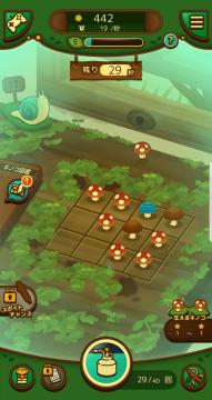
のこのこキノコ
この画像は、ゲームのユーザーインターフェース(UI)を示しています。以下に、主なラベルと機能を説明します。 1. 上部バー: 太陽のアイコンと数字(442):...
in-game menu, option when stuck
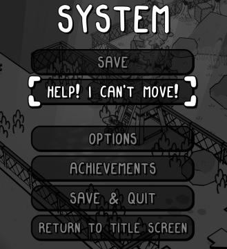
TOEM
The user interface (UI) in the picture is designed with a clear and playful aesthetic, featuring a blackandwhite style that hints at a cartoonish graphics app...
audio options
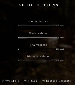
Maid of Sker
The image displays an "Audio Options" interface, likely from a video game or software. Here’s a breakdown of the UI labels and features: Features: 1. Ti...
level up unlocks and bonuses
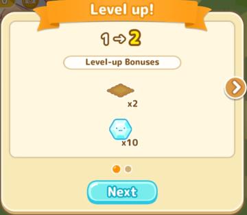
Sumikko Farm
The UI shows a "Level up!" notification, indicating that the user has progressed from level 1 to level 2. Here's a breakdown of its features: 1. Title Bar:...
mod manager: subscribe, unsubsribe, change mod priority

Age of Empires 2 Definitive Edition
The interface displays a series of buttons designed for user actions. 1. Back This button allows users to return to the previous screen, typically a nav...