deathmatch
Description
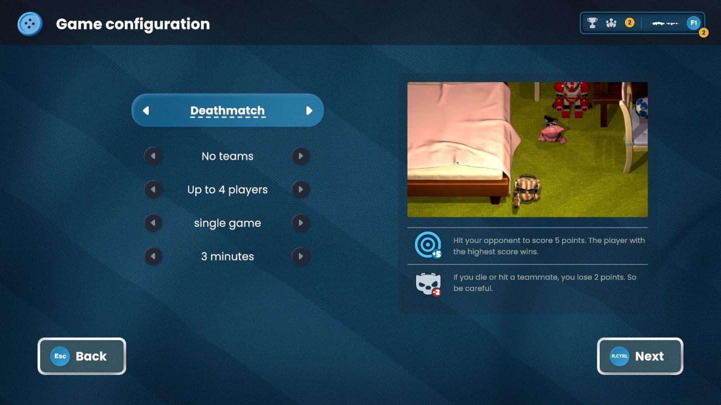
The user interface (UI) in the provided image features a game configuration screen designed for setting up a multiplayer game. Here’s a breakdown of the elements:
Labels and Features:
-
Title Bar:
- "Game Configuration": This is prominently displayed at the top, indicating the purpose of the screen.
-
Game Type Selection:
- "Deathmatch": This label suggests a game mode, highlighting the competitive aspect of the gameplay. It has a button-shaped appearance which indicates it's selectable.
-
Options List:
- "No teams": Indicates team formation rules, suggesting players compete individually.
- "Up to 4 players": Specifies the maximum number of participants, setting expectations for multiplayer capacity.
- "Single game": Suggests that this mode is not part of a series, indicating a standalone gameplay option.
- "3 minutes": Indicates the duration of the game, crucial for setting the pace of play.
-
Instructions Panel:
- Text Box on the Right: This area provides gameplay instructions:
- Describes the objective: "Hit your opponent to score 5 points."
- Clarifies the winning condition: "The player with the highest score wins."
- Warns about penalties for hitting teammates: "If you die or hit a teammate, you lose 2 points."
- Text Box on the Right: This area provides gameplay instructions:
-
Navigation Buttons:
- "Back" Button: Clearly labeled and designed to return to the previous screen, this button allows users to exit the current configuration screen.
- "Next" Button: Denoted with an arrow indicating progression, this button leads the user to the next setup stage, essential for moving forward in the game setup.
-
Additional UI Elements:
- Icons/Buttons: There are trophy and weapon icons at the top right, likely indicating achievements or settings related to game rewards or equipment.
Form:
- The overall design features a modern aesthetic with a dark blue background and a clean, organized layout. The use of rounded buttons and clear typography contributes to user-friendliness, enhancing ease of navigation and comprehension.
This configuration screen effectively communicates the essential elements needed to set up the gameplay while maintaining a visually appealing interface.
Software
Bulanci
Language
English
Created by
 M S
M S
Tags
Sponsored
Similar images
deathmatch
Bulanci
Na obrázku vidíme uživatelské rozhraní pro hru s názvem "Deathmatch". Hlavní prvky a funkce zahrnují: 1. Název hry (Deathmatch): Ten je umístěn v horní čás...
video and gameplay, controls menu
Phoenix Wright: Ace Attorney Trilogy
화면 해상도 설정 UI는 여러 기능을 포함하는 간단하고 직관적인 레이아웃을 가지고 있습니다. 1. 창 모드: "없음"과 "있음"의 옵션이 제공되어, 사용자가 창 모드를...
critical mission failure, resume last save or quit
Mass Effect 1
The user interface features a stark black background that emphasizes the text and buttons in a clear and concise manner. At the top, a large, bold heading reads...
mission results
Phasmophobia
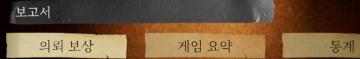
UI 요소는 다음과 같이 구성되어 있습니다: 1. 보고서: 기능: 이 부분은 주로 보고서에 관련된 내용을 표시하거나 접근하는 링크로 보입니다. 형태: 진한...
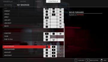
key bindings
Panicore
The image showcases a game settings menu, specifically the "Key Bindings" section, which allows players to customize their controls. UI Features: 1. Ta...
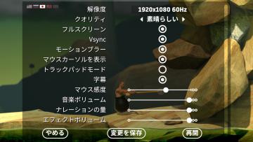
settings: display, sound and controls (mouse sensitivity etc)
Getting Over It with Bennett Foddy
画面には、ゲームの設定メニューが表示されています。左側には設定項目が縦に並んでおり、それぞれが機能を示しています。 1. 解像度 選択された画面解像度を設定...
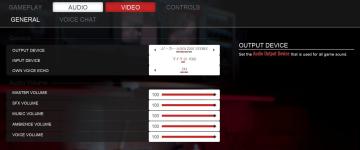
choose output and input audio device (speakers, microphone)
Panicore
The user interface (UI) in the picture presents audio settings for a gaming system. Here’s a breakdown of its features and functions: 1. Tabs: At the top,...
attack, deal damage, dmg, card
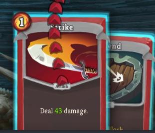
Slay the Spire
The image displays a card game interface with specific UI labels and features. 1. Card Background: Each card has a vibrant, illustrated background, with t...