succulent kicker
Description
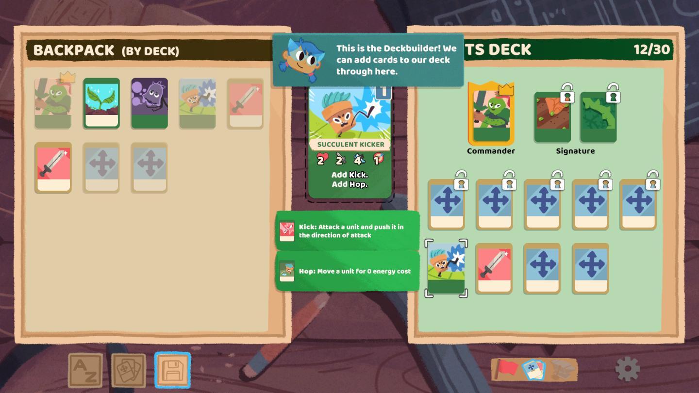
The user interface (UI) in the image showcases various features for a card game or deck-building mechanic, presented in a colorful and playful style.
Key UI Labels and Features:
-
Backpack (By Deck):
- Located at the top left, this label indicates that the section displays cards grouped by their decks.
- The area features smaller card icons, each representing a character or action, with some highlighted (e.g., one card with a crown symbol).
-
Deckbuilder Panel:
- Centered and prominently sized, it includes an animated character indicating the purpose of the interface: adding cards to your deck.
- The main card displayed here is the "Succulent Kicker," which shows detailed attributes like numbers for strength or abilities.
-
Card Abilities:
- Below the main card, two buttons ("Add Kick" and "Add Hop") suggest actions the user can take on the card.
- There are descriptive labels for these abilities:
- Kick: A brief action description indicating its function in gameplay.
- Hop: Another ability with a description highlighting its cost.
-
TS Deck:
- On the right side, labeled "TS Deck," this section shows the player’s current deck status with a total card count displayed (12/30).
- There are also specific card slots for "Commander" and "Signature," indicating unique roles or types of cards within the deck.
- Locked icons suggest that certain cards or features are currently unavailable, hinting at progression mechanics within the game.
-
Navigation and Interaction:
- At the bottom, icons provide navigation options, with a blue diskette icon potentially signifying a save function, allowing users to save their changes or progress.
- Other icons (like "A-Z" and card visuals) likely facilitate searching or sorting through the deck or available cards.
Form:
The UI employs a whimsical and cartoonish aesthetic with bright colors and rounded edges, making it visually appealing and accessible, especially for younger audiences. The layout is structured and intuitive, guiding users to understand their current choices and actions easily.
Overall, this interface effectively combines functionality with an enjoyable design to facilitate deck management and gameplay.
Software
Floppy Knights
Language
English
Created by
 M S
M S
Tags
Sponsored
Similar images
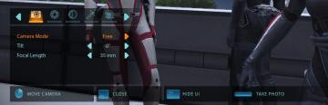
camera mode - hide ui, take photo, move camera
Mass Effect 1
The UI presents several key labels and features for camera controls, designed for functionality and ease of use. 1. Camera Mode: This section allows for s...
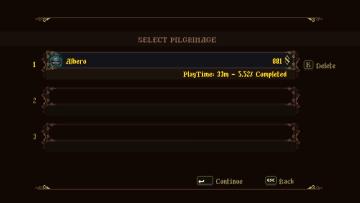
select pilgrimage (save slot)
Blasphemous
The UI features a dark background with ornate, decorative borders that provide a vintage or medieval aesthetic. The title "SELECT PILGRIMAGE" is prominently dis...
grass (digging ok)
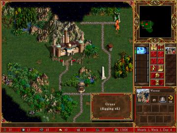
Heroes of Might and Magic 3: Complete
In the image, the user interface (UI) features a rich, detailed layout typical of strategy games, specifically from the "Heroes of Might and Magic" series. ...
accessibility settings
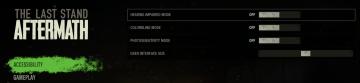
The Last Stand: Aftermath
The user interface (UI) in the image focuses on accessibility settings for the game "The Last Stand Aftermath." Below are the descriptions of the labels and fea...
play select save, save empty
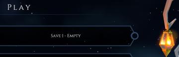
Mages of Mystralia
The UI features in the picture display a simple and elegant interface for a game menu, primarily focused on save management. 1. Main Label: The word "PLAY...
in-game menu (codex, journal, squad,..)
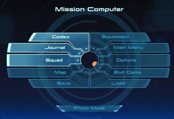
Mass Effect 1
The interface presents a central "Mission Computer" menu, designed for navigation through various game functionalities. The layout combines a circular central e...
side quests
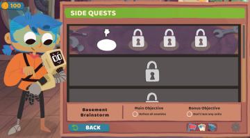
Floppy Knights
The user interface (UI) in the image features a clean and colorful layout designed for easy navigation within a game context, particularly for tracking side que...
favoring species to boost their resolve, cooldown
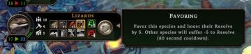
Against the Storm
The user interface features a series of clearly labeled sections, emphasizing functionality and user interaction. 1. Species Indicator: At the top, "Lizard...