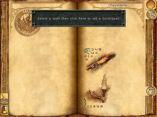
set up a quickspell button, then cast with S
Description
The UI in the image presents a spell selection menu from a fantasy-themed application, likely a game. Here’s a breakdown of its key features:
-
Main Display Area: The center of the interface features an open book-like layout, symbolizing knowledge or magic spells. The parchment texture adds to the thematic feel, enhancing immersion.
-
Instructions Label: At the top, there is a prominent message that reads, "Select a spell then click here to set a QuickSpell." This guidance is clear and directs user action, ensuring players understand they need to make a selection for further action.
-
Spell Icons: Below the instructions, several spell icons are visible, each representing different magical abilities. They are illustrated with varying designs, like a flaming torch and a mystical symbol, adding a visual cue to the nature of the spells.
-
Clickable Area: There is a designated area (likely highlighted or outlined) indicating where the user should click after selecting a spell. This emphasizes interactivity and guides the user on how to proceed.
-
Navigation Buttons: On the left side of the interface, there is a set of buttons or icons for navigation (though the specifics aren’t fully visible). These typically enable the user to switch between different sections or menus, such as accessing different types of spells or going back to a main menu.
-
Thematic Elements: Decorative elements, such as the emblem in the top-left corner and the ornate borders, contribute to the fantasy aesthetic, making the interface visually appealing while supporting its function.
Overall, this UI layout effectively combines functionality with thematic design, guiding the user toward making selections and enhancing the gaming experience.
Software
Might and Magic 8: Day of the Destroyer
Language
English
Created by
 M S
M S
Tags
Sponsored
Similar images
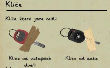
nalezené klíče od domu od auta
Phasmophobia
Na obrázku vidíme uživatelské rozhraní s názvem "Klíče". Sekce je rozdělena na dvě části s ilustracemi klíčů, které byly nalezeny. UI Labels: 1. Název "K...
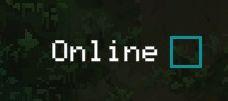
online play
Children of Morta
The UI displays the status "Online" alongside an empty checkbox, indicating the current online status of a user or service. The checkbox is likely interactive,...
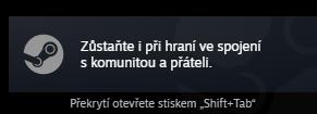
zustante hrat s prateli, play with friends
Steam
Na obrázku je uživatelské rozhraní (UI) aplikace Steam. Obsahuje dvě hlavní části: 1. Hlavní textová zpráva: "Zůstaňte i při hraní ve spojení s komunitou a...
race results
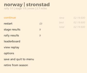
art of rally
The UI displayed presents a straightforward and functional menu for a rally racing game, focusing on user interaction. Labels and Features: 1. Title Ba...
map options add markers

Red Dead Redemption 2
The user interface (UI) presents several functional labels and features, each designed to facilitate navigation and interaction. 1. Add Marker: This label...
rebind controls, assign keyboard or gamepad to each character
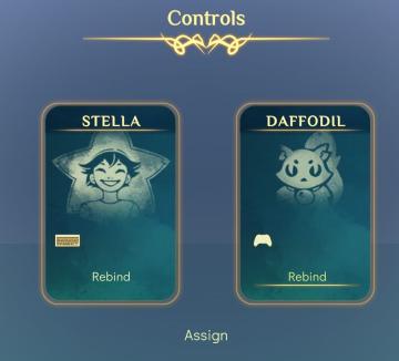
Spiritfarer: Farewell Edition
The UI features a clean, elegant design with a soft gradient background, conveying a serene aesthetic. At the top, the label "Controls" is prominently displayed...
dialogue text speed, flicker and screen shake settings
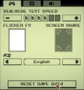
Inscryption
The UI presents various settings for a game with a retro aesthetic. 1. Dialogue Text Speed: This section has a horizontal slider allowing users to adjust t...
settings: display, sound and controls (mouse sensitivity etc)
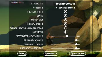
Getting Over It with Bennett Foddy
На изображении представлено меню настроек, содержащее различные параметры, связанные с графикой и звуком. 1. Разрешение позволяет пользователю выбрать ра...