leaderboards
Description
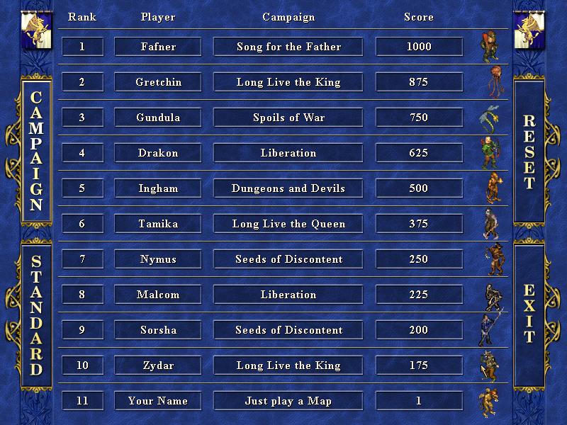
The UI in the picture showcases a leaderboard for a game, organized in a clear and structured layout.
Key Features:
-
Columns:
- Rank: Displays the ranking of players based on their scores, making it easy to identify top performers.
- Player: Lists player names corresponding to each rank, facilitating recognition of competitors.
- Campaign: Shows the specific campaign associated with each player, providing context for their scores.
- Score: Indicates the points earned by each player, essential for determining rankings.
-
Actions:
- RESET: A button likely for resetting scores or refreshing the leaderboard.
- EXIT: A button for exiting the leaderboard or returning to a previous screen.
-
Design and Form:
- The UI features a blue and gold color scheme, contributing to a medieval or fantasy theme, which aligns with the game's aesthetic.
- The use of icons next to player names may indicate character classes or significant achievements, adding visual interest.
-
Accessibility:
- The design is user-friendly, with clear labels and a straightforward layout, allowing players to quickly scan for information.
Overall, the UI effectively combines functionality and a thematic design, enhancing the player experience while navigating through the scoreboard.
Software
Heroes of Might and Magic 3: Complete
Language
English
Created by
 M S
M S
Tags
Sponsored
Similar images
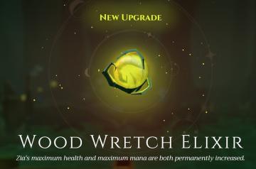
new upgrade maximum health and mana magic will be permanently increased
Mages of Mystralia
The user interface (UI) in the image presents a visually appealing illustration, designed to convey significant information about an upgrade feature in a game....
kupónová aplikace Lidl zobrazit kupónovou kartu
Lidl Plus
Na obrázku vidíme uživatelské rozhraní mobilní aplikace, pravděpodobně související s obchodem Lidl. 1. Hlavní barva a styl: Vizuální styl je moderní a čis...
main menu
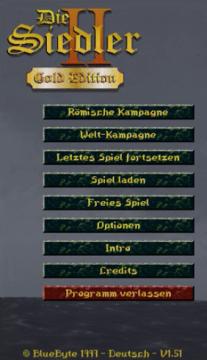
The Settlers II
Im Bild befinden sich die Benutzeroberflächenlabels und Funktionen des Spiels "Die Siedler II: Gold Edition". Am oberen Rand wird der Titel "Die Siedler II" i...
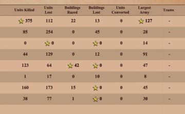
match statistics: k/d ratio, buildings razed, units converted, largest army
Age of Empires 2 Definitive Edition
The image presents a table summarizing various game statistics, likely from a strategy or war simulation game. Here’s a breakdown of the UI labels and features:...
ace card examples

Cursed to Golf
The image features a user interface (UI) layout designed for a gaming context, likely involving a golf or arcadestyle game. Here’s a breakdown of the UI labels...
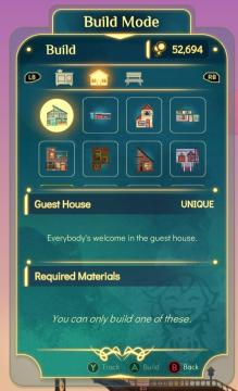
you can only build one of this building
Spiritfarer: Farewell Edition
The interface features a "Build Mode" label at the top, indicating the current mode the player is in. Below this, there are two tab buttons labeled "LB" and "RB...
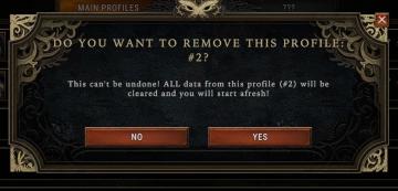
Do you want to remove this profile?
Against the Storm
The UI features a modal window designed to confirm the deletion of a user profile. Title Bar: At the top, it prominently displays the prompt, "DO YOU WA...
現場へ移動、読込 moving to location

Phasmophobia
画面には「現場へ移動中…」というラベルがあります。このラベルは現在、特定の場所へ移動していることを示しています。文字は白色で、少し凝ったフォントが使われており、...