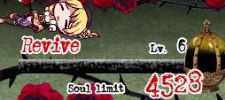
soul limit, revive, healthbar
Description
The UI features in the image highlight several key elements:
-
Revive Button: This prominently labeled “Revive” indicates a function that allows the player to return a character to a playable state after they have been defeated. The bold, red font emphasizes urgency and importance.
-
Level Indicator: The “Lv. 6” label suggests the current level of the character or the player's progression, informing the player of their strength and experience.
-
Soul Limit: Displayed as “Soul limit 4528,” this metric indicates a cap on the amount of souls the player can hold, which may relate to gameplay mechanics such as currency or resources needed for actions within the game.
-
Visual Elements: The background features thorny vines and roses, creating a thematic atmosphere that complements the overall aesthetic of the game, possibly hinting at a darker narrative.
-
Progress Bar: The horizontal bar below the labels may represent a progress gauge related to souls or the revive function, signaling to the player how close they are to achieving certain gameplay goals.
Overall, the design balances functionality with a stylistic approach that fits the game’s tone.
Software
Grief Syndrome
Language
English
Created by
 M S
M S
Sponsored
Similar images
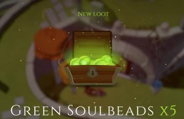
new loot green soul beads x5
Mages of Mystralia
The user interface (UI) in the picture showcases a notification for newly acquired game loot. 1. Title: The label "NEW LOOT" is prominently displayed at t...
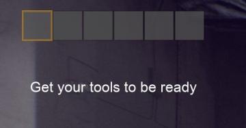
get tools from the wall before starting the game
Panicore
The user interface (UI) in the image features a series of rectangular indicators, likely representing tool slots or inventory spaces. The first slot is highligh...
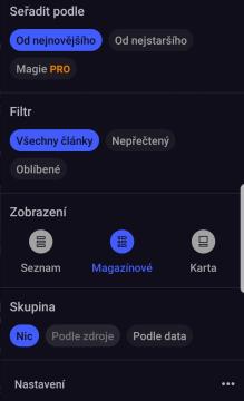
seřadit filtrovat seskupit články
Inoreader
Na obrázku vidíme uživatelské rozhraní aplikace, které má tmavé pozadí s modrými a šedými prvky. 1. Seradit podle (Sort by): Umožňuje uživatelům vybí...
mountain service emergency app
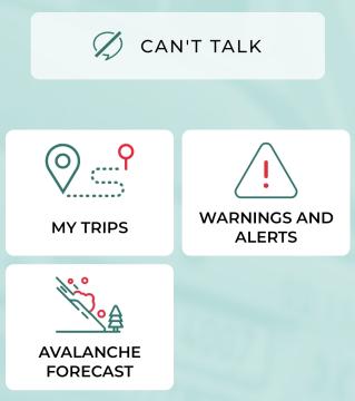
Zachranka
The UI presents a clean and userfriendly layout, focusing on functionality with straightforward labels. 1. Can't Talk: This prominent label at the top in...
autosave automatic save automatically
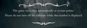
Hollow Knight
The UI design in the image features a centered message set against a dark, slightly blurred background, enhancing readability by contrasting with the text. 1....
vicefist weapon description
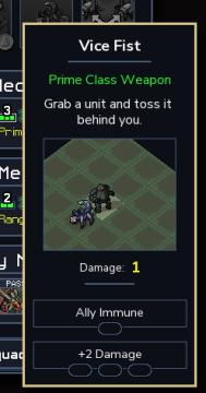
Into the Breach
The UI in the image displays information about a weapon named "Vice Fist." Here’s a breakdown of the labels and features: 1. Title: "Vice Fist" is prominen...
uplatnit poukaz
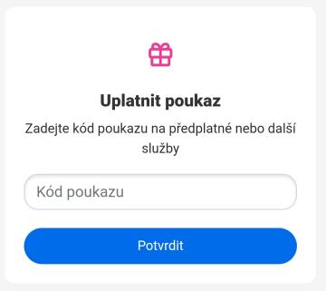
Rekola
Na obrázku je zobrazen uživatelský rozhraní pro uplatnění poukazu. Hlavní funkce jsou následující: 1. Název sekce: "Uplatnit poukaz" toto slouží jako jas...
manual save notification
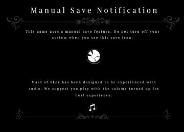
Maid of Sker
The UI in the picture is designed to convey important game information about saving and audio experience in a clear and visually appealing manner. 1. Title...