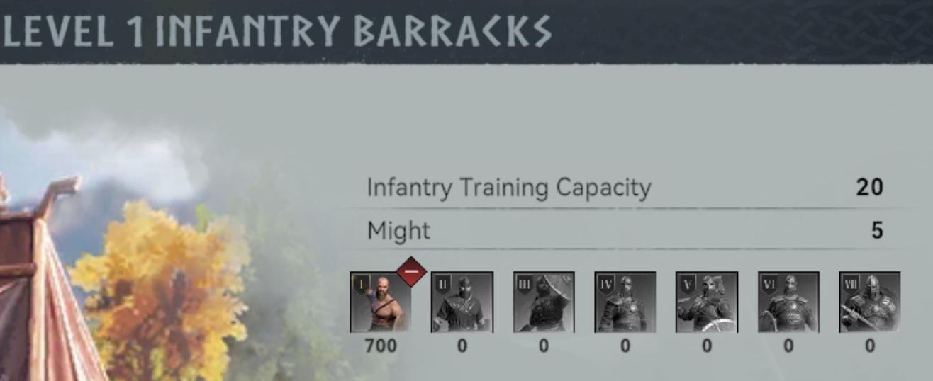
level 1 infantry barracks: queue capacity and might
Description
The UI in the image represents a Level 1 Infantry Barracks within a game interface.
Labels and Features:
-
Header:
- "LEVEL 1 INFANTRY BARRACKS": This prominently displayed title indicates the current level and type of the military structure.
-
Infantry Training Capacity:
- Label: "Infantry Training Capacity"
- Value: "20"
- Function: This indicates the maximum number of infantry units that can be trained at this level, crucial for strategic planning in battle.
-
Might:
- Label: "Might"
- Value: "5"
- Function: Reflects the overall strength or effectiveness of the barracks, which likely influences gameplay mechanics such as unit performance in battles.
-
Unit Icons:
- A series of icons representing different infantry unit types arranged horizontally.
- Each unit has a level indicated (I to VII) and shows corresponding stats, such as 700 for the first unit and zeros for the others.
- Function: These icons allow players to quickly assess the available troop types and their respective levels of training achieved.
-
Selected Unit Indicator:
- An arrow or highlighted icon for the first unit, showing it is currently selected or active.
- Function: This aids users in identifying which unit is currently being focused on for further actions.
Overall, the UI combines functional elements with a clean, organized layout, using graphical icons for easy recognition and interaction within the gameplay context.
Software
Viking Rise
Language
English
Created by
 matej94v
Sponsored
Similar images
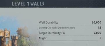
level 1 walls wall durability and might
Viking Rise
The UI in the picture appears to display information related to "Level 1 Walls" in a game, likely reflecting their defensive characteristics. 1. Title ("LEV...
clear save? yes, no

Hollow Knight
The UI features a prompt labeled "CLEAR SAVE?" positioned prominently, indicating a confirmation action regarding the deletion of a saved state. This text is ce...
about app: terms of service, privacy policy, copyright information
Sumikko Farm
The UI features a neatly structured "About" section with a light, inviting color palette. The layout is centered, making it easy to read and navigate. Lab...
main menu
Populous: The Beginning
Die Benutzeroberfläche zeigt das Hauptmenü des Spiels "Populous: The Beginning". Die Hauptüberschrift „POPULOUS“ ist prominent in einer goldenen Schriftart plat...
inventory, tchotchke
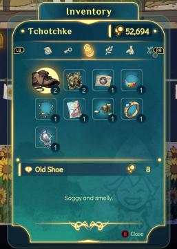
Spiritfarer: Farewell Edition
The UI is designed with a clear and organized layout for managing the player's inventory. At the top, the title "Inventory" is prominently displayed, indicating...
boons of artemis
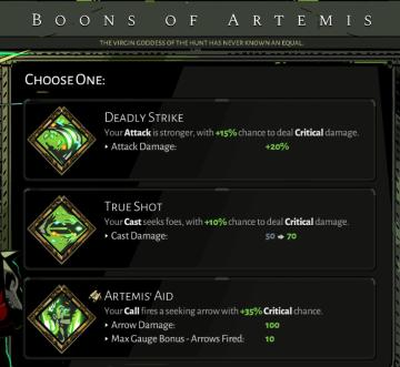
Hades
The image displays a user interface for selecting "Boons of Artemis," likely from a video game. Here's a breakdown of the labels and features: Title: B...
options menu: change user settings, select mods
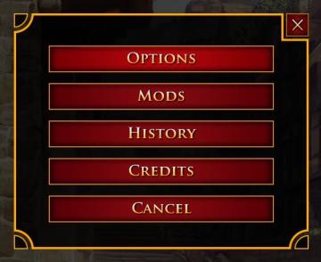
Age of Empires 2 Definitive Edition
The user interface presents a vertical list of labels within a rectangular box with rounded corners. Each label serves a specific function: 1. OPTIONS: Thi...
mission results
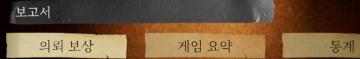
Phasmophobia
UI 요소는 다음과 같이 구성되어 있습니다: 1. 보고서: 기능: 이 부분은 주로 보고서에 관련된 내용을 표시하거나 접근하는 링크로 보입니다. 형태: 진한...