niflung offense
Description
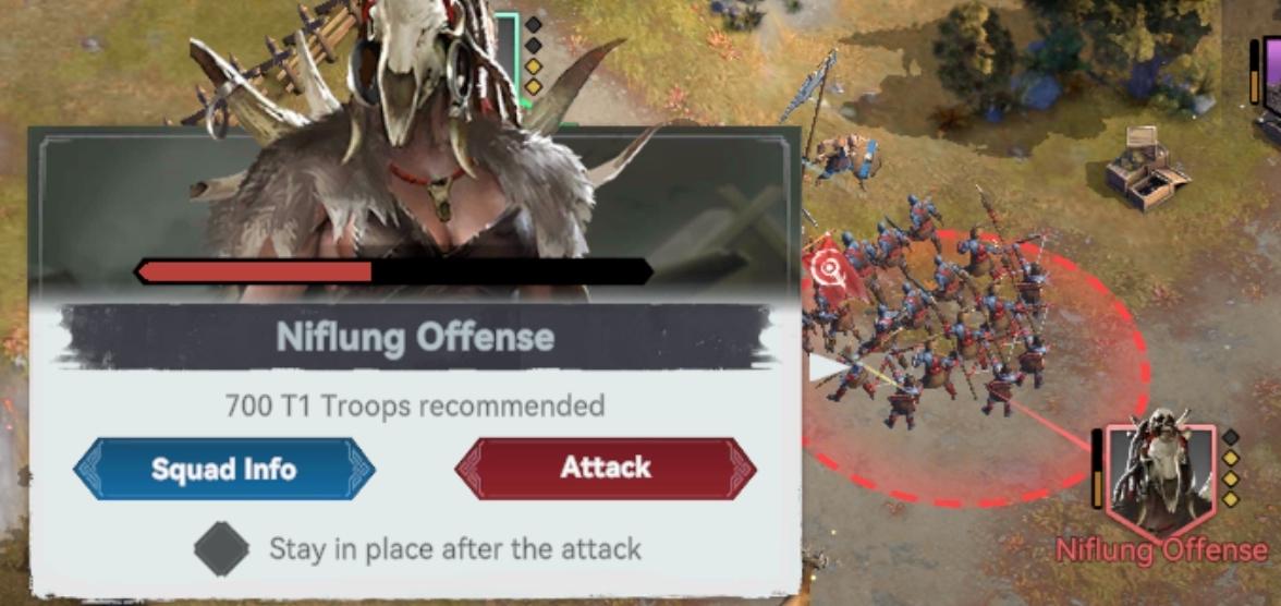
The user interface (UI) in the image appears to be from a real-time strategy game. Here’s a breakdown of its labels and features:
-
Title Bar: "Niflung Offense" is prominently displayed as the title, indicating the context or objective of the current action.
-
Recommended Troop Count: Below the title, there is a statement indicating that "700 T1 Troops recommended," providing guidance on the number of troops needed for the task at hand. This serves to inform players about troop requirements for successful engagement.
-
Progress Bar: There’s a horizontal progress bar beneath the troop recommendation, which likely indicates the strength or status of the current battle or action.
-
Action Buttons:
- Squad Info (blue button): This button allows players to view detailed information about their squad, likely including troop types, stats, and health.
- Attack (red button): This button initiates an offensive action against the opponent. The red color typically signifies caution or a critical action, highlighting the importance of the decision to attack.
-
Strategy Note: The text "Stay in place after the attack" provides strategic instructions, indicating that the player may want to hold their position after launching the attack, which can affect gameplay decisions.
-
Visual Elements: The background includes an artful representation of characters or units, enhancing the thematic immersion, while the buttons are designed with contrasting colors (blue for information and red for action) for easy visibility.
Overall, the UI effectively communicates essential information and guidance for strategic decision-making, combining functional clarity with engaging visual design.
Software
Viking Rise
Language
English
Created by
 matej94v
Sponsored
Similar images
level up

Sumikko Farm
The UI in the picture prominently features the label "LEVEL UP!!" in a large, bold, and cheerful font, primarily colored in orange with a white outline. This de...
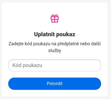
uplatnit poukaz
Rekola
Na obrázku je zobrazen uživatelský rozhraní pro uplatnění poukazu. Hlavní funkce jsou následující: 1. Název sekce: "Uplatnit poukaz" toto slouží jako jas...
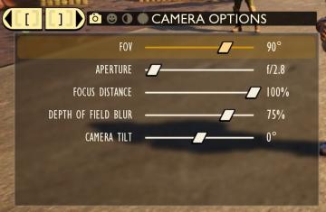
camera mode - depth of field, fov, aperture
Grounded
The user interface (UI) features labels and sliders designed for adjusting various camera settings. Each label clearly indicates the specific setting: 1. FOV...
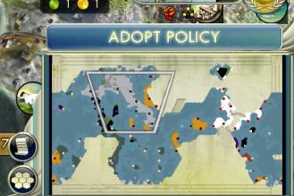
adopt policy
Civilization V
The user interface (UI) in the picture primarily features the "Adopt Policy" label, prominently displayed at the top of the screen. This label indicates a funct...
are you sure you want to quit
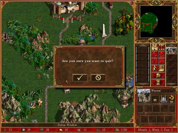
Heroes of Might and Magic 3: Complete
The image depicts a user interface (UI) from a strategy game, featuring several functional elements and components. Dialog Box: Text Area: The promin...
druhá jízda ukončena, jízdu máte od lítačky, zkontrolujte kde parkujete
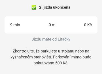
Rekola
Na obrázku vidíme uživatelské rozhraní aplikace, které informuje o dokončení jízdy. 1. Hlavní header: Zelený zaškrtnutý symbol a text "2. jízda ukončena"...
online settings: show download code

Grounded
The UI presents a clean and minimalistic design. 1. Status Indicator: The label "ONLINE" prominently indicates the current connection status. This suggest...
level clear - leave area
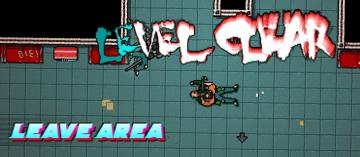
Hotline Miami 2
The user interface in the depicted scene prominently features the label "LEVEL CLEAR," designed in a bold, distressed font that conveys a sense of triumph and e...