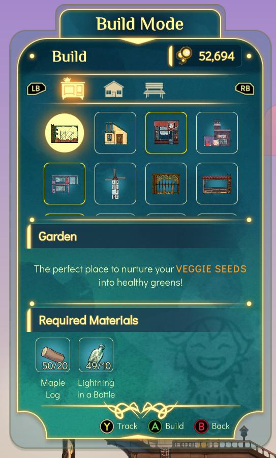
build mode, construct a garden, track required materials
Description
-
Title: "Build Mode" - Clearly indicates the current mode of operation within the UI.
-
Currency Display ("52,694") - Shows a numerical balance, likely representing in-game currency, positioned prominently in the upper right corner.
-
Navigation Buttons (LB, RB) - Located on the left and right side, these buttons are used for navigating between different build options or categories.
-
Build Options Grid - A visually organized section featuring various construction items. Each item is represented by an icon, indicating different structures available for selection (e.g., fences, houses).
-
"Garden" Label - A larger text label that highlights the specific area where players can nurture veggie seeds, adding a thematic focus.
-
Description Text - Below the "Garden" label, a brief description provides context about nurturing veggie seeds, highlighting the function of this section.
-
Required Materials Section - Lists the materials needed for construction, enhancing usability by specifying requirements directly under the build option.
-
Material Count - Each material (Maple Log and Lightning in a Bottle) is accompanied by a numeric display showing current inventory versus required amounts (e.g., "50/20").
-
Action Buttons (Track, Build, Back) - Positioned at the bottom of the UI, these buttons facilitate user actions:
- Track (Y) - Possibly to mark a material or task for following.
- Build (A) - A clear call to action for initiating the building process.
- Back (B) - Allows users to return to the previous menu or screen.
-
Overall Aesthetic - The design features rounded corners and a cohesive color scheme that enhances visual appeal, creating a friendly interface for users.
Software
Spiritfarer: Farewell Edition
Language
English
Created by
 M S
M S
Sponsored
Similar images
about app: terms of service, privacy policy, copyright information

Sumikko Farm
The UI features a neatly structured "About" section with a light, inviting color palette. The layout is centered, making it easy to read and navigate. Lab...
press Space for item lore
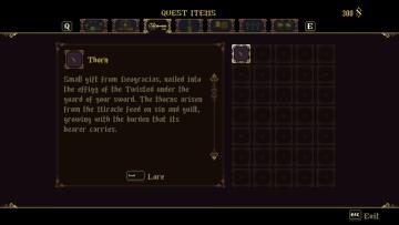
Blasphemous
The UI displays a quest items section framed in a dark, ornate style, enhancing the fantasy theme. The top portion features labels, including "QUEST ITEMS," ind...
Rainstorm difficulty is the way the game is meant to be played
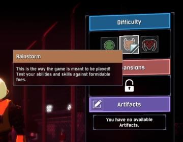
Risk of Rain 2
The UI presents multiple sections, each corresponding to different game settings. The "Difficulty" section is highlighted with a blue label, featuring three sel...
new item acquired
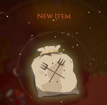
Mages of Mystralia
The UI label in the image primarily features the phrase "NEW ITEM," indicating the acquisition of a new item within a game or application. This label is promine...
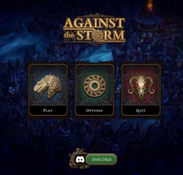
against the storm main menu, discord
Against the Storm
The UI features a symmetrical layout with three main buttons prominently displayed at the center: "Play," "Options," and "Quit." Play: This button featu...
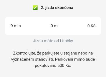
druhá jízda ukončena, jízdu máte od lítačky, zkontrolujte kde parkujete
Rekola
Na obrázku vidíme uživatelské rozhraní aplikace, které informuje o dokončení jízdy. 1. Hlavní header: Zelený zaškrtnutý symbol a text "2. jízda ukončena"...
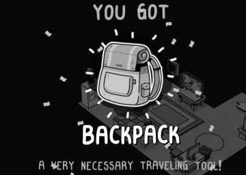
you got backpack
TOEM
The user interface (UI) in the image primarily focuses on celebrating the acquisition of a new item, the "BACKPACK." Key Features: 1. Main Message:...
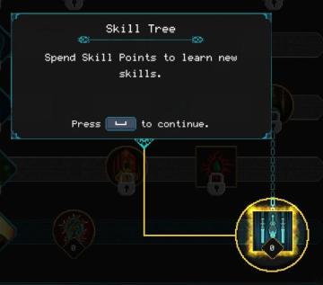
spend skill points tutorial
Children of Morta
Skill Tree: Title indicating the interface section for skill management. Spend Skill Points: Instructions on how to use skill points to acquire new...