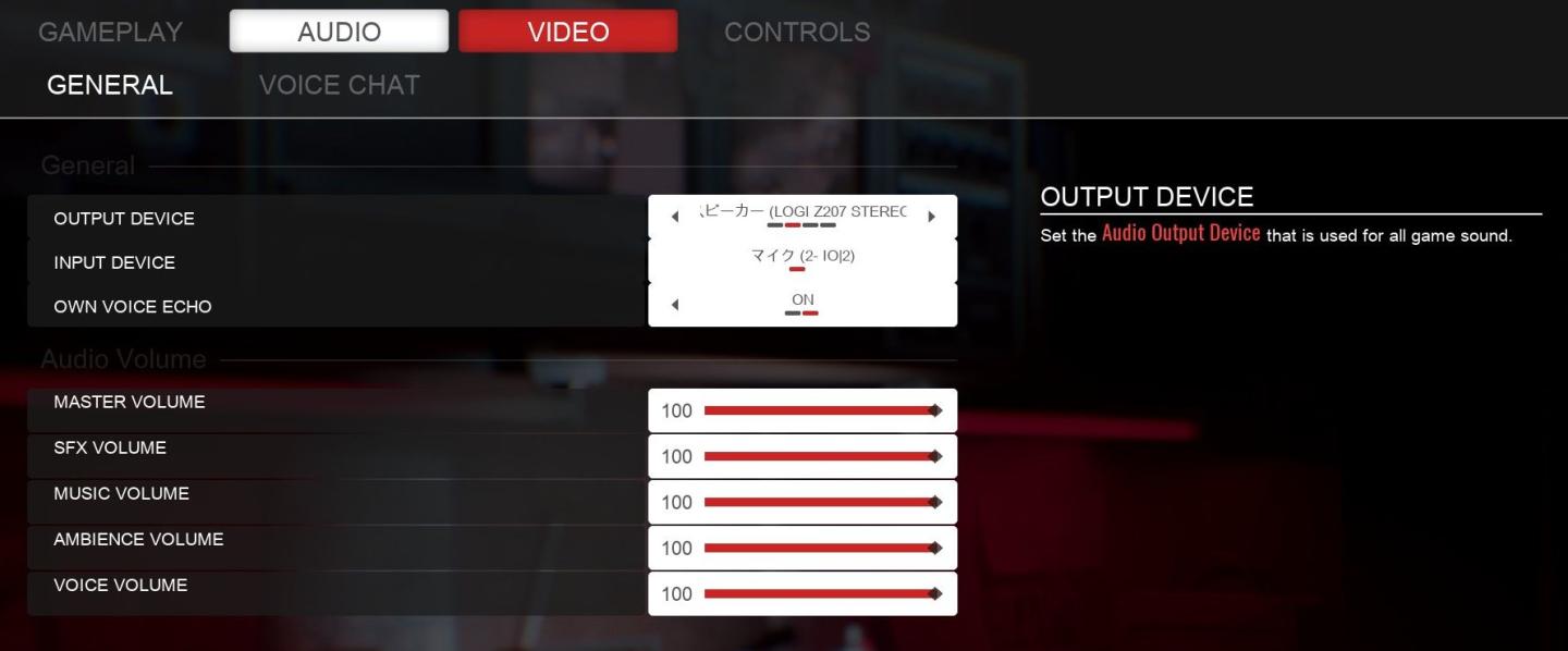
choose output and input audio device (speakers, microphone)
Description
The user interface (UI) in the picture presents audio settings for a gaming system. Here’s a breakdown of its features and functions:
-
Tabs: At the top, there are navigation tabs labeled "GAMEPLAY," "AUDIO," "VIDEO," and "CONTROLS," allowing users to switch between different settings categories quickly.
-
General Section: This section includes options for configuring audio devices:
- OUTPUT DEVICE: A dropdown menu to select the audio output device, indicated by a Japanese label showing connected devices.
- INPUT DEVICE: Similar to the output device, this dropdown allows users to select a microphone or input source.
- OWN VOICE ECHO: A toggle (set to "ON") for echo effects on the user's voice while speaking through the microphone.
-
Audio Volume Section: A set of horizontal sliders for adjusting volume levels, each labeled for clarity:
- MASTER VOLUME: Controls the overall sound level for the game.
- SFX VOLUME (Sound Effects): Specifically adjusts the volume of sound effects.
- MUSIC VOLUME: Adjusts the volume of music tracks within the game.
- AMBIENCE VOLUME: Controls the level of background sounds or ambiance.
- VOICE VOLUME: Adjusts the volume for voice communication.
-
Volume Labels: Each slider is marked with a number "100," indicating the maximum volume, with the sliders likely representing a range from 0 to 100.
-
Form: The design is sleek and organized, utilizing a dark theme with contrasting text that makes options easy to read. The sliders provide a visual representation of volume levels, and the dropdowns are accessible for quick adjustments.
Overall, this UI is functional and user-friendly, allowing gamers to customize their audio settings effectively.
Software
Panicore
Language
English
Created by
 M S
M S
Tags
Sponsored
Similar images
learn a skill at the blacksmith's
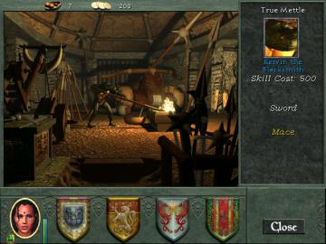
Might and Magic 8: Day of the Destroyer
The user interface (UI) in the picture presents various functional elements designed for interaction within a crafting or gameplay scenario. UI Elements:...
what's new in Shrine of Challenge update
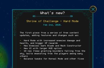
Children of Morta
Title: Indicates the section for new updates. Subtitle: Specifies the update name and date. Bullet Points: Lists specific features and changes...
main menu, single player or multiplayer, credits, options
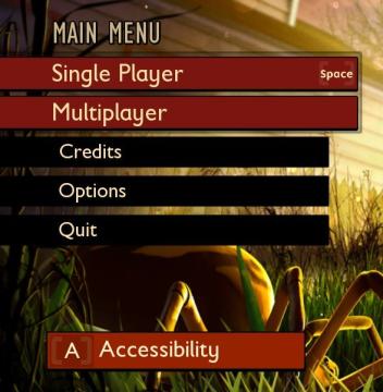
Grounded
The user interface (UI) features a clean layout with a bold, central title labeled "MAIN MENU" at the top, indicating the primary navigation area for the user....
set up a quickspell button, then cast with S
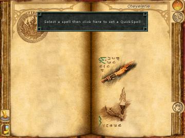
Might and Magic 8: Day of the Destroyer
The UI in the image presents a spell selection menu from a fantasythemed application, likely a game. Here’s a breakdown of its key features: 1. Main Display...
settings - confirm changes or reset all to default

Lethal Company
The user interface features three main labels: "Confirm changes," "Back," and "Reset all to default." 1. Confirm changes: This label typically functions a...
nastavení hry

Bulanci
Na uživatelském rozhraní jsou následující prvky: 1. Hra: Titulek označující sekci, pravděpodobně zaměřenou na herní nastavení. 2. Jazyk: Tento prvek s...
download aktualizace

Steam
Na obrázku vidíme uživatelské rozhraní pro sledování aktualizací, které se zaměřuje na přenosové rychlosti a využití disku. Popisy prvků: 1. Název okna...
main menu: single player campaigns, multiplayer, learn to play
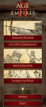
Age of Empires 2 Definitive Edition
The user interface (UI) presents a clear and organized menu for navigating the game "Age of Empires II: Definitive Edition." 1. Title: The top prominently...