vibrations, screenshake, game and input settings
Description
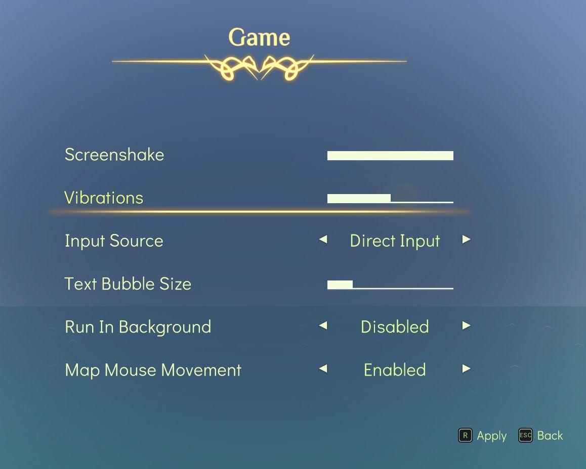
The user interface features a soft gradient background that enhances readability, with a central title labeled "Game" framed by ornate decorative elements.
-
Labels: Clear and concise labels for each setting include "Screenshake," "Vibrations," "Input Source," "Text Bubble Size," "Run In Background," and "Map Mouse Movement." The use of a light font color stands out against the background.
-
Sliders: Each of the first four settings includes adjustable sliders, allowing users to control the intensity of the effects (e.g., the amount of screen shake or vibration). The sliders have a prominent design, with a contrast that highlights their functionality.
-
Input Source: This setting features arrows indicating options for selecting input methods, with "Direct Input" as the selected option. The labeling is user-friendly, guiding through choices.
-
Toggle Options: The "Run In Background" and "Map Mouse Movement" settings utilize toggle options, showing "Disabled" and "Enabled" states, respectively. This clear indication allows users to easily switch settings.
-
Action Buttons: At the bottom, there are clear action buttons labeled "Apply" and "Back." These buttons have a distinct design for easy identification, emphasizing their functionality in saving settings or navigating away.
The overall aesthetic combines functional UI elements with a visually appealing layout, ensuring that users can adjust settings without confusion.
Software
Spiritfarer: Farewell Edition
Language
English
Created by
 M S
M S
Sponsored
Similar images
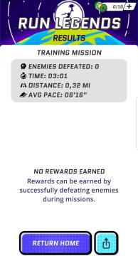
mission results, enemies defeated: 0, no rewards earned
Run Legends
The interface shown in the image is a result screen from a game titled "Run Legends." UI Labels and Features: 1. Header: RUN LEGENDS: This i...
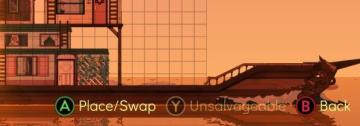
this building is unsalvageable
Spiritfarer: Farewell Edition
The UI features three main control buttons, each labeled with a letter and function: 1. A Place/Swap: This button indicates a dualpurpose function for a...
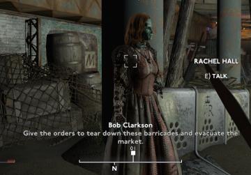
talk with NPCs
Fallout London
The user interface (UI) in the picture consists of several key elements, each serving specific functions within the game's user experience. 1. Character Name...
are you recording? disable the stock background music
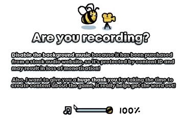
I Commisioned Some Bees 0
The user interface features a playful, cartoonish aesthetic, highlighted by the presence of a bee and a camera icon, suggesting a friendly and engaging tone....
choose a cornerstone
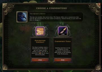
Against the Storm
The user interface (UI) presents a selection screen titled "CHOOSE A CORNERSTONE." At the top, there is a prominent character portrait labeled "The Queen's Envo...
inventory, types of wood
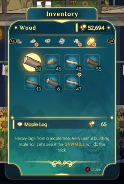
Spiritfarer: Farewell Edition
The UI features a clear and organized layout primarily focused on managing inventory, specifically wood resources. At the top, the title "Inventory" is promin...
build altair of air
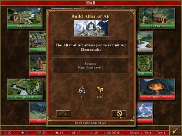
Heroes of Might and Magic 3: Complete
In the provided image, the user interface is designed for a strategy game, likely involving resource management and building structures. Here are the key labels...
ghost types in Korean
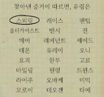
Phasmophobia
주어진 그림에서는 여러 UI 레이블과 그 기능이 나열되어 있습니다. 각 레이블은 특정한 기능이나 요소를 나타내며, 사용자가 선택할 수 있는 다양한 옵션들을 제공합니다....