0 woodcutter's camps built, select or preview building
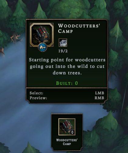
Description
The user interface features a rectangular panel with a dark background, giving it a structured and clean appearance.
-
Title Label: "WOODCUTTERS' CAMP" prominently displayed at the top in a bold, upper-case font, indicating the type of structure.
-
Resource Indicator: Below the title, "19/2" suggests capacity or resource management, possibly indicating available vs. needed resources.
-
Description Text: A brief explanatory line, "Starting point for woodcutters going out into the wild to cut down trees," providing context about the function of the building.
-
Build Status: "BUILT: 0" informs users about the current build count, further adding clarity to the building's status.
-
Interaction Prompts:
- "Select: LMB" indicates the left mouse button is used for selecting the building.
- "Preview: RMB" indicates the right mouse button allows users to preview the building, suggesting a visual or contextual overview before placement.
-
Icon Representation: An illustrative icon of the structure is located at the top left, enhancing visual understanding.
-
Compact Icon: A smaller version of the building icon appears at the bottom, with "0" alongside, probably indicating another metric, such as available counts or requirements.
Overall, the design prioritizes functionality with clear visual cues and simple text for user interaction.
Software
Against the Storm
Language
English
Created by
 M S
M S
Sponsored
Similar images
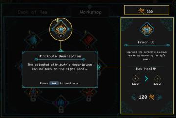
attribute description tutorial
Children of Morta
Book of Rea: Main navigation label. Workshop: Secondary navigation label. 360: Currency or resource indicator. Attribute Description: Po...
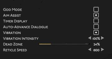
gameplay settings (vibration, aim assist, god mode..)
Hades II Early Access
The user interface (UI) features a clean layout with a dark background, promoting readability and focus on functionality. Each label is presented in a clear, bo...
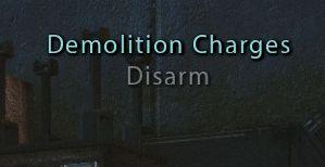
disarm demolition charges
Mass Effect 1
The UI displays the label "Demolition Charges," indicating a feature related to handling explosives or similar devices. It serves as a title to inform the user...
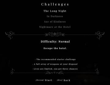
challenges 4
Maid of Sker
The UI in the image presents a menu for a gaming challenge selection, structured clearly to guide the player through the available options. Labels and Fea...
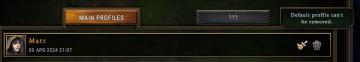
default profile can't be removed
Against the Storm
The user interface features a dark, textured background with contrasting text and icons, creating a visually striking appearance. 1. Main Profiles Button:...
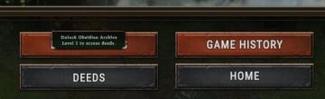
unlock obsidian archives to access deeds
Against the Storm
The interface features several key labels and buttons designed for user interaction. 1. Unlock Obsidian Archives Tooltip: This tooltip message indicates a...
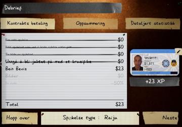
debrief, hopp over, spokelse type
Phasmophobia
Grensesnittet er delt inn i flere seksjoner med tydelige etiketter og funksjoner. 1. Debrief: Øverste seksjon som angir at dette er en oppsummering etter...
last saved: 22 seconds ago
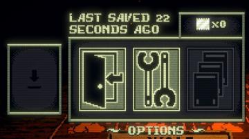
Inscryption
The user interface features a dark, pixelated design, emphasizing a retro aesthetic. 1. Last Saved Indicator: Positioned at the top, it shows the time sin...