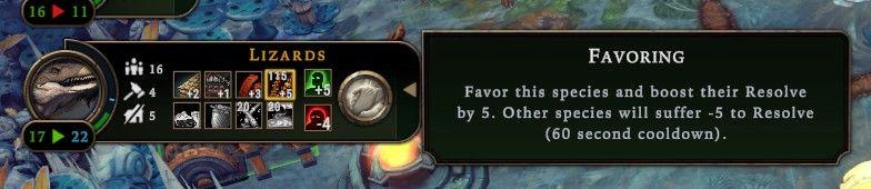
favoring species to boost their resolve, cooldown
Description
The user interface features a series of clearly labeled sections, emphasizing functionality and user interaction.
-
Species Indicator: At the top, "Lizards" is displayed prominently, indicating which species the information pertains to.
-
Resource Metrics: To the left, there are numerical representations showing different resource stats, likely indicating population, health, or other metrics (16, 11, 17, 22). Each number is visually distinct for easy reading.
-
Action Icons: Beneath the species label, a row of icons represents various actions or attributes associated with the Lizards. The icons include symbols for movement, resources, or combat capabilities. These are arranged in a grid for quick reference.
-
Ability Button: A circular button appears to the right, likely used to activate the "Favoring" ability. Its design is intuitive, encouraging user interaction.
-
Ability Description: The right panel provides a detailed explanation of the "Favoring" ability. It clarifies the action—boosting the Resolve of the species by 5 while negatively impacting others. This section is separated by a darker background, enhancing readability.
-
Cooldown Indicator: The mention of a "60 second cooldown" within the ability description gives an important gameplay mechanic, ensuring players understand the timing for using this feature.
The combination of these elements creates a functional and visually organized interface that aids in gameplay decision-making and species management.
Software
Against the Storm
Language
English
Created by
 M S
M S
Sponsored
Similar images
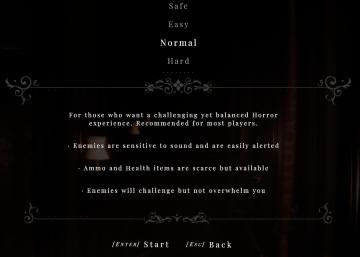
normal difficulty
Maid of Sker
The user interface (UI) displayed features several labels and components focused on selecting the difficulty level for a horror game. 1. Difficulty Options...
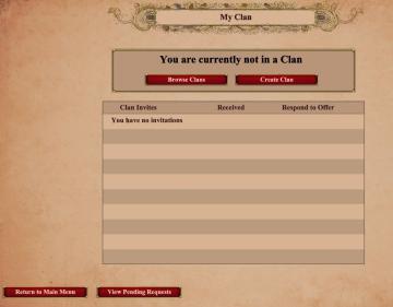
my clan: you have no invitations, you are currently not in a clan
Age of Empires 2 Definitive Edition
The user interface features a clean and structured layout with several key components. At the top, there is a title labeled "My Clan," prominently displayed, in...
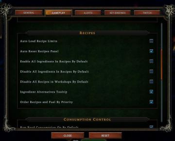
enable or disable all ingredients in recipe by default
Against the Storm
The UI presents a settings panel with several categories, including "GENERAL," "GAMEPLAY," "ALERTS," "KEY BINDINGS," and "TWITCH," clearly labeled at the top fo...
daily challenge score distribution

Mini Motorways
The user interface (UI) presented features a clean and organized layout, emphasizing clarity and functionality. At the top, a large label shows "Tuesday," ind...
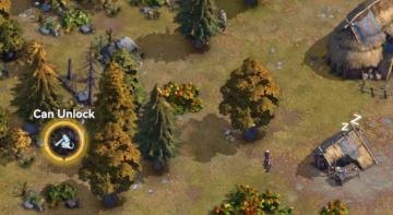
can unlock area
Viking Rise
In the image, the user interface (UI) features a clear label and an icon that indicates interactivity within the game environment. 1. Label: “Can Unlock”...
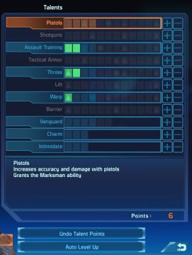
player talents screen, undo talent points button, auto level up button
Mass Effect 1
The UI displays a "Talents" menu, primarily focused on character abilities or skills. The main area features a vertical list of talent categories, including "Pi...
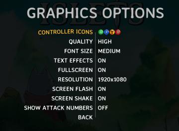
graphics options
Islets
The user interface (UI) in the provided image presents various graphics options for a game, labeled clearly for easy navigation and usability. 1. Header:...
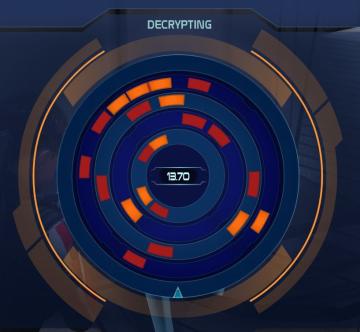
decrypting (hacking into computer console)
Mass Effect 1
The user interface displays a circular progress indicator titled "DECRYPTING" at the top, emphasizing its primary function. This title suggests that the operati...