hero skills, artifacts, etc.
Description
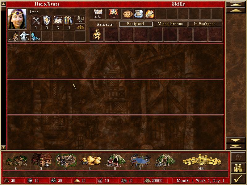
The user interface (UI) in the image resembles a character management window for a strategy or role-playing game. Here's a breakdown of its features and labels:
-
Header Section:
- Title: "Hero/Stats" indicates that this section provides details about the hero's statistics.
- Hero Name: "Luna" is displayed prominently, indicating the character currently selected.
-
Hero Stats:
- Visual Icon: A portrait of the hero is on the left, accompanied by various status icons (possibly representing health, experience, or mana).
- Numeric Stats: The numbers (0, 3, 5) likely denote the hero's attributes, such as level, experience points, or specific skills.
-
Skills and Inventory:
- Tabs labeled "Artifacts," "Equipped," "Miscellaneous," and "In Backpack" are likely designed to categorize the items the hero possesses. Users can switch between these tabs to view different aspects of their inventory.
- Each tab is empty in the provided image, suggesting space for various items.
-
Resource Overview:
- At the bottom, there's a row of icons representing different resources (e.g., gold, wood, stone). Each resource has a corresponding amount, which helps players manage their inventory and assess their capabilities.
-
Game Progress Information:
- Information about the current game month, week, and day (e.g., "Month: 1, Week: 1, Day: 1") is displayed, likely aiding players in tracking turns or days within the game.
-
Visual Design:
- The overall design features a dark and medieval aesthetic with rich color tones, likely to fit the game's theme. The textures in the background may suggest a fantasy environment.
Overall, the UI is function-driven, enhancing usability for players as they manage their hero, resources, and inventory efficiently while retaining a thematic visual style.
Software
Heroes of Might and Magic 3: Complete
Language
English
Created by
 M S
M S
Tags
Sponsored
Similar images
choose your hero
Into the Breach
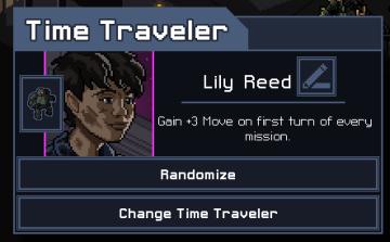
The UI in the image features a character selection screen for a game titled "Time Traveler." 1. Title Bar: The top of the interface prominently displays "...
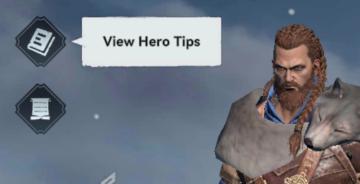
view hero tips
Viking Rise
In the picture, the user interface features include a series of icons and a prominent label for functionality. 1. Icons: On the left side, there are two d...
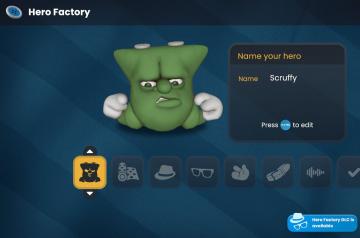
hero factory
Bulanci
The UI in the "Hero Factory" scene features a playful and cartoonish aesthetic, aligning with its fun theme. 1. Title and Name Input: At the top, "Hero Fa...
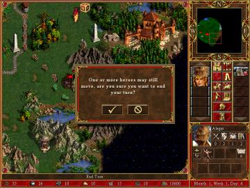
one or more heroes may still move
Heroes of Might and Magic 3: Complete
In the image, the user interface (UI) features and labels are primarily designed for gameplay in a strategy game, likely a turnbased format. Here's a breakdown...
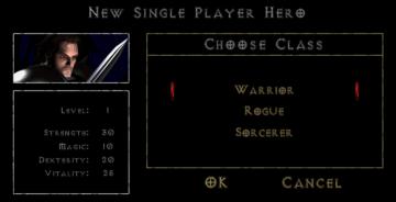
new single player hero
Diablo I
The UI presents a character creation screen with a dark, atmospheric design that aligns with a fantasy theme. Key Features and Functions: 1. Title Bar...
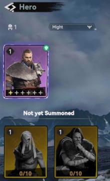
not yet summoned heroes
Viking Rise
The user interface (UI) in the image showcases a section dedicated to "Hero" selection, prominently displaying various features and labels. Main Features:...
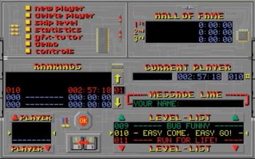
main menu
Supaplex
The UI features a distinctive retro design with a gray background and bright, contrasting text. The main sections include: Navigation and Player Options ...
real yakuza use gamepad

Yakuza 0
The image features a stylized background with dark, textured elements, likely intended to evoke a sense of intensity or energy associated with gaming. 1. Ma...