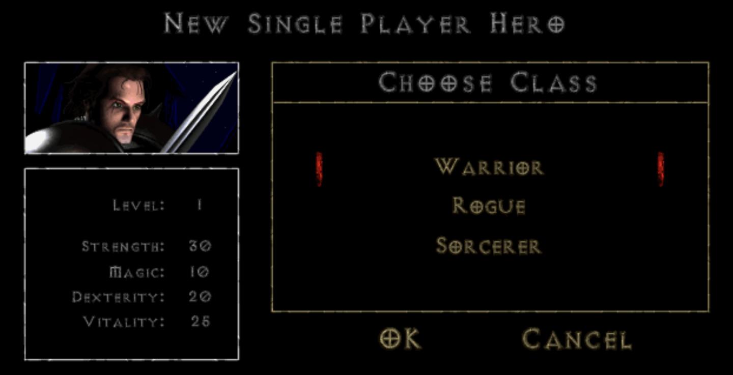
new single player hero
Description
The UI presents a character creation screen with a dark, atmospheric design that aligns with a fantasy theme.
Key Features and Functions:
-
Title Bar: The top of the screen displays "New Single Player Hero," indicating the mode of play. This sets the context for the user.
-
Class Selection: The section labeled "Choose Class" allows players to select their character class. Each class—Warrior, Rogue, and Sorcerer—is listed vertically. The highlighted option (possibly in red) indicates the currently selected class, enhancing usability by providing clear feedback.
-
Character Overview: On the left side, there’s a character portrait that gives a visual reference to the player's chosen character, adding an emotional connection to the gameplay.
-
Stat Display: Under the character portrait, important character stats are outlined:
- Level: Indicates the character's current level (starting at 1).
- Strength, Magic, Dexterity, Vitality: Each stat is labeled with corresponding numerical values, allowing players to assess their character's abilities at a glance.
-
Action Buttons: At the bottom, there are two buttons:
- OK: This confirms the class selection and proceeds to the next step in character creation.
- Cancel: This option allows players to exit or cancel the current selection, facilitating easy navigation.
Visual Style:
The overall form employs a dark background that enhances the readability of the text, with a contrast provided by the light-colored font. The classic fantasy elements in the typography and layout suggest a vintage or nostalgic gaming experience.
Software
Diablo I
Language
English
Created by
 admin
admin
Tags
Sponsored
Similar images
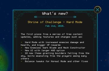
what's new in Shrine of Challenge update
Children of Morta
Title: Indicates the section for new updates. Subtitle: Specifies the update name and date. Bullet Points: Lists specific features and changes...
new profit quota

Lethal Company
The user interface features a large, bold label indicating "NEW PROFIT QUOTA" prominently at the top, which likely signifies a key data point for users. Below t...
message, news, letter, go to

Knights and Merchants
Das Bild zeigt eine Benutzeroberfläche mit mehreren wichtigen Funktionen. Auf der linken Seite befindet sich ein Textfeld, das eine dringliche Nachricht enthä...
create a new post
x.com
Interfejs użytkownika zawiera kilka kluczowych elementów funkcjonalnych. U góry znajduje się komunikat „Każdy może odpowiedzieć”, co informuje użytkowników o do...
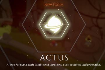
new focus actus
Mages of Mystralia
The UI in the picture presents a focused feature set related to spellcasting mechanics in a gaming context. Key components include: 1. Label "New Focus": P...
obtained new worker
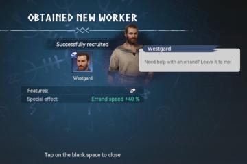
Viking Rise
The user interface (UI) in the picture indicates that a new worker has been successfully recruited, highlighting critical information with clarity and functiona...
new loot green soul beads x5
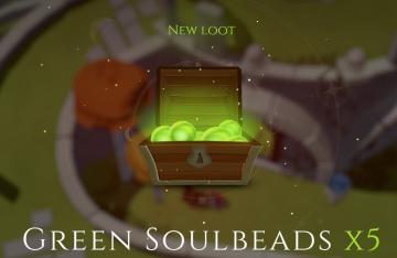
Mages of Mystralia
The user interface (UI) in the picture showcases a notification for newly acquired game loot. 1. Title: The label "NEW LOOT" is prominently displayed at t...
you have a new mail notification
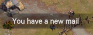
Viking Rise
The UI message displayed in the picture reads "You have a new mail!" This notification serves the function of alerting the user to new incoming messages or corr...