hero factory
Description
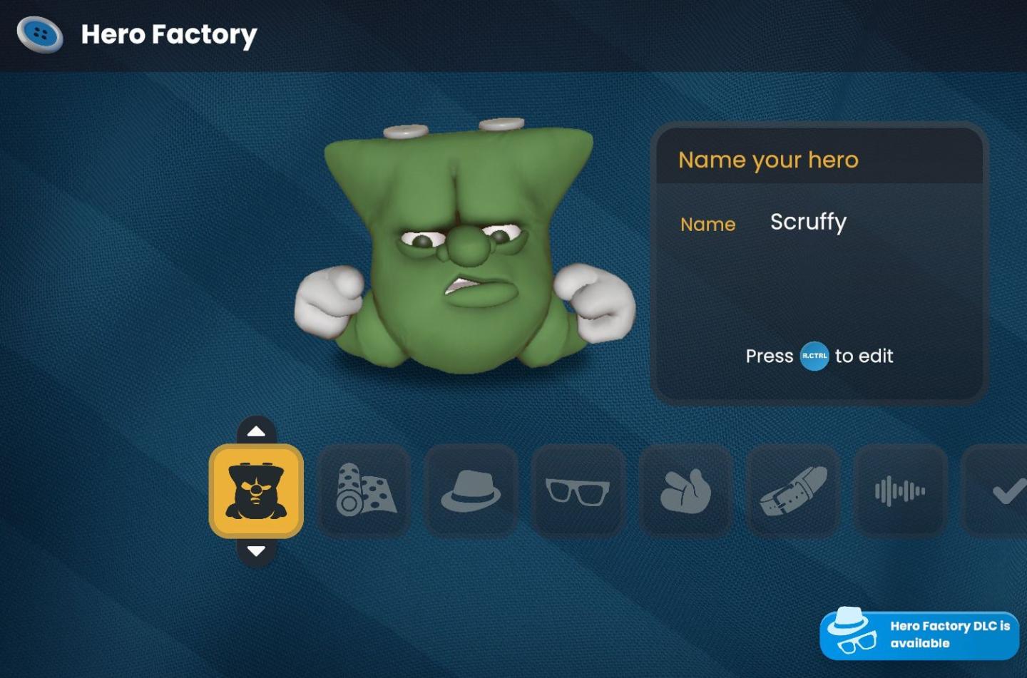
The UI in the "Hero Factory" scene features a playful and cartoonish aesthetic, aligning with its fun theme.
-
Title and Name Input: At the top, "Hero Factory" is prominently displayed, signaling the main context. To the right, there’s a box labeled "Name your hero" where the current name "Scruffy" is shown, along with a prompt to press a button to edit it. This makes it clear that users can customize the character's name easily.
-
Character Display: A 3D model of a green character appears prominently in the center. This adds a personal touch, allowing users to see their creations visually.
-
Function Menu Icons: Below the character, there are various icons arranged in a horizontal row. Each icon represents a feature for customization:
- The first icon seems to relate to selecting or creating different characters.
- Subsequent icons might represent different customization options like outfits (with rolls of fabric), accessories (like a hat and glasses), physical features (hands), sound settings, etc.
-
Navigation Buttons: To the left of the icon row, vertical arrows allow users to scroll through different options or categories, enhancing navigation through the features.
-
DLC Notification: At the bottom right, a small notification informs users about available downloadable content (DLC), suggesting additional features or items that can be accessed for a more enriched experience.
Overall, the interface is user-friendly, vibrant, and visually engaging, encouraging interaction and creativity in character creation.
Software
Bulanci
Language
English
Created by
 M S
M S
Tags
Sponsored
Similar images
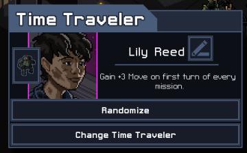
choose your hero
Into the Breach
The UI in the image features a character selection screen for a game titled "Time Traveler." 1. Title Bar: The top of the interface prominently displays "...
one or more heroes may still move
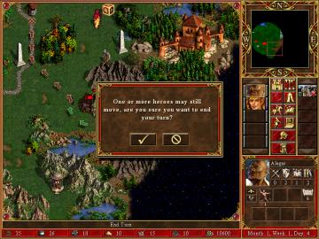
Heroes of Might and Magic 3: Complete
In the image, the user interface (UI) features and labels are primarily designed for gameplay in a strategy game, likely a turnbased format. Here's a breakdown...
new single player hero
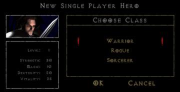
Diablo I
The UI presents a character creation screen with a dark, atmospheric design that aligns with a fantasy theme. Key Features and Functions: 1. Title Bar...
view hero tips
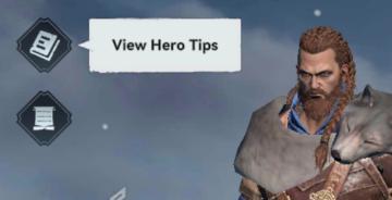
Viking Rise
In the picture, the user interface features include a series of icons and a prominent label for functionality. 1. Icons: On the left side, there are two d...
hero skills, artifacts, etc.
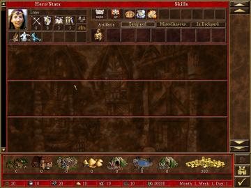
Heroes of Might and Magic 3: Complete
The user interface (UI) in the image resembles a character management window for a strategy or roleplaying game. Here's a breakdown of its features and labels:...
not yet summoned heroes
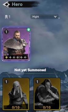
Viking Rise
The user interface (UI) in the image showcases a section dedicated to "Hero" selection, prominently displaying various features and labels. Main Features:...
camera mode - switch camera mode or reset factory defaults
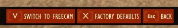
Grounded
The UI features several buttons, each serving a distinct function within the interface. 1. V Button "SWITCH TO FREECAM": This button is likely designed t...
apply or discard settings changes or reset to factory default
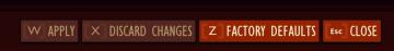
Grounded
The UI features a set of buttons that perform distinct functions related to managing changes. The labels are presented in a bold, legible font against a muted c...