apply or discard settings changes or reset to factory default

Description
The UI features a set of buttons that perform distinct functions related to managing changes. The labels are presented in a bold, legible font against a muted color scheme.
-
W APPLY: This button confirms changes made by the user. Its positioning suggests it is the primary action, inviting users to finalize their adjustments.
-
X DISCARD CHANGES: This option allows users to cancel any modifications. It serves as a safety net, ensuring users can revert to the previous state without commitment.
-
Z FACTORY DEFAULTS: This label indicates a reset function, reverting all settings to their original state. It stands out, likely signaling a cautionary action, as returning to factory settings may result in the loss of custom configurations.
-
Esc CLOSE: This button exits the current interface without applying any changes, providing a straightforward method for users to leave the menu quickly.
The design emphasizes clarity and ease of use, ensuring that users can navigate their options efficiently.
Software
Grounded
Language
English
Created by
 M S
M S
Sponsored
Similar images
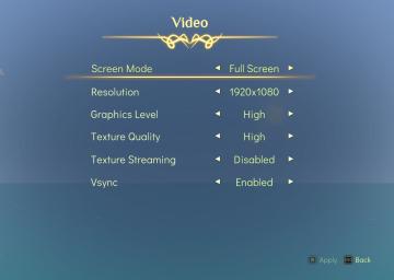
video settings, apply or go back
Spiritfarer: Farewell Edition
The interface displays a "Video" settings menu, organized clearly with labels that denote various options for video configuration: Screen Mode: This opti...
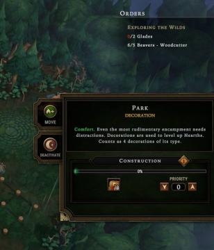
park decoration, under construction
Against the Storm
The UI features a clean layout with various functional elements. 1. Orders Section: At the top, this area has headings for "Exploring the Wilds," displayi...
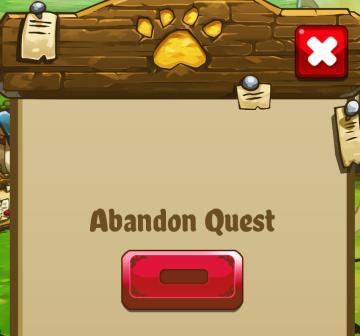
abandon quest
Cat Quest
The UI in the picture features a simple, cartoonish design with a warm, inviting color palette. Here's a breakdown of its components: 1. Title Area: At the...
mountain service emergency app

Zachranka
The UI presents a clean and userfriendly layout, focusing on functionality with straightforward labels. 1. Can't Talk: This prominent label at the top in...
tap anywhere to continue

Run Legends
The UI label in the image reads "TAP ANYWHERE TO CONTINUE." Function: Interaction Prompt: This label serves as a clear instruction to users that the...
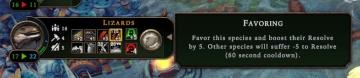
favoring species to boost their resolve, cooldown
Against the Storm
The user interface features a series of clearly labeled sections, emphasizing functionality and user interaction. 1. Species Indicator: At the top, "Lizard...
hero factory
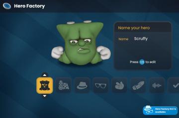
Bulanci
The UI in the "Hero Factory" scene features a playful and cartoonish aesthetic, aligning with its fun theme. 1. Title and Name Input: At the top, "Hero Fa...
inspect the gate
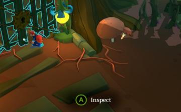
Mages of Mystralia
In the image, the user interface (UI) features a prominent label "Inspect" displayed in a circular green button, indicating an interaction prompt when the playe...