not yet summoned heroes
Description
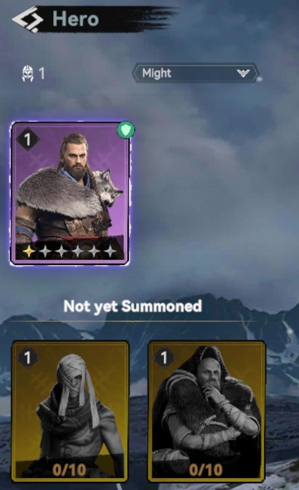
The user interface (UI) in the image showcases a section dedicated to "Hero" selection, prominently displaying various features and labels.
Main Features:
-
Hero Section:
- Title "Hero": Clearly indicates the current menu focus.
- Icon Indicator: Displays a numerical value (1), which may represent the number of heroes owned or a specific rank.
-
Hero Card:
- Primary Hero Display: Features a large, visually striking card showing the primary hero with a purple background, indicating a special status or rarity.
- Green Circle/Indicator: Suggests that this hero is currently active or selected.
- Star Rating: Shows the hero's level or rank, indicated by stars (up to five), which communicate the hero's strength or rarity.
-
Additional Heroes Section:
- Cards for Additional Heroes: Below the main hero, there are two smaller hero cards styled in a darker theme (
brownish) labeled "Not yet Summoned." - Hero Count and Summon Status: For each additional card, there are indicators (0/10) that likely denote how many times the hero can be summoned or the progression towards summoning.
- Cards for Additional Heroes: Below the main hero, there are two smaller hero cards styled in a darker theme (
-
Attribute Selector:
- Might Selector: There is a drop-down menu labeled "Might," suggesting the ability to filter or sort heroes based on different attributes or types.
Form Aspects:
- Visual Hierarchy: The larger hero card draws immediate attention due to size and color contrast, while the smaller cards are secondary, assisting in the organization of information.
- Color Coding: The use of different colors (purple for active and darker shades for inactive) helps convey status quickly.
Overall, the UI is streamlined for easy navigation, focusing on hero selection and summon management, with clear visual cues and data representation.
Software
Viking Rise
Language
English
Created by
 matej94v
Sponsored
Similar images
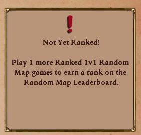
not yet ranked: play one more game to join leaderboard
Age of Empires 2 Definitive Edition
The UI features a rectangular notification box with a bordered design, likely to draw attention. At the top, an exclamation mark icon emphasizes urgency, sugges...
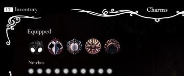
equipped charms and available notches
Hollow Knight
The UI features include the following labels and elements: LT Inventory: Located in the top left, likely indicating the button to access the inventory sc...
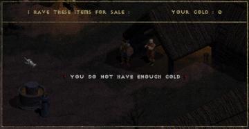
you do not have enough gold
Diablo I
The UI in the image represents a shopping interface from a game, likely an RPG. Features and Functionality: 1. Header: At the top, the label "I HAVE T...
you have a new mail notification
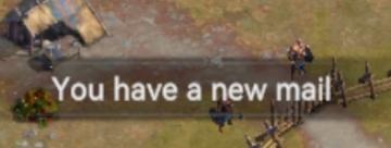
Viking Rise
The UI message displayed in the picture reads "You have a new mail!" This notification serves the function of alerting the user to new incoming messages or corr...
optional features dialog, enable notifications, don't ask this again
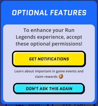
Run Legends
The user interface (UI) in the picture features a notification prompt designed for the "Run Legends" game. It is set against a predominantly blue background, en...
not enough skill points
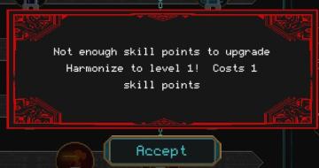
Children of Morta
Message Box: Alerts the user about insufficient skill points. Notification Text: Indicates the specific action (upgrading "Harmonize" to level 1) an...
ready not ready ready up, game lobby
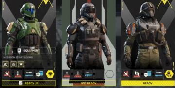
Helldivers 2
The user interface (UI) in the image presents a character selection screen, likely for a squadbased game. Here’s a breakdown of the labels and features: 1. ...
saving content. please do not turn off your computer
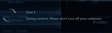
Mass Effect 1
The interface displays several UI labels and features related to the saving process of a game. 1. Save Slots: The section shows multiple save slots labele...