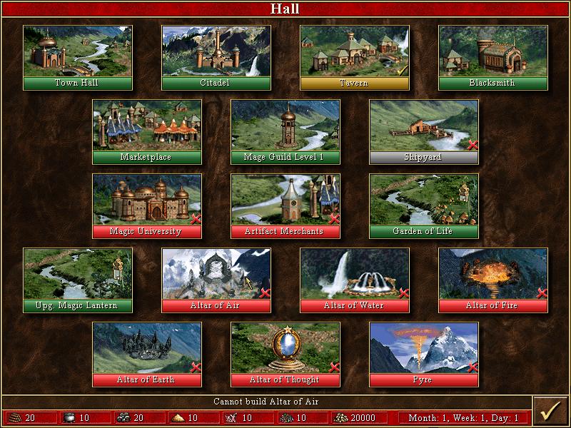
cannot build altair of air
Description
The image depicts a user interface (UI) for a game management screen, likely from a strategy game. Here’s a breakdown of the key features and labels focusing on their functions:
UI Labels and Features:
-
Title Bar ("Hall"):
- Function: Indicates the current section or menu within the game. It provides context about the buildings and structures that can be interacted with.
-
Building Thumbnails:
- Each building (e.g., Town Hall, Citadel, Tavern, etc.) is represented by a small image and label.
- Function: Clicking on these thumbnails likely allows players to view more information about each building, including benefits, construction costs, and upgrade options.
-
Building Availability Indicators:
- Some buildings have a red "X" or are grayed out.
- Function: This indicates that these buildings are either unavailable for construction or cannot be built due to resource constraints. It offers a visual cue for players to identify which options they can pursue.
-
Resource Counts (bottom section):
- Displays numerical values representing resources (e.g., gold, wood, stone, etc.).
- Function: Players can quickly assess their available resources to make decisions about which buildings they can construct or upgrade.
-
Status Messages (bottom):
- Example: "Cannot build Altar of Air."
- Function: Provides direct feedback to the player about their construction options, promoting strategic decision-making.
-
Resource Icons:
- Each resource type is associated with its respective icon.
- Function: This visual representation allows for quick identification and resource management.
-
Time Indicator:
- "Month: 1, Week: 1, Day: 1."
- Function: Indicates the game’s progression, which may influence resource regeneration and construction times.
Form Elements:
- The overall layout is grid-like, organizing buildings logically for easy access.
- The visual style features detailed artwork for each building, contributing to an immersive gaming experience.
- Color coding (e.g., green buildings indicating active options) provides an intuitive understanding of player choices at a glance.
Summary:
The UI effectively combines functionality and visual design to facilitate gameplay, allowing players to navigate options, manage resources, and plan strategies visually and intuitively.
Software
Heroes of Might and Magic 3: Complete
Language
English
Created by
 M S
M S
Tags
Sponsored
Similar images
build altair of air
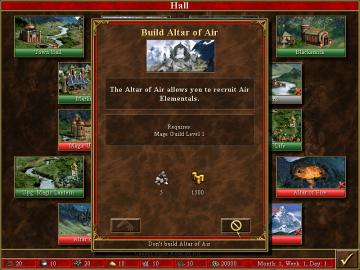
Heroes of Might and Magic 3: Complete
In the provided image, the user interface is designed for a strategy game, likely involving resource management and building structures. Here are the key labels...
item cannot be used
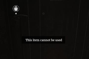
Maid of Sker
The user interface (UI) in the image features a dark wooden door with a lock icon positioned in the upper left corner. This icon signifies the lock status of th...
map options add markers

Red Dead Redemption 2
The user interface (UI) presents several functional labels and features, each designed to facilitate navigation and interaction. 1. Add Marker: This label...
defeat 100 enemies in brawler style
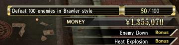
Yakuza 0
The image showcases a video game UI focused on player objectives and ingame currency. Here's a breakdown of its features: 1. Objective Tracker: Lab...
セーブデータリセット
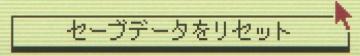
Inscryption
この画像には、保存データをリセットするためのUIラベルがあります。「セーブデータをリセット」というテキストは、ユーザーに特定のアクションを促す重要な機能を示してい...
settings: display, sound and controls (mouse sensitivity etc)
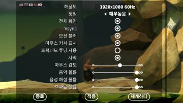
Getting Over It with Bennett Foddy
이 화면은 게임의 설정 메뉴로, 다양한 옵션을 조정할 수 있는 UI를 보여줍니다. 왼쪽에는 언어 설정 아이콘이 있으며, 여러 국기를 통해 언어 변경이 가능합니다. 메뉴...
new game warrior stats
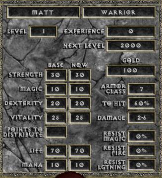
Diablo I
The user interface (UI) in the picture comprises several key elements focused on character statistics for a roleplaying game (RPG), presenting both functionali...
start game or load game, delete save, game progression
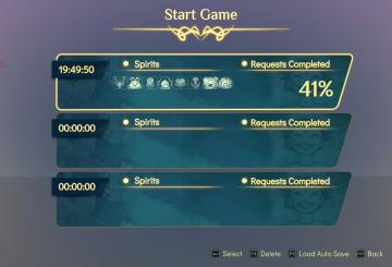
Spiritfarer: Farewell Edition
The interface presents a "Start Game" menu prominently at the top, styled with a decorative golden font, conveying a sense of adventure or fantasy. Below the ti...