stamp the card
Description
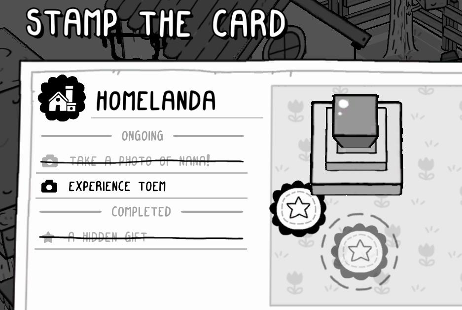
The UI features in the "STAMP THE CARD" overlay are designed for clarity and ease of navigation.
-
Title: At the top, "STAMP THE CARD" is prominently displayed in a bold and playful font, indicating the main action of the interface.
-
Section Label: Below the title, "HOMELANDA" serves as the header for this specific card, suggesting that it pertains to a particular area or task related to the gameplay.
-
Ongoing Tasks: The tasks are divided into two categories: "ONGOING" and "COMPLETED."
- Under "ONGOING," there are two tasks:
- Take a photo of Nana!: This task features a simple camera icon, hinting at the action required. It’s straightforward, suggesting immediate engagement.
- Experience Toem: This task also includes a camera icon, which indicates a connection to photographic activities.
- Under "ONGOING," there are two tasks:
-
Completed Tasks: The "COMPLETED" section shows past tasks. The crossed-out task "A hidden gift" provides a visual cue that the objective has been fulfilled.
-
Visual Elements:
- There’s a central area with an image (a box or stamp) that may represent a collectible or interaction point. It's visually distinct, suggesting it might be an area for interaction or completion of tasks.
- Decorative icons—like the house symbol and stars—add whimsy to the design.
Overall, the design combines functional clarity with a playful aesthetic, making tasks easily recognizable and guiding users through their gameplay objectives.
Software
TOEM
Language
English
Created by
 M S
M S
Tags
Sponsored
Similar images
collect stamps
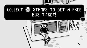
TOEM
The UI in the image features a prominent alert box that instructs the player on a game mechanic. Here’s a breakdown: 1. Text Labels: The bold, uppercase te...
got stamp!
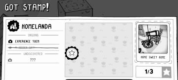
TOEM
The user interface (UI) in the picture displays a playful and whimsical design, featuring a monochrome color scheme with accentuated graphic elements. Here’s a...
timestamp, hawaii
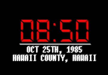
Hotline Miami 2
The user interface displays a digital clock in a striking red font against a black background, emphasizing clarity and legibility. The large digits "08:50" indi...
weapons items selection
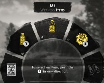
Red Dead Redemption 2
The image displays a user interface (UI) element commonly used in video games for item selection. UI Labels and Features: 1. Label at the Top: ...
map selection, connect the city
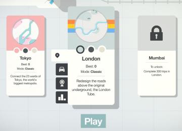
Mini Motorways
The user interface (UI) features three city options: Tokyo, London, and Mumbai, each presented in a card format. 1. Tokyo Card: Title: "Tokyo" is...
display settings, resolution, brightness settings
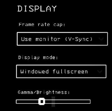
Lethal Company
The interface presents a "DISPLAY" section with a minimalist aesthetic, characterized by a black background and simple white text. Each label and control is des...
hades settings categories
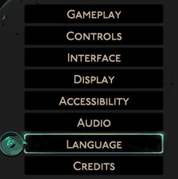
Hades II Early Access
The image displays a vertical menu with various options related to game settings. Each label represents a specific category that users can select to adjust thei...
camera mode (orbitcam) - drag scene to orbit, mousewheel to zoom
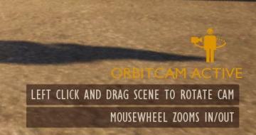
Grounded
The user interface features a prominent header, "ORBITCAM ACTIVE," indicating that a specific camera mode is currently engaged. This label is rendered in a vibr...