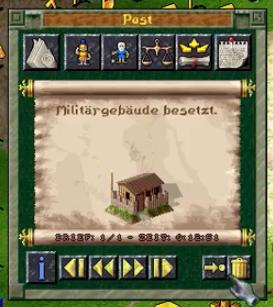
Militärgebäude besetzt
Description
Die Benutzeroberfläche zeigt eine Informationsansicht mit verschiedenen Elementen, die bestimmte Funktionen erfüllen. Am oberen Rand befinden sich mehrere Symbole, die wahrscheinlich für verschiedene Spielressourcen oder Aktionen stehen. Diese Icons sind einfach gestaltet und ermöglichen schnellen Zugriff auf wichtige Spielinformationen.
In der Mitte wird eine Nachricht angezeigt, die den Zustand eines militärischen Gebäudes beschreibt. Darunter befindet sich eine visuelle Darstellung des Gebäudes, was die Funktion der Informationsdarstellung verstärkt.
Am unteren Rand gibt es Navigationssymbole, die durch Pfeile gekennzeichnet sind. Diese ermöglichen das Blättern durch verschiedene Nachrichten oder Informationen. Ein Info-Button links aktiviert wahrscheinlich weitere Details oder Erklärungen zur aktuellen Ansicht. Der Papierkorb symbolisiert die Möglichkeit, Informationen zu löschen oder zu archivieren.
Insgesamt kombiniert die UI Funktionalität mit einem klaren, einfachen Design, das leicht verständlich ist.
Software
The Settlers II
Language
German
Created by
 admin
admin
Sponsored
Similar images
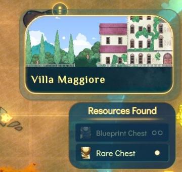
villa maggiore - rare chests and blueprints can be found
Spiritfarer: Farewell Edition
The user interface (UI) features a decorative label at the top indicating "Villa Maggiore." This label is presented in a stylistic font, adding to the overall a...
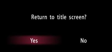
return to title screen
Yakuza 0
The user interface (UI) in the picture presents a straightforward confirmation dialog. Features and Functionality: 1. Question Prompt: The text...
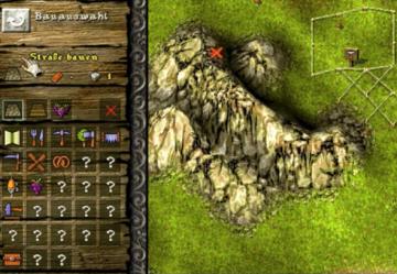
build a road
Knights and Merchants
Das Bild zeigt eine Benutzeroberfläche (UI) für ein Bau oder Strategiespiel. Die Funktionen sind klar kategorisiert und bieten eine intuitive Navigation. Link...
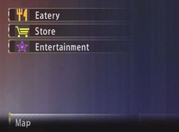
map key legend eatery store entertainment
Yakuza 0
The image displays a user interface (UI) menu with several labeled options, presented in a vertical list. Here's a breakdown of the elements: 1. Eatery: Th...
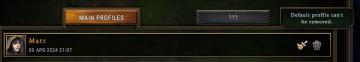
default profile can't be removed
Against the Storm
The user interface features a dark, textured background with contrasting text and icons, creating a visually striking appearance. 1. Main Profiles Button:...
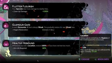
choose from the boons of aphrodite
Hades II Early Access
The user interface (UI) presents a series of labels and features organized in a clean layout. Each section provides information on specific gameplay mechanics o...
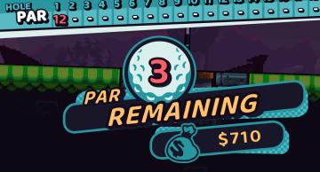
3 par remaining reward
Cursed to Golf
The user interface (UI) in the image consists of several key elements that contribute to gameplay functionality and visual clarity. 1. Hole and Par Display...
ゆうれい幽霊ミッション結果
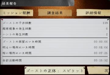
Phasmophobia
この画像は、ゲームの報告画面を示しており、ユーザーインターフェイス(UI)のラベルと機能が含まれています。 1. タイトル: 「結果報告」と大きく表示されており、...