main menu
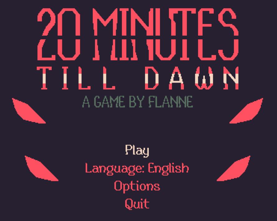
Description
The UI of "20 Minutes Till Dawn" features a bold and striking design that conveys a sense of urgency and intrigue.
Key Elements and Functions:
-
Game Title:
- Label: "20 MINUTES TILL DAWN"
- Function: Serves as the primary identifier of the game. The large, stylized font captures attention and sets the tone.
-
Subtitle:
- Label: "A GAME BY FLANNE"
- Function: Provides attribution, indicating the developer. This is smaller than the title but still prominent.
-
Play Button:
- Label: "Play"
- Function: Initiates the game. It is likely emphasized in a bright color, inviting players to start their gaming experience.
-
Language Selector:
- Label: "Language: English"
- Function: Offers players the option to select the game's language. This feature promotes accessibility.
-
Options Button:
- Label: "Options"
- Function: Opens settings for adjusting game preferences, such as audio and graphics. It suggests customization.
-
Quit Button:
- Label: "Quit"
- Function: Exits the game, providing a clear, accessible way for players to leave the menu or game.
Design Aspects:
- Color Scheme: Dark background with bright text and accents enhances readability and highlights menu options.
- Font Style: A mix of bold and less pronounced typographies creates visual hierarchy, guiding players’ focus.
- Graphical Elements: The presence of stylized graphics (e.g., red shapes on either side) adds a dynamic touch, contributing to the overall theme of the game.
Overall, the UI combines functional elements with an engaging aesthetic to create an inviting and coherent entry point for players.
Software
20 Minutes Till Dawn
Language
English
Created by
Sponsored
Similar images
quit to main menu? a save will be made for you

Grounded
The interface presents a confirmation dialogue with a clear and engaging design. The title "QUIT TO MAIN MENU?" stands out prominently at the top, indicating th...
main menu (save game, load game, settings, exit..)
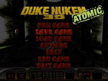
Duke Nukem 3D Atomic Edition
The user interface (UI) in the image features a bold, stylized title "DUKE NUKEM 3D" prominently displayed at the top, emphasizing the game’s identity. The word...
main menu: start new career, exit, extras

Mass Effect 1
The UI presents three main labels with distinct functions, each crafted for clarity and ease of navigation. 1. Start New Career: This primary option, highl...
Mages of Mystralia main menu
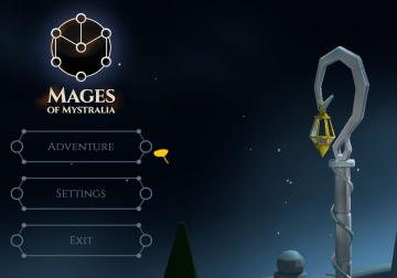
Mages of Mystralia
The user interface (UI) in the image presents a clean and visually appealing layout for the game "Mages of Mystralia." Labels and Features: 1. Game Tit...
main menu racegame
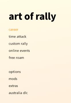
art of rally
The UI presents a clean, minimalist design with a soft gradient background that transitions from a pale yellow to offwhite, contributing to a calming aesthetic...
snakebird main menu start exit credits options
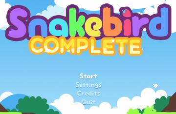
Snakebird
The UI in the image features a colorful and playful design, aligning with the game’s whimsical theme. The main title, "Snakebird COMPLETE," is prominently displ...
main menu: alternativer, credits, avslutt spillet
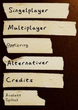
Phasmophobia
UI labels in the image consist of a series of torn paperlike strips, giving a rustic or informal feel to the design. The labels are written in a simple, sanss...
Maid of Sker main menu
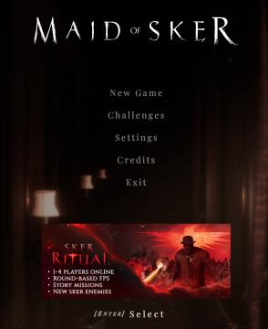
Maid of Sker
The user interface (UI) in the image showcases a dark, atmospheric design aligned with the horror theme of the game "Maid of Sker." The main menu features sever...
 M S
M S