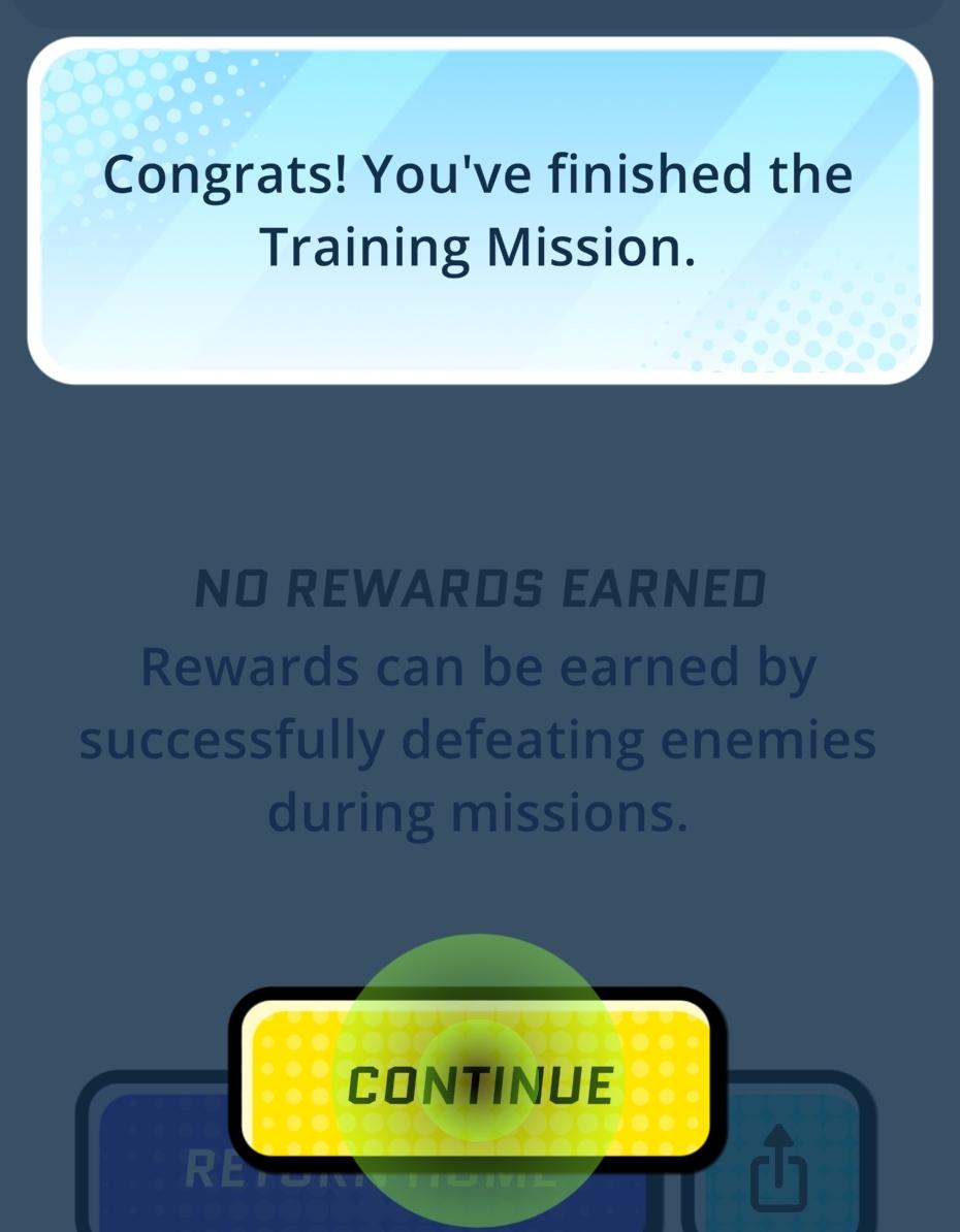
congrats! you completed the training mission
Description
The user interface (UI) in the picture features several key elements designed for user interaction and experience.
-
Message Box: At the top, there’s a message box congratulating the user for completing a training mission. This box uses a light gradient background, providing visual clarity and enhancing readability. The use of friendly language aims to encourage users.
-
Reward Status: Below the message, the text states "NO REWARDS EARNED," indicating that the user did not achieve rewards in this session. This section informs users about their performance, subtly prompting them to engage more in future missions to earn rewards.
-
Instructions: A follow-up message explains how rewards can be obtained, offering guidance on what actions to take next. This instructional text is presented in a slightly smaller font for clear hierarchy while remaining easy to read.
-
Action Buttons:
- Continue Button: A prominent yellow button labeled "CONTINUE" directs users to proceed. The bright color and bold font draw attention, indicating it is the primary action to take after reading the message. The button is rounded, lending a friendly and approachable aesthetic.
- Return Home Button: Located to the left of the "CONTINUE" button, this button enables users to return to the main menu or home screen. Its design is more subdued compared to the primary button, indicating a secondary action.
-
Background and Layout: The background employs a gradient color scheme and dot patterns, creating a modern and dynamic appearance that adds visual interest without overwhelming the user.
Overall, this UI design effectively communicates mission results and guides user actions while maintaining an inviting and engaging atmosphere.
Software
Run Legends
Language
English
Created by
 matej94v
Sponsored
Similar images
bonus odměna uhodni ducha guess the ghost type reward
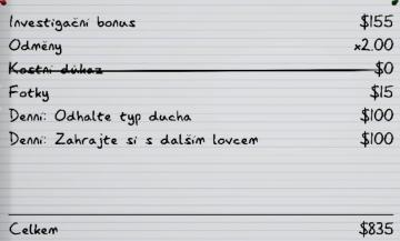
Phasmophobia
Tento uživatelský rozhraní zobrazuje seznam položek s jejich hodnotami a funkčními odkazy, což naznačuje, že se jedná o systém sledování nebo inventáře spojenéh...
gameplay settings 3
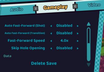
Cursed to Golf
The UI in the picture features a settings menu divided into several labeled sections designed for gameplay customization. 1. Sections: Audio: Acc...
replay tutorial missions
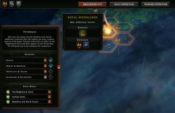
Against the Storm
The user interface (UI) features various labeled sections and elements designed to guide player interactions. 1. Main Areas: Smoldering City: Ser...
inspect the gate
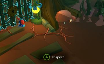
Mages of Mystralia
In the image, the user interface (UI) features a prominent label "Inspect" displayed in a circular green button, indicating an interaction prompt when the playe...
reticle options
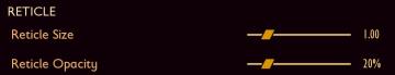
Grounded
The UI features a section labeled "RETICLE," which appears prominently at the top. Within this section, two adjustable sliders are provided for user interaction...
equipped charms and available notches
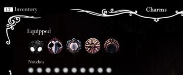
Hollow Knight
The UI features include the following labels and elements: LT Inventory: Located in the top left, likely indicating the button to access the inventory sc...
options menu: change user settings, select mods
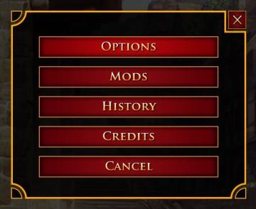
Age of Empires 2 Definitive Edition
The user interface presents a vertical list of labels within a rectangular box with rounded corners. Each label serves a specific function: 1. OPTIONS: Thi...
ゆうれい幽霊ミッション結果
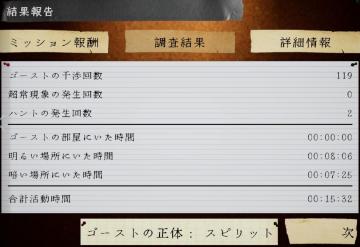
Phasmophobia
この画像は、ゲームの報告画面を示しており、ユーザーインターフェイス(UI)のラベルと機能が含まれています。 1. タイトル: 「結果報告」と大きく表示されており、...