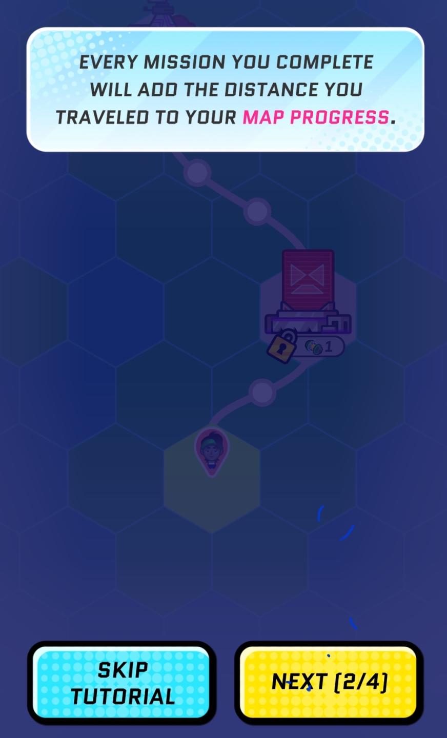
every mission you complete will add the distance you travelled
Description
The UI in the picture includes several key components designed for guidance and navigation within a game or app:
-
Text Box: At the top, a prominent text box displays a message indicating that completing missions contributes to "map progress." The text is styled with a bold, modern font and includes a highlighted word "MAP PROGRESS" to draw attention.
-
Map Visualization: Below the text, a hexagonal grid represents the map. Each hexagon appears to have different icons or indicators that may suggest various mission types or locations. The color gradient and design provide a dynamic feel.
-
Locked Icon: Near the center, there’s a padlock symbol indicating that certain paths or features may be locked until prerequisites are met, encouraging progression.
-
Currency Indicator: An icon showing a currency or point system appears next to the locked icon. This suggests the player can earn or spend resources to unlock features or advance.
-
Character Icon: Lower in the layout, there’s a character icon denoting the player’s position or avatar on the map, providing a personal touch to the navigation.
-
Navigation Buttons: Two buttons are located at the bottom:
- Skip Tutorial: This button, in a bright blue with rounded edges, offers an option to bypass the tutorial. It features a clear, readable font that emphasizes ease of use.
- Next [2/4]: The yellow button indicates progression through tutorial steps, showing that this is the second part out of four. This button also has a modern design, making it visually distinct.
Overall, the UI is functionally oriented towards guiding the user through a tutorial with engaging graphics, while the form is colorful and modern, enhancing user experience through intuitive design.
Software
Run Legends
Language
English
Created by
 matej94v
Sponsored
Similar images
Well done! Level complete

Snakebird
The image features a prominent UI label that reads "Well done!" rendered in a playful, bold font. The color palette consists of vibrant yellows and oranges, con...
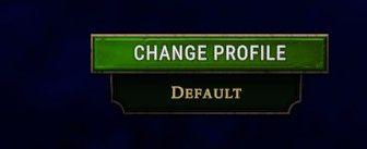
change profile, default profile
Against the Storm
The UI features a green button labeled "CHANGE PROFILE," indicating its primary function is to allow users to switch between different user profiles. The button...
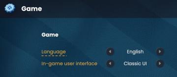
game settings
Bulanci
The user interface (UI) displayed in the picture primarily focuses on game settings, specifically for language selection and user interface style. Here’s a brea...
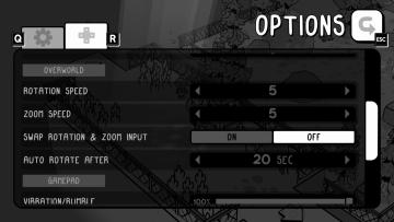
overworld controls settings
TOEM
The user interface (UI) in the image features an options menu with several labeled settings for gameplay customization. 1. Title Label: At the top, "OPTIO...
objective: answer the phone
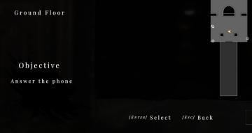
Maid of Sker
The user interface (UI) features a dark, minimalistic design that emphasizes functionality with a somber aesthetic. Labels and Features: 1. Ground Floo...
in-game main menu, load, save, restart
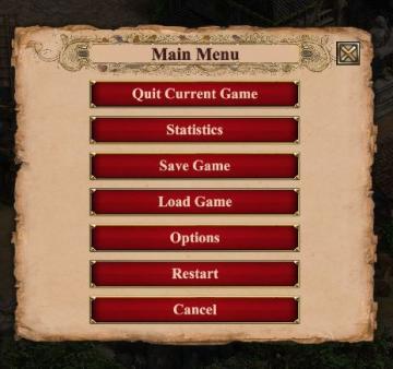
Age of Empires 2 Definitive Edition
The interface presents a Main Menu with a classic, vintage aesthetic, highlighted by ornamental borders and a textured background. The menu features a centraliz...
nudge camera
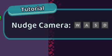
Cursed to Golf
The UI features a tutorial overlay, designed to instruct the player on how to use camera controls. 1. Label: The word "Tutorial" is prominently displayed...
"read to me" function settings and subtitles settings
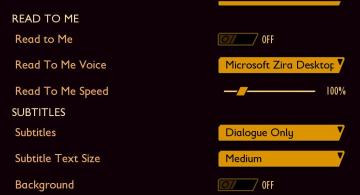
Grounded
The user interface presents a clear layout with labels categorized under "READ TO ME" and "SUBTITLES." 1. Read to Me: This section allows users to enable a...