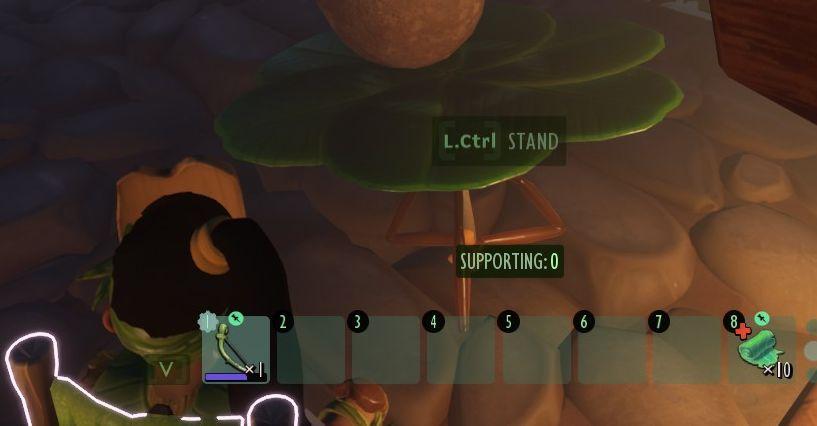
press left control to stand up from chair
Description
The user interface (UI) features several key components that enhance functionality:
-
Action Prompt: At the top center, "L.Ctrl STAND" indicates an action that can be performed, likely relating to standing or interacting with the environment. This label is easily readable and suggests the player's current options.
-
Support Status: Below the action prompt, "SUPPORTING: 0" shows the current status or resource related to support, possibly indicating the structural integrity or assistance available in the game.
-
Inventory Bar: A horizontal row of slots at the bottom serves as an inventory display. Each numbered slot (0-7) can hold items or tools, with slot 0 featuring a visible item, likely indicating active equipment.
-
Health or Resources Indicator: On the far right, an icon with a number (10) represents a specific resource, possibly health or a replenishable item. The design contributes to quick recognition during gameplay.
-
Character Status: The character, dressed in earthy tones, has a visible health bar just above the inventory, depicted in a minimalist style, enhancing focus on survival elements.
The combination of these features creates an intuitive experience, allowing players to quickly understand their current status and available actions within the game environment. The aesthetic choice of colors is functional, improving clarity amidst the immersive graphics.
Software
Grounded
Language
English
Created by
 M S
M S
Sponsored
Similar images
press left for boon info screen (your active boons)

Hades II Early Access
The UI label displayed is designed to provide user guidance and enhance interaction within a game or application. The phrase "Press for Boon Info" conveys a cle...
přehrát nejnovější díl

iVysílání
Na obrázku je vidět tlačítko s výrazným červeným pozadím, které má funkci přehrávání. Text "Přehrát nejnovější díl" jasně naznačuje, že jeho účelem je zahájit p...
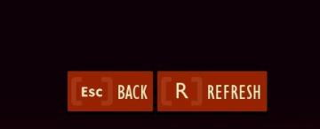
go back or refresh list
Grounded
The user interface features three distinct buttons with specific functions. 1. Esc: This button serves as a shortcut for escaping or closing the current v...
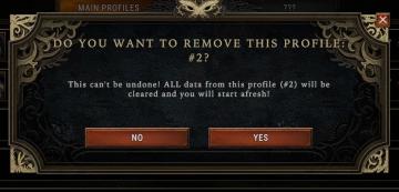
Do you want to remove this profile?
Against the Storm
The UI features a modal window designed to confirm the deletion of a user profile. Title Bar: At the top, it prominently displays the prompt, "DO YOU WA...
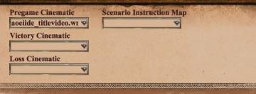
scenario editor: choose cinematics
Age of Empires 2 Definitive Edition
The UI shown features a series of labeled input fields and dropdown menus related to cinematics and scenario instructions. 1. Pregame Cinematic: This fiel...
are you sure you want to exit?
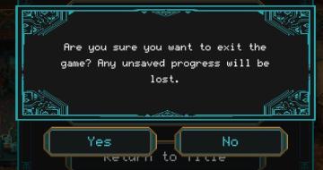
Children of Morta
Confirmation Dialog: Asks if the user wants to exit the game, warning about unsaved progress. "Yes" Button: Confirms the exit action. "No" Button: Cancels...
ability description tutorial
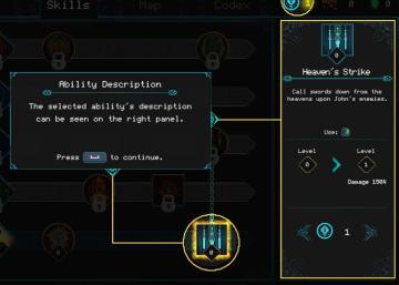
Children of Morta
Skills, Map, Codex: Main navigation options. Ability Description: Popup indicating the currently selected ability's details. Right Panel: Disp...
キャッシュを削除しますか?
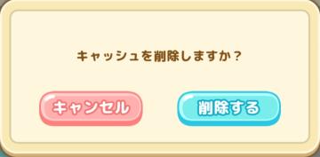
Sumikko Farm
この画面は、キャッシュを削除するかどうかを確認するダイアログボックスです。 機能 メッセージ: 「キャッシュを削除しますか?」と表示されており、ユーザー...