quick battle, 2 sappers, attack, support, defense
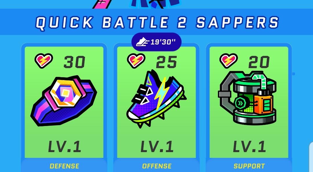
Description
The UI in the picture features a colorful and vibrant design, utilizing a playful aesthetic that suits a gaming environment.
-
Top Section:
- Title: "QUICK BATTLE 2 SAPPERS" is prominently displayed at the top, indicating the game's mode or event.
- Timer: A digital timer (19'30'') is shown, likely counting down or keeping track of the match duration, emphasizing urgency and gameplay timing.
-
Item Cards:
- There are three distinct item cards organized horizontally, each representing different categories:
- Defense (Left Card):
- Visual: Icon shows a shield-like shape, contributing to the sense of protection.
- Health Indicator: Displays "30" with an accompanying heart icon, denoting the amount of defense available.
- Level Label: Marked as "LV.1," indicating its current level.
- Offense (Middle Card):
- Visual: Depicts a pair of sneakers, symbolizing speed and attack.
- Health Indicator: Shows "25" with a heart icon, representing offensive capability.
- Level Label: Also marked "LV.1."
- Support (Right Card):
- Visual: Features a device or gadget, implying it offers assistance in gameplay.
- Health Indicator: Displays "20" with a heart icon.
- Level Label: Clearly marked as "LV.1."
- There are three distinct item cards organized horizontally, each representing different categories:
-
Overall Design:
- The background uses a bright blue color, which leverages contrasting green and black for the item cards, creating visual interest and easy differentiation.
- Font choices are bold and modern, enhancing readability and engagement.
This layout effectively communicates gameplay mechanics, allowing players to quickly assess their options and strategies in a visually appealing format.
Software
Run Legends
Language
English
Created by
 matej94v
Sponsored
Similar images
set up a quickspell button, then cast with S
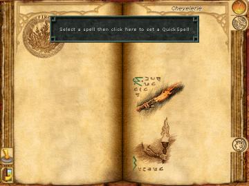
Might and Magic 8: Day of the Destroyer
The UI in the image presents a spell selection menu from a fantasythemed application, likely a game. Here’s a breakdown of its key features: 1. Main Display...
new loot green soul beads x5
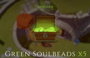
Mages of Mystralia
The user interface (UI) in the picture showcases a notification for newly acquired game loot. 1. Title: The label "NEW LOOT" is prominently displayed at t...
you got the Miho Tono Type A card
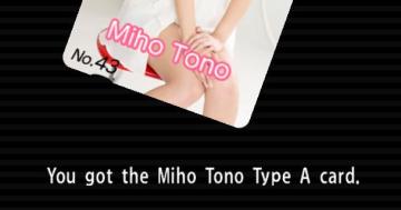
Yakuza 0
The user interface (UI) in the image features a card display along with a textual notification. UI Labels and Features: 1. Card Display: Image...
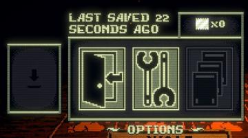
last saved: 22 seconds ago
Inscryption
The user interface features a dark, pixelated design, emphasizing a retro aesthetic. 1. Last Saved Indicator: Positioned at the top, it shows the time sin...
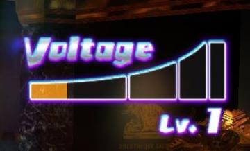
dancing minigame voltage combo
Yakuza 0
The UI features a prominently displayed "Voltage" label, rendered in a bold, futuristic font that emphasizes its importance. The label is stylized with a glowin...
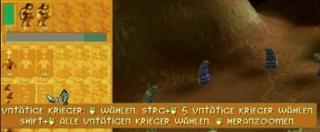
untätige Krieger wählen
Populous: The Beginning
Das Bild zeigt eine Benutzeroberfläche (UI) eines strategischen Spiels. Auf der linken Seite sind verschiedene Symbole zu sehen, die wahrscheinlich für die Ausw...
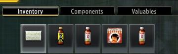
inventory components valuables
Yakuza 0
The UI in the picture features three main tabs: Inventory, Components, and Valuables. Each label is clearly defined, allowing users to easily naviga...
autosave feature
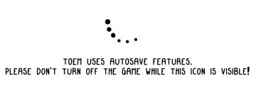
TOEM
The UI in the image features two main components: an animated icon and a message regarding autosave functionality. 1. Animated Icon: The icon consists of s...