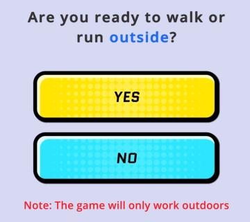
ready to go? learn how to play?
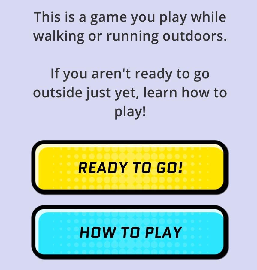
Description
The interface in the picture features a simple and user-friendly layout designed for a mobile game aimed at outdoor activities like walking or running.
UI Labels and Features:
-
Title and Description:
- The upper section contains a clear title and brief description explaining the game's purpose. The text is centered and conveys essential information, welcoming the user while explaining the context of the game.
-
Main Buttons:
- READY TO GO!:
- A vibrant yellow button with bold black text. Its color and size make it stand out, indicating it is the primary action for users who are ready to start playing.
- HOW TO PLAY:
- A blue button, slightly less prominent than the yellow one but still clearly defined. This button allows users to access instructions if they are not prepared to start the game immediately.
- READY TO GO!:
-
Color and Style:
- The buttons feature a rounded design with contrasting colors that enhance accessibility and engagement. The bright colors help draw attention, encouraging interaction.
-
Background:
- A soft, light colored background (likely pale blue) creates a soothing environment, ensuring that the text and buttons remain the focal points.
Overall, the design choices enhance clarity and guide users effectively toward their next actions, whether they are ready to play or looking for instructions.
Software
Run Legends
Language
English
Created by
 matej94v
Sponsored
Similar images
are you ready to run outside? the game will only work outside
Run Legends
In the user interface presented, the primary function is to prompt the user to indicate their readiness to engage in an outdoor walking or running activity. ...
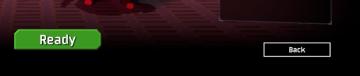
ready to start game or go back
Risk of Rain 2
The UI features two primary buttons: "Ready" and "Back." The "Ready" button is prominently displayed in a vibrant green, suggesting its importance in initiati...
ready not ready ready up, game lobby
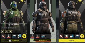
Helldivers 2
The user interface (UI) in the image presents a character selection screen, likely for a squadbased game. Here’s a breakdown of the labels and features: 1. ...
alert: orders ready to complete
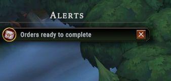
Against the Storm
The interface features a notification panel titled "Alerts," prominently displayed at the top. This label indicates its function as a system for tracking import...
get tools from the wall before starting the game
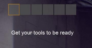
Panicore
The user interface (UI) in the image features a series of rectangular indicators, likely representing tool slots or inventory spaces. The first slot is highligh...
skip intro - yes or no?
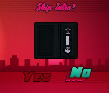
Hotline Miami 2
The interface features a retrostyle design with a vibrant red background, complemented by a city silhouette at the bottom. At the top, the text "Skip Intro?" i...
gemstone
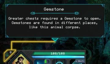
Children of Morta
Title: "Gemstone" – Indicates the item in focus. Description: Explains that a Gemstone is necessary to open greater chests and provides context on w...
optional features dialog, enable notifications, don't ask this again
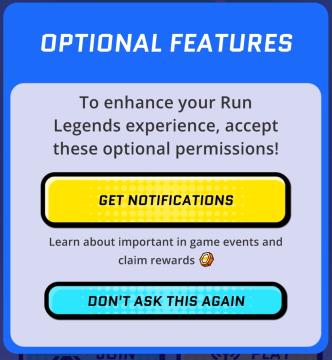
Run Legends
The user interface (UI) in the picture features a notification prompt designed for the "Run Legends" game. It is set against a predominantly blue background, en...