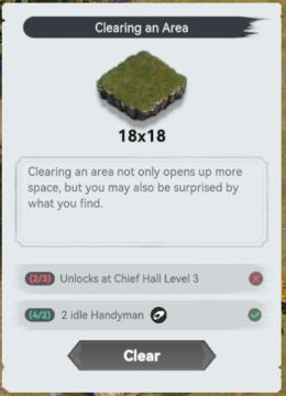
clearing an area requirements
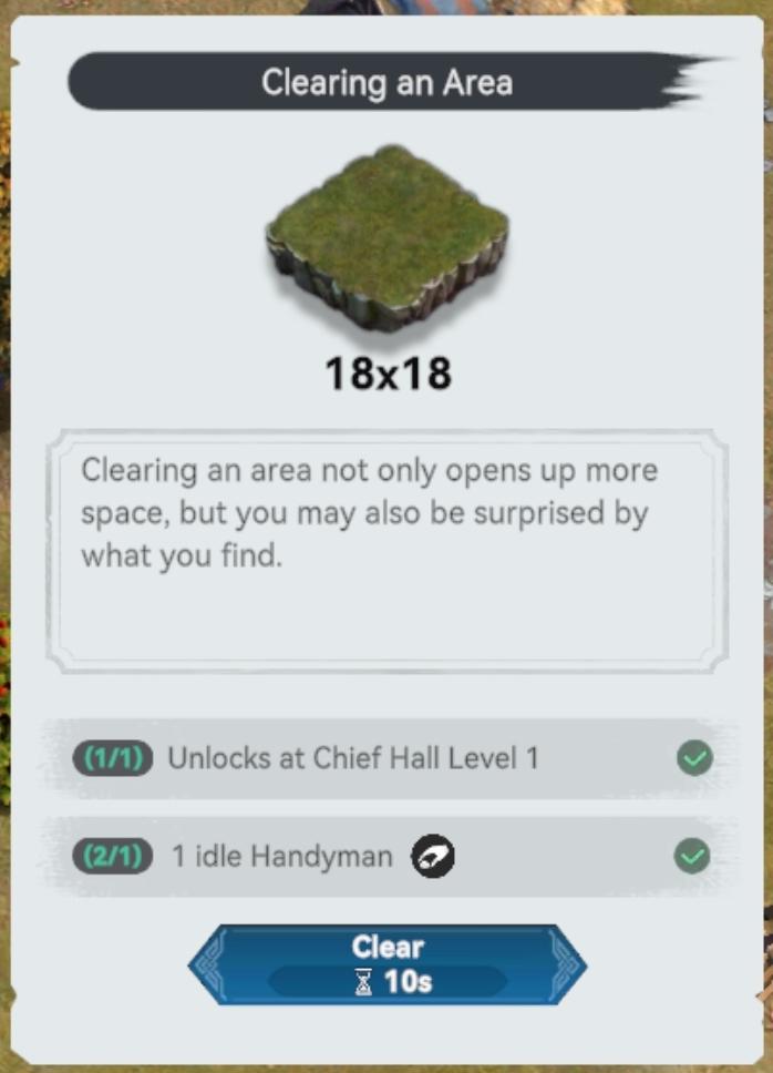
Description
The UI features and labels in the provided image are designed to guide the user through the process of clearing an area in the game. Here's a breakdown of the key components:
-
Title Label:
- "Clearing an Area" - This indicates the primary action the user is about to undertake.
-
Area Representation:
- A graphical representation of the area to be cleared is shown as a square block, labeled "18x18." This visual helps users understand the size of the area they will be clearing.
-
Description:
- A brief text block explains the benefits of clearing the area, emphasizing not just the creation of space but also the potential surprises that may be discovered.
-
Requirements Section:
- This section presents the prerequisites:
- "(1/1) Unlocks at Chief Hall Level 1" - Indicates the need to reach a certain level to unlock this action.
- "(2/1) 1 idle Handyman" - Indicates the necessity for an available handyman to execute the action, with a visual confirmation (checkmark) indicating that it is met.
- This section presents the prerequisites:
-
Action Button:
- A prominent "Clear" button allows users to initiate the clearing process, visually highlighted in blue to draw attention.
- Next to it, a timer ("10s") indicates the duration for clearing the area, providing users with an estimate of the time commitment involved.
Overall, the form of the UI is clean and intuitive, utilizing icons, checkmarks, and descriptive text to ensure users can easily understand the function and requirements for clearing an area effectively.
Software
Viking Rise
Language
English
Created by
 matej94v
Sponsored
Similar images
Clearing an area requirements
Viking Rise
The UI in the image is designed for a game interface focused on clearing land. Here’s a breakdown of its features and functions: 1. Title Bar: The header l...
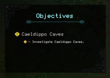
objectives
Children of Morta
Objectives: Title indicating the section for quests or tasks. Caeldippo Caves: Main objective name, highlight for focus. Investigate Caeldippo C...
starting the generator
The Last Stand: Aftermath
In the UI of the image, several key labels and features are present, primarily designed to facilitate player interaction within the game environment. 1. Powe...
baking bread from wheat, increase know how
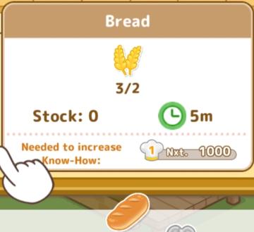
Sumikko Farm
The UI presents a clear and functional layout regarding the bread production process. Here's a breakdown of the labels and features: 1. Title ("Bread"): Pr...
cursed to golf course

Cursed to Golf
The user interface (UI) in the picture features several key elements that enhance user interaction and navigation: 1. Main Title "CURSED TO GOLF": This p...
complete deeds to get rewards
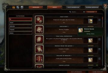
Against the Storm
The user interface (UI) features a structured layout designed to facilitate navigation and task completion within the game. The main options are labeled as "UPG...
Objective: find and activate the Teleporter
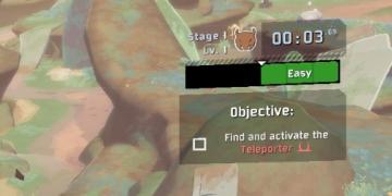
Risk of Rain 2
The user interface presents several distinct features and labels that guide the player through the game. 1. Stage Indicator: At the top left, there is a l...
map selection, connect the city
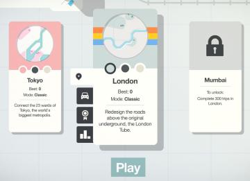
Mini Motorways
The user interface (UI) features three city options: Tokyo, London, and Mumbai, each presented in a card format. 1. Tokyo Card: Title: "Tokyo" is...