replay tutorial missions
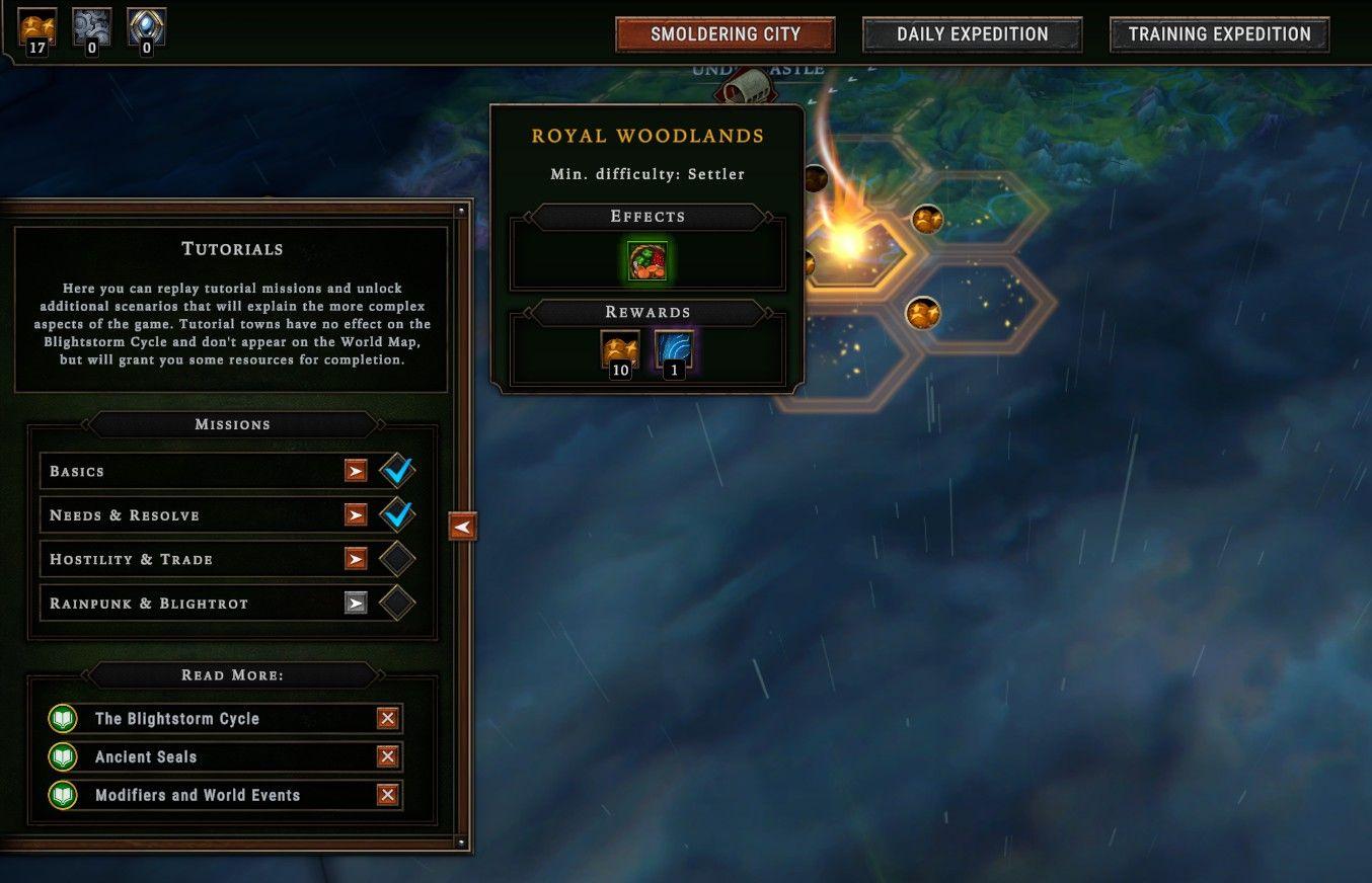
Description
The user interface (UI) features various labeled sections and elements designed to guide player interactions.
-
Main Areas:
- Smoldering City: Serves as a central hub, likely indicating the game's primary location or theme.
- Daily Expedition and Training Expedition: Function buttons for engaging in specific gameplay modes, suggesting a focus on daily challenges and skill improvement.
-
Tutorials Section:
- Tutorials Heading: Introduces the purpose of this section, which is to facilitate replaying tutorial missions and unlocking scenarios.
- Mission List: Features various missions with checkboxes for progress tracking. This includes:
- Basics: Completed mission indicated by a checkmark.
- Needs & Resolve: Completed.
- Hostility & Trade: Incomplete.
- Rainpunk & Blightrot: Incomplete, denoted by an empty checkbox.
-
Details Panel for Royal Woodlands:
- On the Right Side: Highlights a specific mission, "Royal Woodlands," with the minimum difficulty level stated as "Settler."
- Effects and Rewards: Clearly outlines mission effects and reward items, enhancing the player's understanding of incentives, such as resources and bonuses.
-
Read More Section:
- Provides additional resources or links for deeper gameplay mechanics, with titles like "The Blightstorm Cycle," "Ancient Seals," and "Modifiers and World Events," encouraging further exploration.
The form is functional, with a clear dark-themed layout that enhances readability and player engagement. The structure is intuitive, promoting an organized flow of information and ease of navigation.
Software
Against the Storm
Language
English
Created by
 M S
M S
Sponsored
Similar images
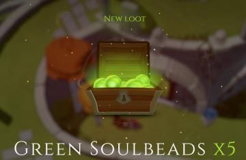
new loot green soul beads x5
Mages of Mystralia
The user interface (UI) in the picture showcases a notification for newly acquired game loot. 1. Title: The label "NEW LOOT" is prominently displayed at t...
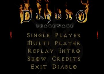
diablo main menu
Diablo I
The user interface (UI) in the image features the title "DIABLO SHAREWARE" prominently at the top, styled with a dramatic and gothic font, which reflects the ga...
全ての記事 未読 all articles unread articles

Inoreader
この画像には、主に次のUIラベルと機能があります。 1. メニューボタン(三本線アイコン): 機能:メニューを開くためのボタンで、他のオプションやページにア...
you can relisten to phonograph

Maid of Sker
The UI in the image features a minimalistic design, dominated by a black background which creates a stark contrast with the text and icons. 1. Alert Icon:...
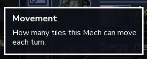
movement explained
Into the Breach
The UI label in the picture is titled "Movement," which serves a clear functional purpose by providing information about the movement range of a Mech in the gam...
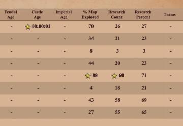
technology statistics: age progression, researched techs, map % explored
Age of Empires 2 Definitive Edition
The table presents a structured format for displaying gamerelated metrics, likely from a strategy or simulation game. Key features include: 1. Age Metrics...
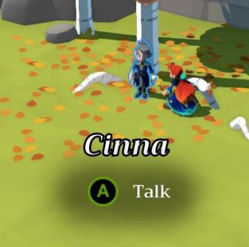
talk to Cinna
Mages of Mystralia
In the user interface (UI) presented in the picture, the primary feature is a dialogue prompt for an interaction with a character named "Cinna." Key Eleme...
cookies legal terms of use podmínky
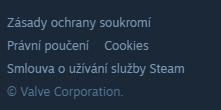
Steam
Na obrázku se nachází uživatelské rozhraní s několika základními odkazy. 1. Zásady ochrany soukromí Tento odkaz zajišťuje přístup k informacím o ochraně...