deliver orders menu, locked orders
Description
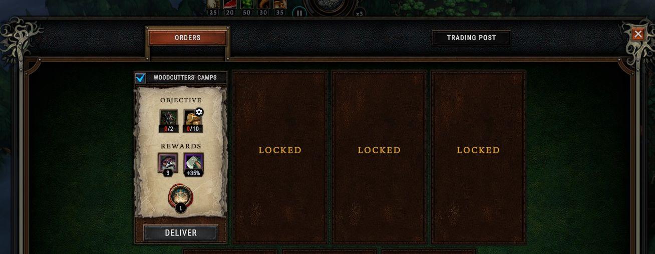
The user interface displays a panel titled "ORDERS" on the left, housing key information about a mission labeled "WOODCUTTERS' CAMPS."
Features and Labels:
-
Objective Section:
- Displays current task progress with icons indicating requirements (e.g., 0 out of 2 and 0 out of 10). These visual elements help users quickly assess what is needed to complete the objective.
-
Rewards Section:
- Lists potential rewards in the form of icons and numerical values, such as a number (3) and a percentage boost (+35%). This motivates users by illustrating benefits gained from successful task completion.
-
Deliver Button:
- A prominent button at the bottom labeled "DELIVER" is used to finalize the order or complete the current objectives. Its design likely stands out to draw user attention and facilitate action.
-
Locked Panels:
- Three panels marked "LOCKED" indicate additional orders or missions that are currently unavailable. This visual distinction suggests future unlockable content, creating anticipation for the user.
-
Trading Post Button:
- Located in the upper right corner, this button offers access to a different feature or section, potentially related to trading or inventory management.
The layout is structured to guide the user’s focus toward completing tasks, understanding objectives, and recognizing rewards, while maintaining an appealing and functional aesthetic.
Software
Against the Storm
Language
English
Created by
 M S
M S
Sponsored
Similar images
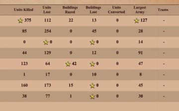
match statistics: k/d ratio, buildings razed, units converted, largest army
Age of Empires 2 Definitive Edition
The image presents a table summarizing various game statistics, likely from a strategy or war simulation game. Here’s a breakdown of the UI labels and features:...
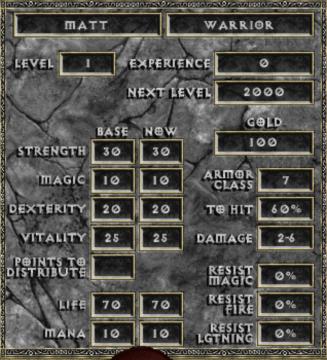
new game warrior stats
Diablo I
The user interface (UI) in the picture comprises several key elements focused on character statistics for a roleplaying game (RPG), presenting both functionali...
全ての記事 未読 all articles unread articles
Inoreader
この画像には、主に次のUIラベルと機能があります。 1. メニューボタン(三本線アイコン): 機能:メニューを開くためのボタンで、他のオプションやページにア...
start adventure
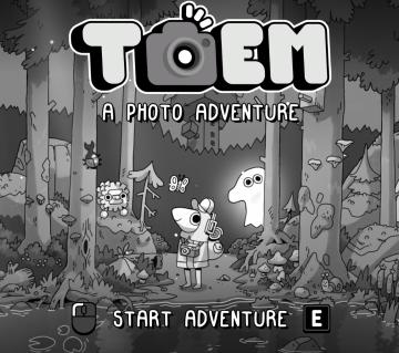
TOEM
The user interface (UI) in the image features a whimsical and playful aesthetic, characterized by a handdrawn art style with a monochromatic color palette. Her...
inventory, keys
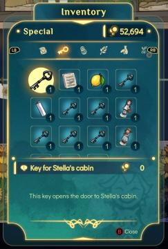
Spiritfarer: Farewell Edition
The user interface (UI) in the picture showcases an inventory screen with a focus on special items. Top Header: The label "Inventory" is prominently dis...
disarm demolition charges
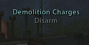
Mass Effect 1
The UI displays the label "Demolition Charges," indicating a feature related to handling explosives or similar devices. It serves as a title to inform the user...
diplomacy menu
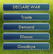
Civilization V
The image features a user interface (UI) with several interactive buttons. Each button represents a different function: 1. DECLARE WAR: This prominent top...
Phasmophobia lastebil
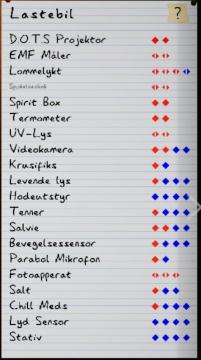
Phasmophobia
Bilde er en brukergrensesnitt med en liste av utstyr, sannsynligvis relatert til ghost hunting eller paranormal forskning. Hver rad representerer en enhet med n...