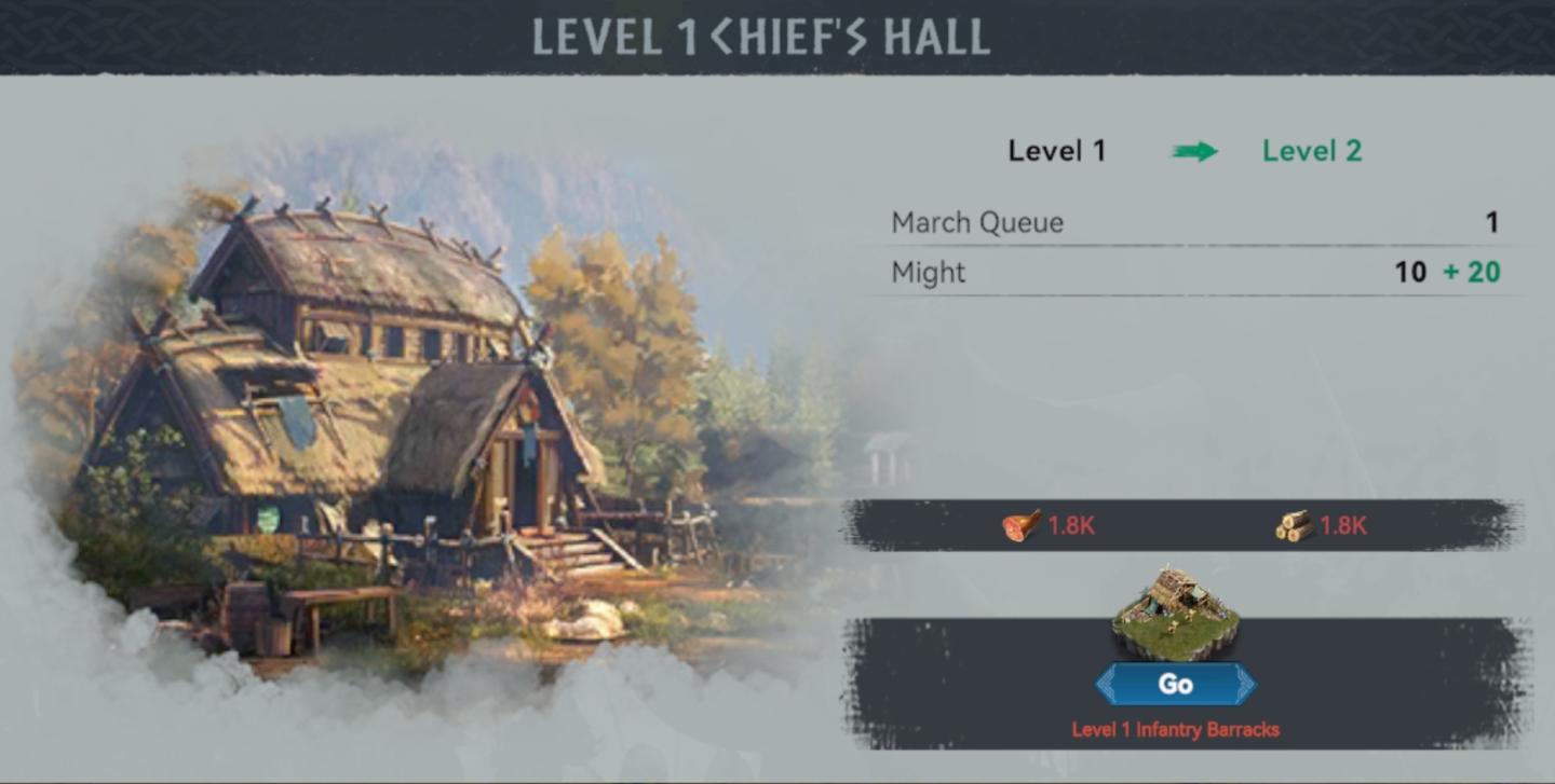
upgrade chief's hall, march queue and build might
Description
The user interface (UI) in the image showcases key features and labels designed for managing the "Chief's Hall" in a strategy game.
-
Header Section:
- Level Indicator: Displays "LEVEL 1 CHIEF'S HALL," signifying the current upgrade tier and the structure being interacted with.
- Next Level Arrow: An arrow points towards "Level 2," indicating potential for upgrade and progression.
-
Resource Display:
- March Queue: Shows "March Queue" with a value of "1," indicating the number of ongoing troop movements or actions.
- Might: Lists "Might" with a value of "10 + 20," which likely represents a power or strength metric. The description could suggest an increase or bonus.
-
Resource Costs:
- Two icons represent resources needed for an action or upgrade:
- A meat icon labeled "1.8K," indicating a need for that specific resource amount.
- A wood icon also labeled "1.8K," implying another resource requirement.
- Two icons represent resources needed for an action or upgrade:
-
Action Button:
- Go Button: Prominently displayed, this button is labeled "Go" and is likely intended to initiate an action, such as upgrading or moving to the specified location, which refers to the "Level 1 Infantry Barracks."
-
Background Visual:
- The background features a detailed illustration of the Chief's Hall, adding aesthetic appeal and context to the UI.
Overall, the UI effectively balances functional elements and visual components, presenting the information clearly while maintaining a thematic design.
Software
Viking Rise
Language
English
Created by
 matej94v
Sponsored
Similar images
ammunition shop item description ammo cartridge contains
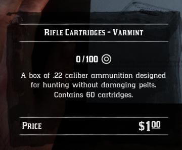
Red Dead Redemption 2
The UI in the image displays information about "Rifle Cartridges Varmint." Here are the key features and labels: 1. Title: The top label prominently feat...
to shoot arrows
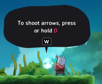
Islets
The UI in the picture features a speech bubble that provides instructions to the player. The main function is to guide the player on how to shoot arrows in the...
sound settings, mute in background
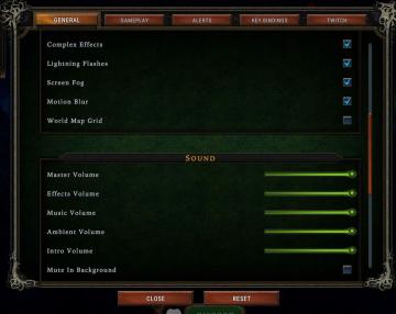
Against the Storm
The interface features a settings menu divided into various sections to manage game effects and sound. General Section Labels: Lists options such as...
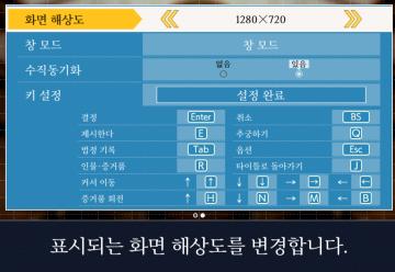
video and gameplay, controls menu
Phoenix Wright: Ace Attorney Trilogy
화면 해상도 설정 UI는 여러 기능을 포함하는 간단하고 직관적인 레이아웃을 가지고 있습니다. 1. 창 모드: "없음"과 "있음"의 옵션이 제공되어, 사용자가 창 모드를...
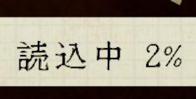
読み込み中 読込中
Phasmophobia
この画像には、UIのラベルとして「読込中」と「2%」が表示されています。 読込中: このラベルは、データやコンテンツが現在読み込まれていることを示します。ユーザ...
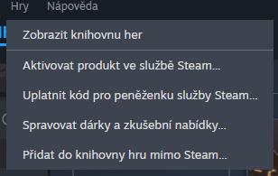
library, add product, activate, use code
Steam
Na obrázku vidíme uživatelské rozhraní, konkrétně část menu, které se týká správy her a produktů v platformě Steam. Popis funkcí: 1. Zobrazit knihovnu...
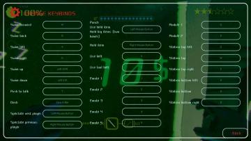
keybinds, how to control
Murky Divers
The image depicts a user interface (UI) for configuring keybindings in a game, likely designed for swimming or underwater exploration. Key Features: 1. ...
view hero tips
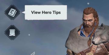
Viking Rise
In the picture, the user interface features include a series of icons and a prominent label for functionality. 1. Icons: On the left side, there are two d...