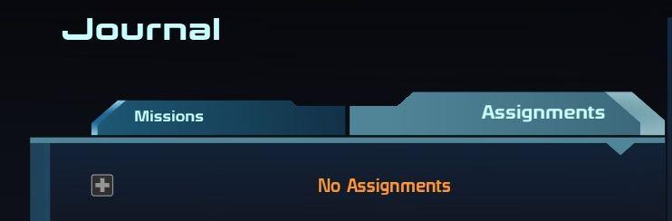
journal: no assignments
Description
The UI presents a clean and organized layout designed for easy navigation. The top section features the label “Journal,” indicating the current context or section within the application.
Beneath this, two tabs, labeled “Missions” and “Assignments,” allow users to switch between these two categories. The "Missions" tab is highlighted, suggesting active selection, while "Assignments" is visible but unselected. This tabbed design promotes efficient access to different sets of information.
In the center area, a prompt reading “No Assignments” appears in orange text, indicating that there are currently no assignments available under the selected tab. This feature effectively communicates the current state to the user while maintaining a visually appealing contrast against a darker background.
A plus sign icon, likely representing an option to add new assignments, is located near the “Missions” tab, enhancing the functionality by allowing users to initiate actions related to missions. The use of colors and shapes creates a user-friendly interface that balances aesthetic appeal with practical usability.
Software
Mass Effect 1
Language
English
Created by
 M S
M S
Sponsored
Similar images
journal: sort entries by name, newest, oldest
Mass Effect 1
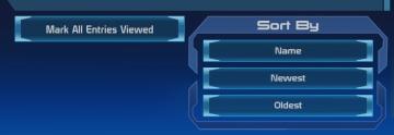
The user interface features two main sections with distinct functionalities. On the left side, the button labeled "Mark All Entries Viewed" serves a straightf...
Configuración de la cámara
Animal Crossing: New Horizons
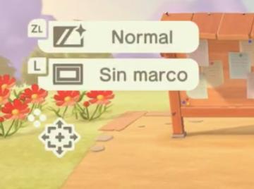
La interfaz muestra etiquetas con funciones específicas. En la parte superior, se encuentra un ícono que indica el modo "Normal", accesible a través del botón Z...
alliance patrol report, ok button
Mass Effect 1
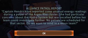
The UI features a dialogue box titled "ALLIANCE PATROL REPORT," indicating its purpose of conveying important information. The text within the box describes a s...
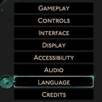
hades settings categories
Hades II Early Access
The image displays a vertical menu with various options related to game settings. Each label represents a specific category that users can select to adjust thei...
now travelling to Haven

Mages of Mystralia
The image features a clear and artistic user interface that conveys a feeling of journey and exploration. UI Labels: 1. Title: "TRAVELLING TO HAVEN" i...
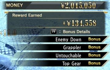
brawl reward untouchable
Yakuza 0
The user interface (UI) in the image primarily focuses on displaying financial rewards and bonus information, typical of a video game or scoring system. 1. M...
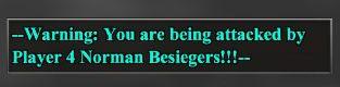
warning - you are being attacked by another player
Age of Empires 2 Definitive Edition
The UI features a warning message designed to alert players about an ongoing attack. The text is prominently displayed in a distinctive turquoise color, contras...
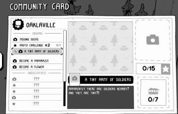
a tiny army of soldiers
TOEM
The "Community Card" UI features a clean, minimalist design primarily in black and white, with playful graphic elements. Main Sections and Features: 1. ...