photo mode main menu (hide ui, take photo, camera settings)
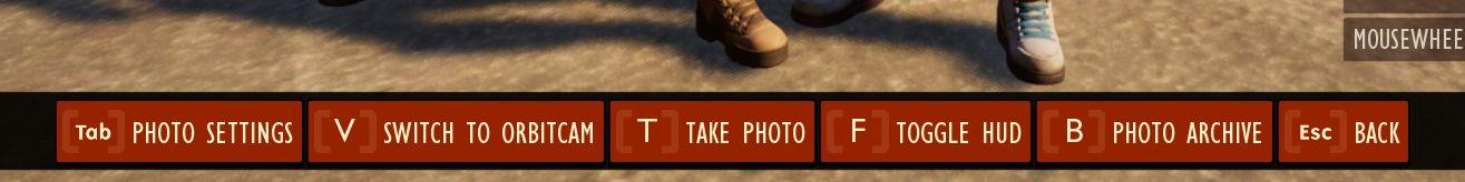
Description
The UI features several interactive labels, each associated with a specific function, displayed in a horizontal layout.
-
Tab - Photo Settings: This option likely opens a menu for adjusting various settings related to photography.
-
V - Switch to Orbitcam: Selecting this allows users to change camera perspectives, enhancing the ability to frame shots.
-
T - Take Photo: A straightforward function to capture images, emphasizing its primary role in photography.
-
F - Toggle HUD: This button may hide or show the heads-up display, providing users with a clearer view when capturing images.
-
B - Photo Archive: This option opens a gallery or storage area for previously captured images, facilitating easy access to past photos.
-
Esc - Back: A common function for returning to the previous menu or exiting the current mode.
The visual style of the buttons features bold labels against a muted background, contributing to clarity and ease of use. Each label is designed to be easily readable, enhancing user experience.
Software
Grounded
Language
English
Created by
 M S
M S
Sponsored
Similar images
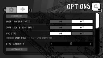
photo mode controls settings
TOEM
The UI in the image showcases an options menu for a game, specifically designed for photomode settings. Here’s a breakdown of its features and their functions:...
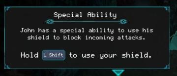
special ability tutorial
Children of Morta
Title: "Special Ability" indicates the purpose is to inform about a unique skill. Description: Explains John’s ability to block attacks with a shiel...
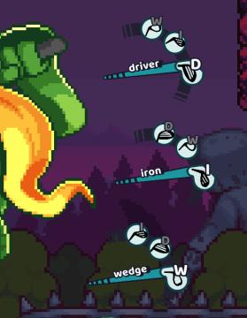
driver, iron, wedge
Cursed to Golf
The UI in the image displays a selection of golf club types, designed for a gaming interface. Each club type is represented by a label and an icon, giving the u...
parry, counterattack
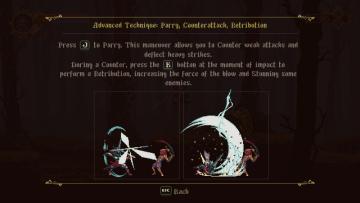
Blasphemous
The user interface features a dark, atmospheric background that enhances the thematic feel of the game. At the top, a health bar or status indicator is present,...
supporting character Terry can give a little cheer
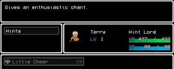
LISA: The Painful - Definitive Edition
The user interface (UI) in the picture is designed with a retro aesthetic, reminiscent of classic roleplaying games. Main Features: 1. Text Area:...
you got clogs
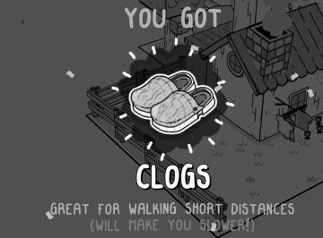
TOEM
match statistics: military, economy, technology, society score
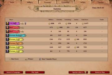
Age of Empires 2 Definitive Edition
The user interface features a statistics table that summarizes player performance. Each player's name is accompanied by a unique colored banner, facilitating ea...
villa maggiore - rare chests and blueprints can be found
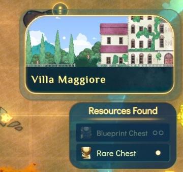
Spiritfarer: Farewell Edition
The user interface (UI) features a decorative label at the top indicating "Villa Maggiore." This label is presented in a stylistic font, adding to the overall a...