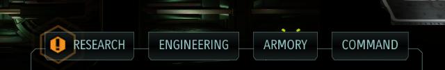
sections of the x-com 2 base
Description
The user interface (UI) in the picture features four primary labels: Research, Engineering, Armory, and Command. Each label serves a distinct function within the application, likely related to aspects of a strategy or simulation game.
-
Research: This section likely allows users to explore and develop new technologies or upgrades, suggesting a focus on innovation and advancement.
-
Engineering: This area may involve the construction or enhancement of structures and equipment, emphasizing practical application and resource management.
-
Armory: This label suggests a focus on weapons, gear, or character equipment, likely involving inventory management and combat preparation.
-
Command: This section probably enables users to manage overall strategy, troop movements, or operations, highlighting strategic decision-making.
Form-wise, the labels are presented in a sleek, modern design with a dark color scheme, contributing to a high-tech aesthetic. The use of bold typography and a uniform layout provides clarity and ease of navigation, enhancing user experience. The presence of an exclamation mark on the Research label may indicate that it requires attention or is currently active, drawing the user's eye to important information.
Software
XCOM 2
Language
English
Created by
 M S
M S
Sponsored
Similar images
mea culpa altar
Blasphemous
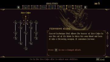
The user interface (UI) presented in the image contains several key labels and features designed for managing abilities in a game. 1. Ability Labels: The...
spectating other players while dead

Lethal Company
The UI features a prominent label that reads "(Spectating: )" in a bold, red font. This label signifies that the user is currently in a spectator mode, indicati...
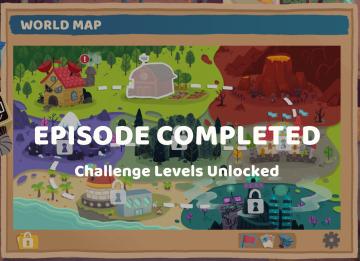
episode completed
Floppy Knights
The user interface (UI) in the image features a vibrant world map central to gameplay, with the title "WORLD MAP" displayed prominently at the top in a bold, st...
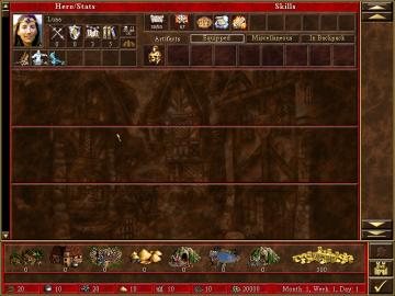
hero skills, artifacts, etc.
Heroes of Might and Magic 3: Complete
The user interface (UI) in the image resembles a character management window for a strategy or roleplaying game. Here's a breakdown of its features and labels:...
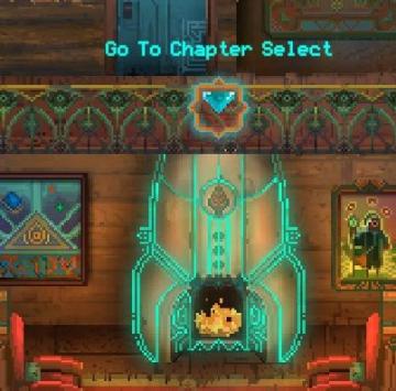
go to chapter selection
Children of Morta
Go To Chapter Select: Main action label indicating navigation to a chapter selection menu. Arrow Icon: Indicates that the label is interactive, sugg...
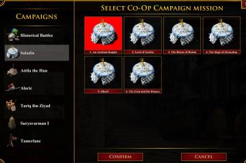
select coop campaign mission
Age of Empires 2 Definitive Edition
The user interface displays various campaign options divided into two sections: the left pane features sidenavigation labels for different campaigns, while the...
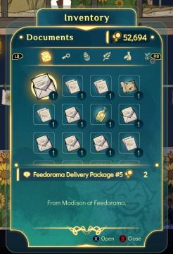
inventory, documents, open and read
Spiritfarer: Farewell Edition
The interface features a clean, colorful design with rounded edges, enhancing its visual appeal. At the top, the title "Inventory" is prominently displayed, ind...
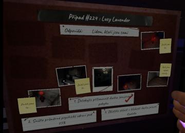
krvavý měsíc, úkoly
Phasmophobia
Na obrázku je interaktivní tabule, která slouží k organizaci informací o případu. V horní části se nachází název „Případ 224: Lucy Lavender“, což jasně identif...