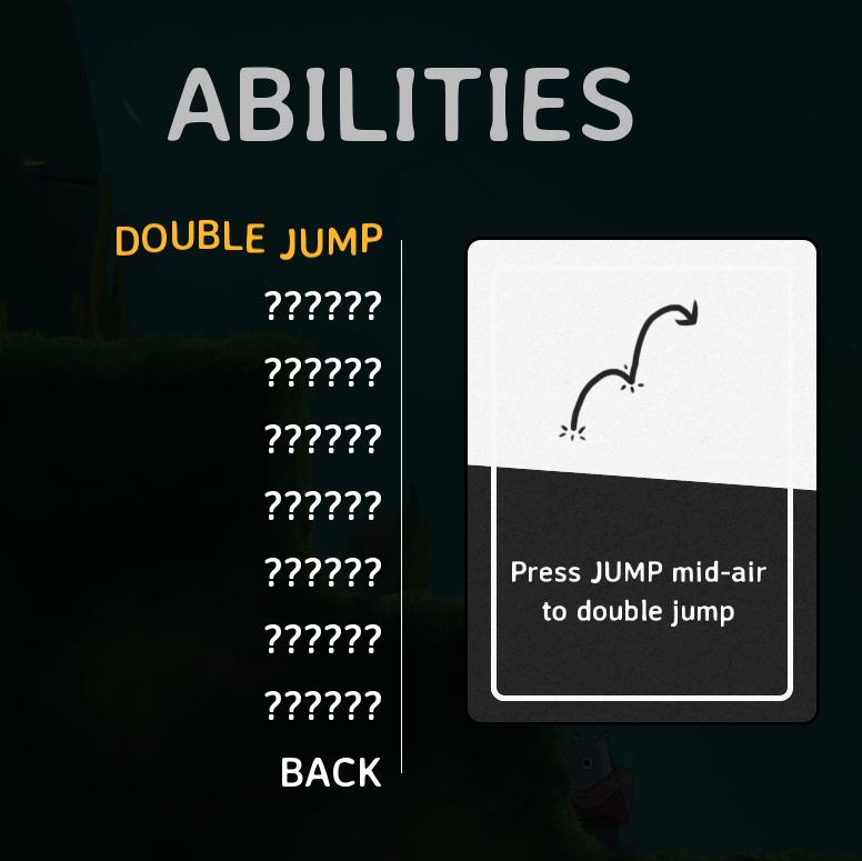
abilities
Description
The user interface (UI) in the picture is designed for a gaming application, specifically focusing on the abilities of a character. Here are the key features and their functions:
-
Header Label ("ABILITIES"):
- Function: Indicates the section of the UI, which outlines various character abilities.
- Form: Bold, capitalized font suggests importance.
-
Ability Name ("DOUBLE JUMP"):
- Function: Specifies the particular ability being described.
- Form: The use of a distinct color (yellow) helps it stand out.
-
Ability Descriptions (indicated by "??????"):
- Function: Placeholder for additional abilities or details. This area is likely intended to list more abilities related to the character.
- Form: Uniform and consistent layout for clarity.
-
Ability Card:
- Function: Provides a visual representation of the double jump mechanic. It instructs players on how to activate the ability ("Press JUMP mid-air to double jump").
- Form: Uses an illustrated arrow to visually represent the action, complemented by clear, light text for easy reading.
-
Back Button ("BACK"):
- Function: Allows navigation to the previous menu or section, ensuring easy user flow.
- Form: Typically displayed in a contrasting color for visibility and ease of access.
Overall, the UI combines functional elements with a minimalistic design, emphasizing usability and clarity for gamers.
Software
Islets
Language
English
Created by
 M S
M S
Tags
Sponsored
Similar images
ranger abilities, rpg level up
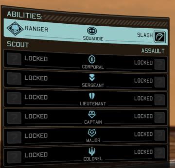
XCOM 2
The UI in the image presents a character's abilities and ranks within a game. Here's a breakdown of the features and their functions: Main Sections: 1. A...
お知らせページ、最新更新
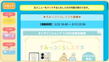
Sumikko Farm
この画面は、モバイルアプリやウェブサイトのユーザーインターフェースの一部で、主に以下のような機能を持っています。 1. お知らせボタン: 左上にある「お知らせ」...
druhy duchů v češtině, dvojčata démon mimik
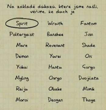
Phasmophobia
Na obrázku je uživatelské rozhraní, které obsahuje seznam duchů a jejich kategorií. V horní části je vyznačený termín „Spirit“ v oválném rámečku, což naznačuje,...
easy
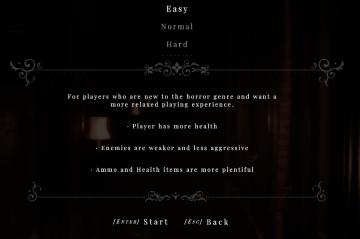
Maid of Sker
The user interface (UI) in the image presents a level selection screen, typically found in video games. Here’s a breakdown of its features and labels: 1. Dif...
overworld controls settings
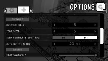
TOEM
The user interface (UI) in the image features an options menu with several labeled settings for gameplay customization. 1. Title Label: At the top, "OPTIO...
stamp the card
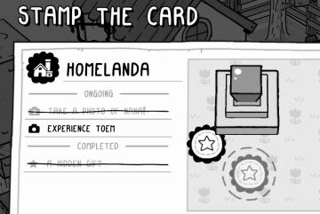
TOEM
The UI features in the "STAMP THE CARD" overlay are designed for clarity and ease of navigation. 1. Title: At the top, "STAMP THE CARD" is prominently dis...
Retrieve my progress, load game, restore data

Candy Crush Saga
The user interface features two prominent buttons designed for user interaction. 1. Play! Button: Function: This button initiates the gameplay, a...
main menu racegame
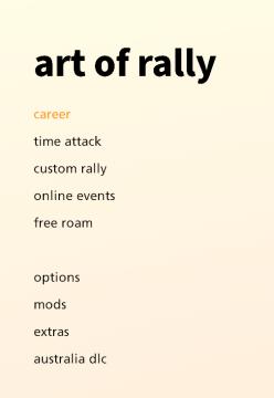
art of rally
The UI presents a clean, minimalist design with a soft gradient background that transitions from a pale yellow to offwhite, contributing to a calming aesthetic...