flamepurr
Description
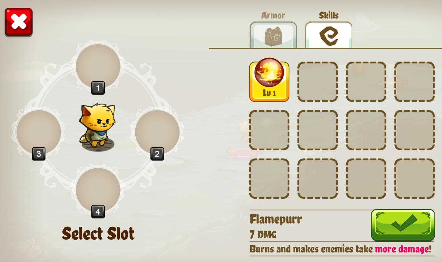
The user interface (UI) features in the image you provided are designed for a game selection screen, with a focus on character and skills setup. Here’s a breakdown of the labels and features:
-
Close Button (Red X): Located at the top left, this button allows the user to exit or cancel the current selection, highlighted in red for immediate visibility. It serves the function of providing an easy way to abort the action.
-
Character Display: A cute animated character (a cat) is centered on the screen, serving both aesthetic and functional purposes—this visual represents the player's avatar.
-
Slot Selection (Numbers 1 to 4): These are numbered slots arranged around the character. They indicate available positions for the selection of characters or items. This visual arrangement guides the user in choosing a specific slot.
-
Select Slot Label: Positioned below the character, this instructive label prompts the user to make their selection, using a warm font that complements the playful theme of the game.
-
Armor Section: On the top left, there’s an "Armor" label with a corresponding icon, indicating that players can equip armor items for their character. This feature enhances the character's defenses.
-
Skills Section: The top right has a "Skills" label with an icon, signaling where players can view and select specific skills or abilities that enhance gameplay.
-
Skill Icon (Flamepurr): Below the skills label, this icon indicates a specific skill called "Flamepurr," which details its damage stats and effects. The icon is visually distinct, with a level indicator (Lv 1) emphasizing progression.
-
Skill Description: Under the Flamepurr icon, there’s a brief description of the skill’s functionality—highlighting its impact in gameplay (burns and increases damage to enemies).
-
Confirm Button (Green Checkmark): Located at the bottom right, this button allows the user to confirm selections. Its green color signifies affirmative action, making it recognizable and inviting to press.
Overall, the UI's design combines playful visuals with functional elements, ensuring the player can easily navigate through character selection and skill management in a game-like setting.
Software
Cat Quest
Language
English
Created by
 M S
M S
Tags
Sponsored
Similar images
you do not have enough gold
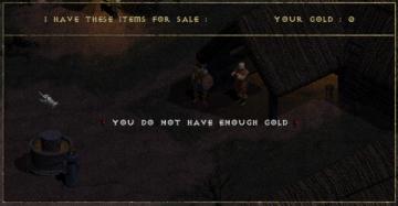
Diablo I
The UI in the image represents a shopping interface from a game, likely an RPG. Features and Functionality: 1. Header: At the top, the label "I HAVE T...
kupónová aplikace menu, coupon app menu
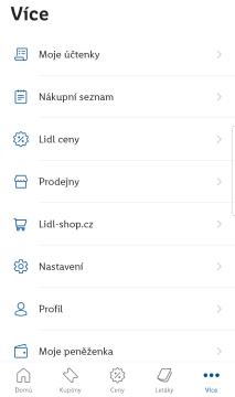
Lidl Plus
Na obrázku vidíme uživatelské rozhraní aplikace s názvem "Více". Hlavní funkce jsou organizované do seznamu, což usnadňuje uživatelům orientaci. 1. Moje účte...
caeldippo caves
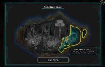
Children of Morta
Title: "Caeldippo Caves" indicates the name of the location. Map Area: Illustrates the cave layout with highlighted sections. Marker Icon: S...
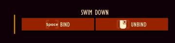
bind or unbind key for "swim down" action
Grounded
The user interface features two primary buttons labeled "BIND" and "UNBIND," both associated with the action of "SWIM DOWN." BIND Button: This button is...
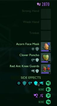
inventory - strong hand, weak hand, trinket
Grounded
The user interface features a clear layout that organizes various equipment categories, including "Strong Hand," "Weak Hand," and "Trinket." These labels indica...
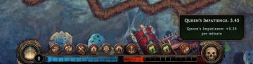
queen's impatience per minute
Against the Storm
The UI features a horizontal status bar at the bottom, showcasing two distinct segments: a blue section on the left, representing a form of progress or resource...
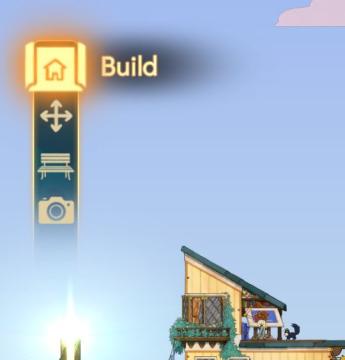
build menu
Spiritfarer: Farewell Edition
The UI features a vertical sidebar with a prominent "Build" label at the top, indicating the primary action available. Below this, there are three icons represe...
emergency app instructions how to
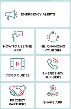
Zachranka
The user interface (UI) displayed in the picture consists of several labeled sections, each featuring specific functions related to emergency preparedness and a...