main menu
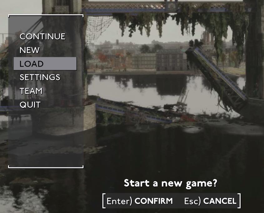
Description
The UI features in the image consist of several key elements designed for navigating gameplay options:
-
Menu Options:
- The main menu is displayed on the left side, with clear labels including Continue, New, Load, Settings, Team, and Quit.
- The options are presented in a vertical list, which is a common layout for ease of navigation. Each label is in bold text, ensuring visibility and readability.
-
Highlighted Option:
- The Load option is highlighted, indicating it is the currently selected choice. This visual cue helps users quickly identify their selection.
-
Confirmation Prompt:
- At the bottom, there’s a prompt that says, "Start a new game?". This suggests a transition to a new game setup and engages users in the decision-making process.
-
Action Buttons:
- Under the prompt, there are clear action buttons labeled [Enter] CONFIRM and [Esc] CANCEL. This intuitive labeling guides users on how to proceed, emphasizing functionality.
-
Form and Aesthetics:
- Overall, the UI utilizes a simple, minimalist design, focusing on functionality with a clean layout. The color contrast between text and background ensures clarity, while the surrounding graphical elements create a cohesive visual experience relevant to the gaming environment.
This setup effectively balances form and function, providing a user-friendly interface for game navigation.
Software
Fallout London
Language
English
Created by
 M S
M S
Tags
Sponsored
Similar images
main menu Panicore
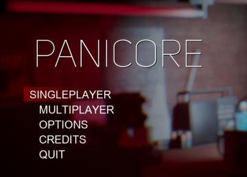
Panicore
The user interface (UI) in the picture features a clean and modern design focused on functionality. The title "PANICORE" is prominently displayed at the top, su...
host game, join a crew, settings, main menu
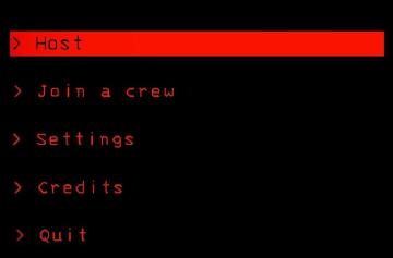
Lethal Company
The interface features a predominantly black background, creating a stark contrast with red and white text, which enhances readability. Host: This label...
main menu
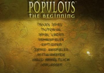
Populous: The Beginning
Die Benutzeroberfläche zeigt das Hauptmenü des Spiels "Populous: The Beginning". Die Hauptüberschrift „POPULOUS“ ist prominent in einer goldenen Schriftart plat...
main menu
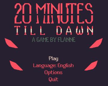
20 Minutes Till Dawn
The UI of "20 Minutes Till Dawn" features a bold and striking design that conveys a sense of urgency and intrigue. Key Elements and Functions: 1. Game...
you died: continue or exit to main menu
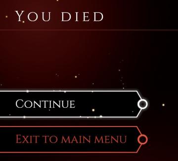
Mages of Mystralia
The user interface (UI) in the picture displays a game over screen, characterized by a dark red background with a subtle sparkle effect, contributing to a drama...
main menu
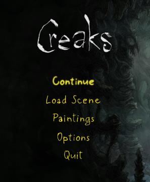
Creaks
The UI in the image features a dark, atmospheric background that complements the game’s theme, providing a sense of immersion. Labels and Features: 1. ...
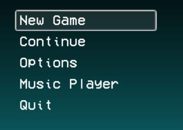
main menu, you can access music player
LISA: The Painful - Definitive Edition
The UI presented in the image features a vertical menu with five options, each serving distinct functions for navigating a game or application. 1. New Game...
Maid of Sker main menu
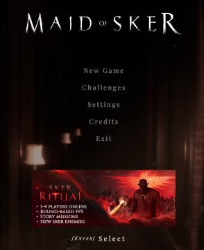
Maid of Sker
The user interface (UI) in the image showcases a dark, atmospheric design aligned with the horror theme of the game "Maid of Sker." The main menu features sever...