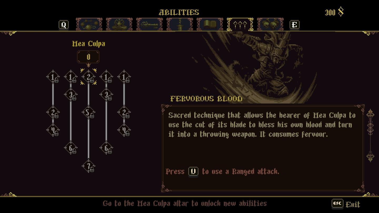
mea culpa altar
Description
The user interface (UI) presented in the image contains several key labels and features designed for managing abilities in a game.
-
Ability Labels: The title "Mea Culpa" indicates the specific ability being highlighted. Below, the number "0" likely represents a point or resource total related to this ability.
-
Ability Tree: A series of nodes are arranged in a branching format, showcasing the progression of the "Mea Culpa" ability. Each node is labeled with a level and associated numbers, which probably indicate costs or effects connected to each upgrade.
-
Fervorous Blood Description: This section provides details about the selected ability. It describes its function as a technique that transforms the user's blood into a projectile, emphasizing that it consumes a resource called "fervour."
-
Input Commands: A prompt in the description suggests pressing "U" to use the ability, clearly guiding the user on controls.
-
Navigation and Exit Options: At the bottom of the interface, there is a message directing the player to the "Mea Culpa altar" for unlocking new abilities. An "ESC" label signifies the option to exit the menu.
-
Visual Style: The design of the UI features ornate elements and a dark background, which might evoke a thematic connection to the game's overall aesthetic. The text is visually distinct and is likely meant to enhance readability against the darker elements of the interface.
These components work together to provide an organized and informative experience, enabling players to understand and enhance their abilities effectively.
Software
Blasphemous
Language
English
Created by
 M S
M S
Tags
Sponsored
Similar images
private server means you need to invite your friends on Steam
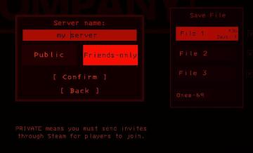
Lethal Company
The UI features a dark theme with red accents, establishing a bold visual style. Key elements include: 1. Server Name Input Box: A prominent text field lab...
Rainstorm difficulty is the way the game is meant to be played
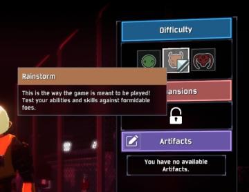
Risk of Rain 2
The UI presents multiple sections, each corresponding to different game settings. The "Difficulty" section is highlighted with a blue label, featuring three sel...
main menu
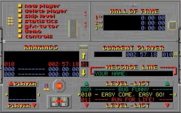
Supaplex
The UI features a distinctive retro design with a gray background and bright, contrasting text. The main sections include: Navigation and Player Options ...
to shoot arrows
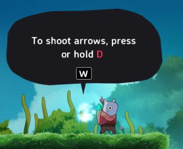
Islets
The UI in the picture features a speech bubble that provides instructions to the player. The main function is to guide the player on how to shoot arrows in the...
resume game, invite more players, or quit
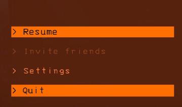
Lethal Company
The user interface features several interactive labels arranged vertically. Each label is accompanied by a ">" symbol, indicating that they can be selected or e...
substory end
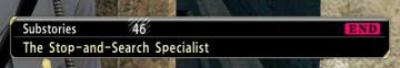
Yakuza 0
The user interface (UI) in the picture features several key elements: 1. Labeling: The top section is labeled "Substories," indicating that this area perta...
set autopause for certain events in alert settings
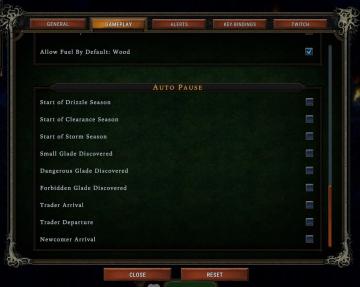
Against the Storm
The user interface presents several key components organized into distinct sections. The top row features tabs labeled GENERAL, GAMEPLAY, ALERTS, ...
Configuración de la cámara
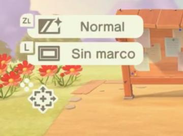
Animal Crossing: New Horizons
La interfaz muestra etiquetas con funciones específicas. En la parte superior, se encuentra un ícono que indica el modo "Normal", accesible a través del botón Z...