background selector
Description
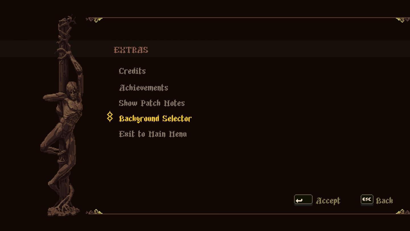
The user interface features a dark background that enhances the visibility of the menu options. At the top, the label "EXTRAS" is prominently displayed, serving as the section header. Below that, various options include "Credits," "Achievements," "Show Patch Notes," and "Exit to Main Menu," each presented in a contrasting font color for easy readability.
The "Background Selector" option is highlighted in a vibrant yellow, indicating it is either active or selected. This choice allows users to customize their interface, adding a personalized touch.
At the bottom of the screen, there are buttons labeled "Accept," "ESC," and a navigation arrow, facilitating user interaction. These buttons are styled simply but effectively to integrate with the overall aesthetic. The layout balances functionality with a visually appealing design, ensuring clarity and ease of use.
Software
Blasphemous
Language
English
Created by
 M S
M S
Tags
Sponsored
Similar images
sound settings, mute in background
Against the Storm
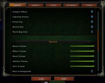
The interface features a settings menu divided into various sections to manage game effects and sound. General Section Labels: Lists options such as...
are you recording? disable the stock background music
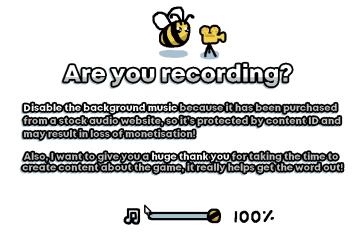
I Commisioned Some Bees 0
The user interface features a playful, cartoonish aesthetic, highlighted by the presence of a bee and a camera icon, suggesting a friendly and engaging tone....
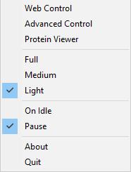
background app menu
Folding@home
The UI features a vertical menu with several options, likely related to controlling a software application. The labels denote various functionalities: 1. Web...
camera mode - teen options (choose player pose or props)
Grounded
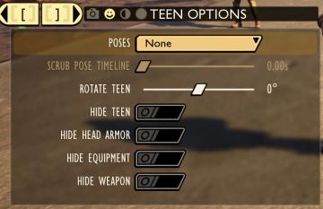
The user interface displays a panel titled "TEEN OPTIONS," indicating its focus on character customization or control, specifically for a teen character. ...
shop keep
Children of Morta
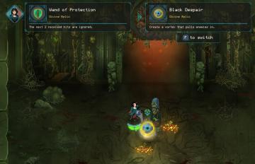
Wand of Protection: Displays the item name, type ("Divine Relic"), and a description indicating it will negate the next two hits. Black Despair: Sim...
press any button to start the game

Inscryption
The user interface presents a retro pixel art style, characterized by a brown background that enhances a vintage aesthetic. The large title "INSCRYPTION" is pro...
choose from the boons of Apollo
Hades II Early Access
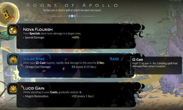
The interface presents three distinct abilities, each with a specific function and labeled for clarity. 1. Nova Flourish: This ability increases the damage...
saving
Maid of Sker
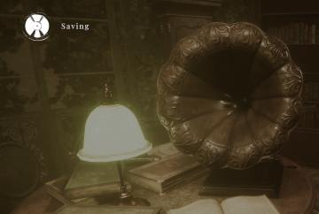
The user interface (UI) in the image includes a few distinct features that enhance the gameplay experience: 1. Saving Indicator: The word "Saving" is promi...