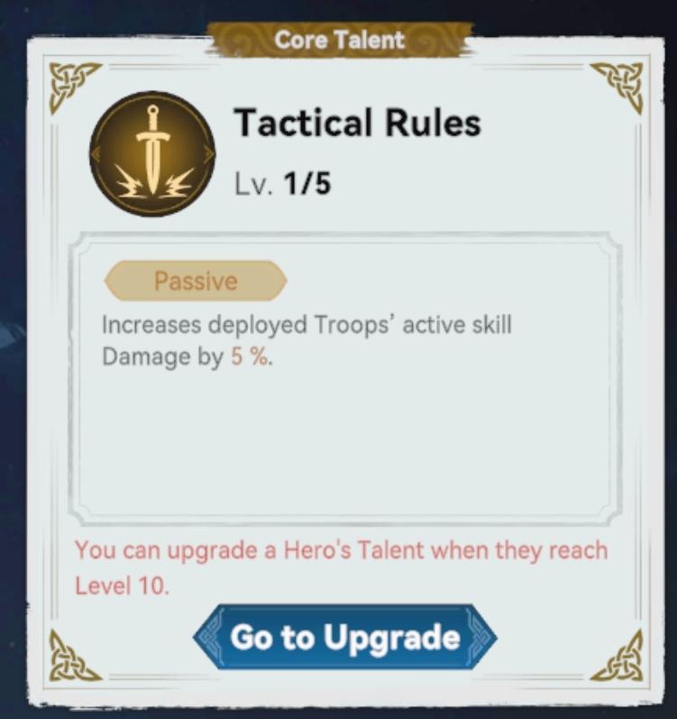
viking chief core talent: tactical rules
Description
The UI in the image presents a "Core Talent" selection screen for a game, detailing a specific talent called "Tactical Rules."
Labels and Features:
-
Header:
- "Core Talent": Indicates the section of the interface focused on talents.
-
Talent Name:
- "Tactical Rules": The name of the specific talent, prominently displayed for easy identification.
-
Level Indicator:
- "Lv. 1/5": Shows the current level of the talent and the maximum achievable level. This provides a quick reference for progression.
-
Talent Type:
- "Passive": Highlighted in a labeled box, indicating that the effect of this talent is automatic and does not require activation from the player.
-
Description:
- Effect Text: States the functionality of the talent — "Increases deployed Troops’ active skill Damage by 5%." This is clearly presented for understanding the talent’s impact on gameplay.
-
Upgrade Note:
- Text: "You can upgrade a Hero's Talent when they reach Level 10." This provides essential information about leveling up and enhancing talents for players.
-
Upgrade Button:
- "Go to Upgrade": A clearly marked button at the bottom, suggesting interaction and leading the user to the upgrade options. It's enclosed in a distinct shape that likely draws attention.
Design Elements:
- Color Scheme: Soft hues with contrasting text for readability, balancing form and function.
- Iconography: The sword icon next to the talent name signifies a combat-related skill, enhancing the thematic visual representation of the talent.
- Organization: Clearly structured layout that separates each element, making navigation intuitive and efficient for players.
Overall, the UI effectively communicates all necessary information for players engaged in talent progression within the game.
Software
Viking Rise
Language
English
Created by
 matej94v
Sponsored
Similar images
viking chief details
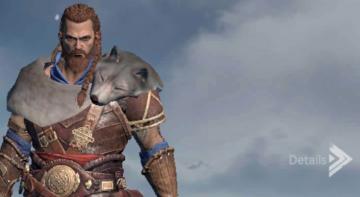
Viking Rise
In the image, we see a character with a rugged, warriorlike appearance, wearing intricate armor adorned with a wolf’s head on their shoulder, suggesting streng...
new game warrior stats
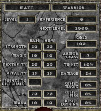
Diablo I
The user interface (UI) in the picture comprises several key elements focused on character statistics for a roleplaying game (RPG), presenting both functionali...
seřadit filtrovat seskupit články
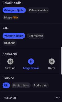
Inoreader
Na obrázku vidíme uživatelské rozhraní aplikace, které má tmavé pozadí s modrými a šedými prvky. 1. Seradit podle (Sort by): Umožňuje uživatelům vybí...
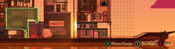
move, place building, swap building, salvage building
Spiritfarer: Farewell Edition
The UI features a grid overlay, which helps in aligning objects for placement and modification. The highlighted green area indicates the selected zone for inter...
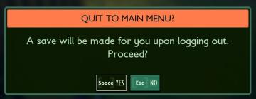
quit to main menu? a save will be made for you
Grounded
The interface presents a confirmation dialogue with a clear and engaging design. The title "QUIT TO MAIN MENU?" stands out prominently at the top, indicating th...
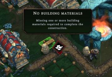
no building materials
Against the Storm
The UI features prominently display a warning message indicating a lack of required resources for construction. The text "No building materials" is centered and...
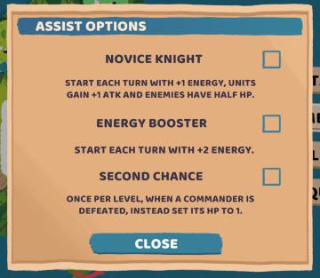
assist options for more casual play
Floppy Knights
The user interface (UI) presented in the image features a menu for "ASSIST OPTIONS," structured to help players select different gameplay enhancements. UI...
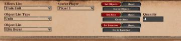
editor scenario, triggers, effect list: add effect for scripted missions
Age of Empires 2 Definitive Edition
The user interface features a series of dropdown menus and buttons, designed for selecting and configuring various game actions. UI Elements: 1. Effect...