viking chief details
Description
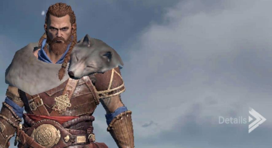
In the image, we see a character with a rugged, warrior-like appearance, wearing intricate armor adorned with a wolf’s head on their shoulder, suggesting strength and ferocity. This design is both functional for a fantasy setting and visually striking.
To the right of the character, there's a UI label that reads "Details," indicated with an arrow. This label likely functions as a button or prompt that allows users to access additional information about the character, perhaps providing insights into their skills, equipment, or background story. The arrow design suggests a forward navigation, implying that clicking or selecting it will lead to more detailed content.
The overall UI is minimalistic, ensuring that the focus remains on the character while still providing an intuitive way for users to delve deeper into gameplay features.
Software
Viking Rise
Language
English
Created by
 matej94v
Sponsored
Similar images
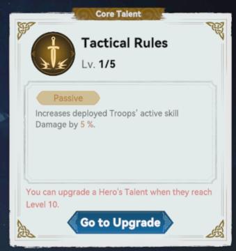
viking chief core talent: tactical rules
Viking Rise
The UI in the image presents a "Core Talent" selection screen for a game, detailing a specific talent called "Tactical Rules." Labels and Features: 1. ...
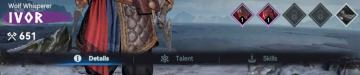
chief details menu, talents and skills
Viking Rise
The user interface (UI) in the image features several functional elements designed for character management in a game setting. 1. Character Name and Title:...
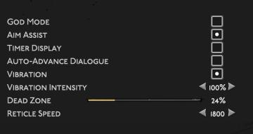
gameplay settings (vibration, aim assist, god mode..)
Hades II Early Access
The user interface (UI) features a clean layout with a dark background, promoting readability and focus on functionality. Each label is presented in a clear, bo...
map key legend eatery store entertainment
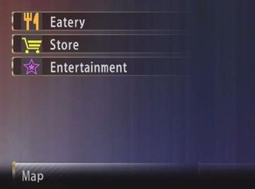
Yakuza 0
The image displays a user interface (UI) menu with several labeled options, presented in a vertical list. Here's a breakdown of the elements: 1. Eatery: Th...
detonation in 5 minutes
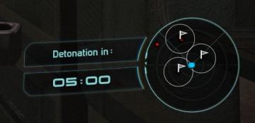
Mass Effect 1
The interface includes a prominent countdown timer indicating "Detonation in:" with a clear display of five minutes remaining, represented as "05:00." This info...
sound settings, input can be voice activated
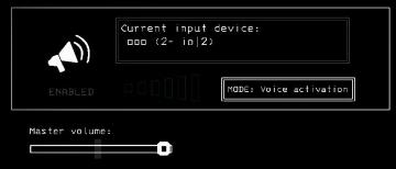
Lethal Company
The UI features a clean and minimalistic design, predominantly using monochromatic tones. 1. Current Input Device Label: Displayed prominently at the top,...
speed up item reduces time for any queue
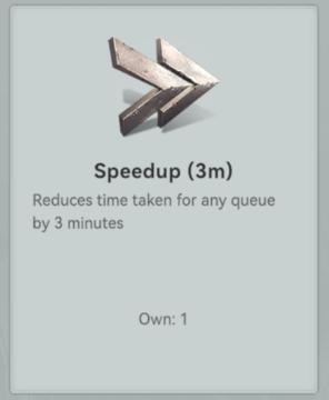
Viking Rise
The UI features a clear and concise design, focusing on functionality with minimal clutter. 1. Icon: At the top, there's a stylized icon that resembles tw...
selected mutation loadout is activated
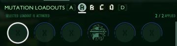
Grounded
The user interface features a labeled section for “MUTATION LOADOUTS,” with options from A to D clearly indicated at the top. The highlighted letter “A” signifi...