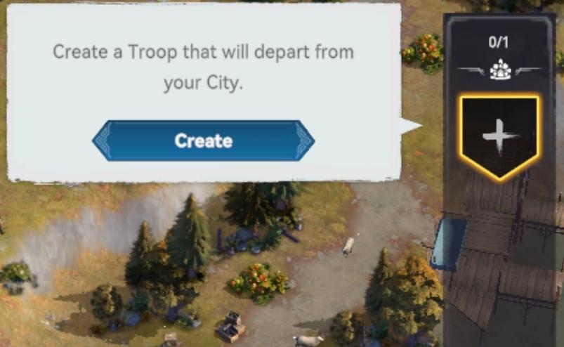
create a troop that will depart from your city
Description
The user interface (UI) in the picture features a dialog box with a primary function focused on troop creation.
Key Elements:
-
Text Header:
- Label: "Create a Troop that will depart from your City."
- Function: This provides clear instructions to the user, indicating what action they can take—specifically, to create a troop.
-
Action Button:
- Label: "Create"
- Appearance: The button is prominently displayed, featuring a blue color with a slightly rounded shape.
- Function: This button triggers the troop creation process when clicked, making it the main interactive element.
-
Information Box:
- The box has a light background, creating contrast with the text for better readability.
- The wording is straightforward, guiding the user effectively without overwhelming them.
-
Side Panel Indicator:
- The right side of the image features a panel with numerical indicators (e.g., "0/1") and a symbol of a troop icon.
- Function: This shows the current troop capacity or count, providing users with instant feedback on their troop status.
Overall, the UI design focuses on clarity and immediate action, employing a clean aesthetic that enhances user understanding of the troop creation process.
Software
Viking Rise
Language
English
Created by
 matej94v
Sponsored
Similar images
create a squad and march
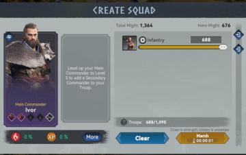
Viking Rise
The UI in the image is structured to facilitate squad creation for a game, likely involving strategy and combat. Here’s a breakdown of the labels and features:...
create a new post
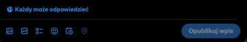
x.com
Interfejs użytkownika zawiera kilka kluczowych elementów funkcjonalnych. U góry znajduje się komunikat „Każdy może odpowiedzieć”, co informuje użytkowników o do...
get milk for free, stock: 0
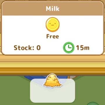
Sumikko Farm
The UI in the image features a simple and playful design, characteristic of casual gaming interfaces. 1. Title Area: At the top, "Milk" indicates the item...
Neuer Gebäudetyp Fischerhütte
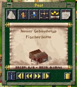
The Settlers II
Das Benutzeroberfläche (UI) bietet verschiedene Funktionen, die durch spezifische Beschriftungen und Symbole klar gekennzeichnet sind. Oben befindet sich der Ti...
0 woodcutter's camps built, select or preview building
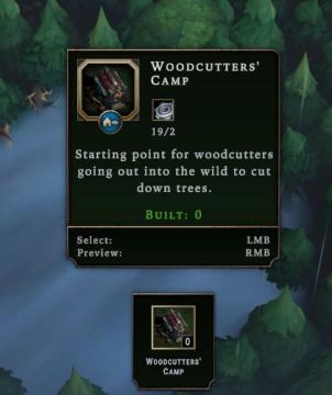
Against the Storm
The user interface features a rectangular panel with a dark background, giving it a structured and clean appearance. Title Label: "WOODCUTTERS' CAMP" pr...
divine grace, altar ignition items
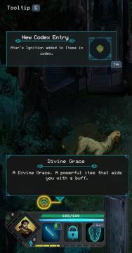
Children of Morta
Tooltip C: Indicates contextual help or notification. New Codex Entry: Notification for newly added item in the codex. Atar's Ignition: Specif...
captain's log - shenanigans section
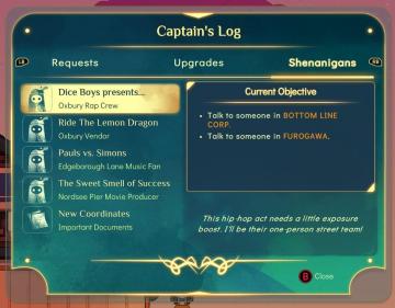
Spiritfarer: Farewell Edition
The user interface (UI) in the image displays a "Captain's Log" screen with several labels and functional elements arranged neatly. 1. Log Title: The titl...
camera mode - depth of field, fov, aperture
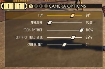
Grounded
The user interface (UI) features labels and sliders designed for adjusting various camera settings. Each label clearly indicates the specific setting: 1. FOV...