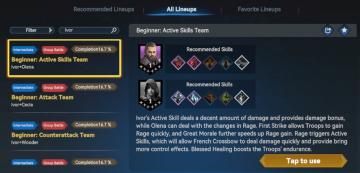
recommended lineups
Description
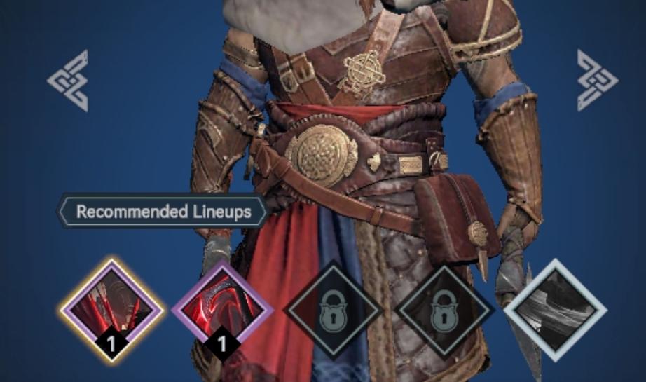
In the image, the user interface (UI) presents several labeled features and graphical elements primarily designed for functionality within a gaming context.
-
Recommended Lineups Label: Positioned prominently at the center bottom, this label indicates suggestions for character lineups, likely providing players with optimized setups. The use of an unobtrusive gray background and clear text aids visibility.
-
Icon Slots: Below the "Recommended Lineups" label, there are four icon slots. Each is styled with distinct shapes and colors, enhancing user differentiation.
- The first three slots feature icons with numbers indicating available uses or selections.
- The final two slots are marked with a lock symbol, suggesting that they are currently inaccessible or require certain criteria to be unlocked.
-
Icon Design: The icons exhibit varied forms and colors:
- The first icon is highlighted in yellow, possibly indicating a special item or ability.
- The second icon is red, which could denote higher importance or urgency.
- The third icon is purple, hinting at a different category or level of equipment.
- The locked icons are in a neutral color, likely indicating they are unavailable, thus guiding the user intuitively.
-
Character Display: A character model is prominently featured, showcasing detailed armor and attire, emphasizing the theme of the game. This serves both a functional role (displaying the chosen character) and a formal aesthetic appeal, immersing the player in the game world.
Overall, the UI effectively combines clear labels and intuitively designed icons to enhance user experience, facilitating navigation and improving gameplay engagement.
Software
Viking Rise
Language
English
Created by
 matej94v
Sponsored
Similar images
recommended lineups
Viking Rise
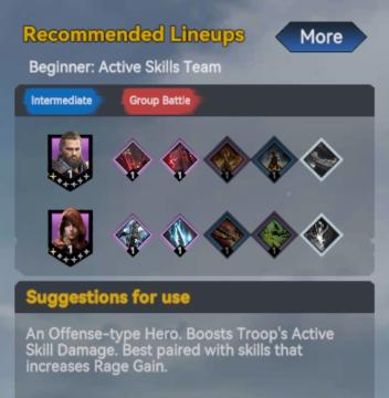
The interface features several components designed to provide players with strategic information for team lineups. 1. Title Section: The header "Recommend...
note: playing with a controller recommended
Hades II Early Access
The UI features a prominent logo at the top left corner, identifying "SUPERGIANT GAMES," which serves to brand the game and create a sense of recognition. Adj...
use of a controller is recommended
Mages of Mystralia
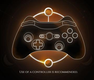
The image features a simplified outline of a game controller, likely intended for gaming interface instructions. UI Labels and Features: 1. Controller...
all lineups screen
Viking Rise
The UI in the image appears to be from a gaming application related to team lineups, likely for a strategy or roleplaying game. Here’s a breakdown of the label...
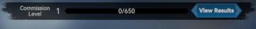
commission level
Viking Rise
The user interface (UI) presented features several key components designed for functionality and clarity: 1. Commission Level Label: This label is prominen...
Diplomacy victory, just one more turn
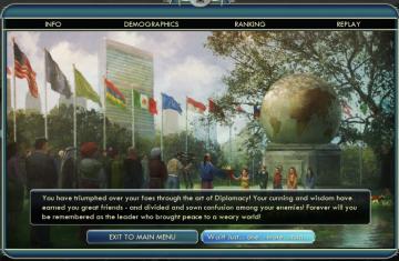
Civilization V
The user interface (UI) in the picture appears to be from a strategy game, possibly one related to diplomacy or civilization management. Here’s a breakdown of t...
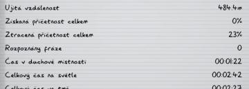
ujitá vzdálenost příčetnost mentální zdraví kroky metry metrů
Phasmophobia
Na obrázku vidíme uživatelské rozhraní, které zřejmě slouží k záznamu a sledování různých statistik. Formát je čistý a přehledný, se zřetelnými odděleními mezi...
disarming (ESC to cancel)
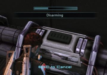
Mass Effect 1
The user interface in the picture features a progress bar at the top, indicating the state of a disarming operation. This bar visually represents completion, in...