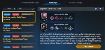
recommended lineups
Description
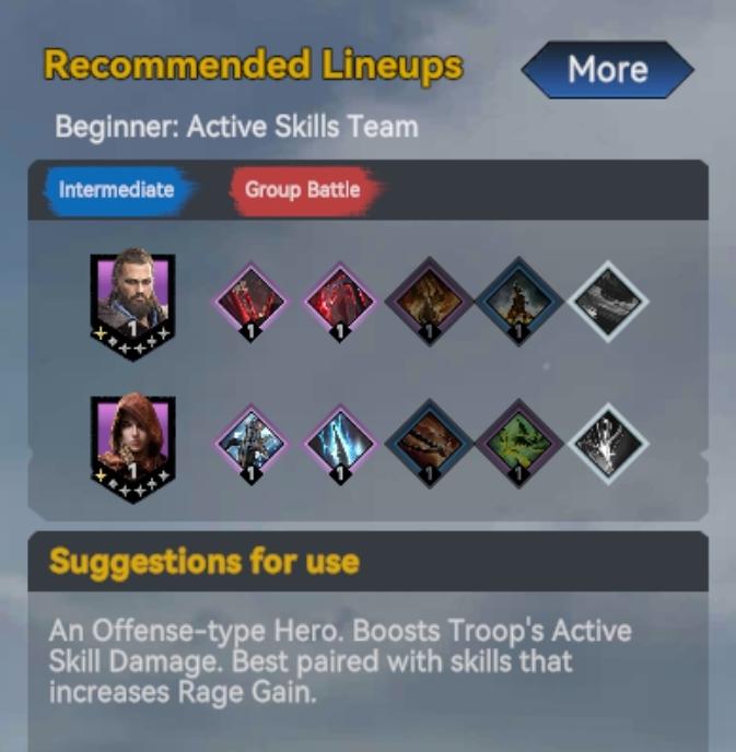
The interface features several components designed to provide players with strategic information for team lineups.
-
Title Section: The header "Recommended Lineups" clearly indicates the purpose of the UI. Below, it specifies the target audience ("Beginner: Active Skills Team") to guide users.
-
Tabs for Difficulty Level: Two prominent tabs are labeled "Intermediate" (blue) and "Group Battle" (red). These allow users to switch between different lineup recommendations based on their current level or game mode.
-
Hero and Skill Cards: The main area displays character portraits (represented by images) and skill cards (rendered as colored diamonds). Each character has a star rating indicator in the corner, suggesting its strength or rarity.
-
Count Indicators: Each card features a numeral "1," which likely represents the level or rank of the character or skill. This concise labeling helps users assess the power level at a glance.
-
Suggestions Section: At the bottom, a detailed description outlines how to effectively use the characters. This text explains the primary benefits, such as boosting troop skill damage and suggesting optimal pairing with specific abilities.
-
"More" Button: A button labeled "More" in the top right implies additional information or options might be available, enhancing user navigation and engagement.
Overall, the design is functional and intuitive, combining informative text with visual elements to optimize user experience and decision-making in gameplay.
Software
Viking Rise
Language
English
Created by
 matej94v
Sponsored
Similar images
recommended lineups
Viking Rise
In the image, the user interface (UI) presents several labeled features and graphical elements primarily designed for functionality within a gaming context. 1....
use of a controller is recommended
Mages of Mystralia
The image features a simplified outline of a game controller, likely intended for gaming interface instructions. UI Labels and Features: 1. Controller...
note: playing with a controller recommended
Hades II Early Access
The UI features a prominent logo at the top left corner, identifying "SUPERGIANT GAMES," which serves to brand the game and create a sense of recognition. Adj...
all lineups screen
Viking Rise
The UI in the image appears to be from a gaming application related to team lineups, likely for a strategy or roleplaying game. Here’s a breakdown of the label...
select team and controller type
Chicago 90
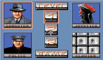
The user interface features several distinct sections. To the left, two character portraits are displayed: a "Gangster" at the top and a "Police" officer below....
druhy duchů v češtině, dvojčata démon mimik
Phasmophobia
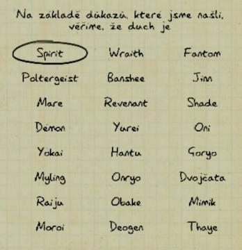
Na obrázku je uživatelské rozhraní, které obsahuje seznam duchů a jejich kategorií. V horní části je vyznačený termín „Spirit“ v oválném rámečku, což naznačuje,...
producing milk in 3s
Sumikko Farm
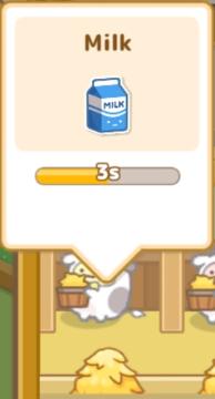
The UI in the picture focuses on the process of gathering milk, characterized by several key labels and features: 1. Title: At the top, the label "Milk" cl...
use easy decryption on computer console
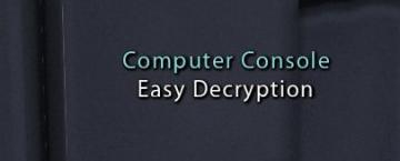
Mass Effect 1
The UI labels in the picture indicate that this interface is for a "Computer Console" designed for "Easy Decryption." The label "Computer Console" likely sign...