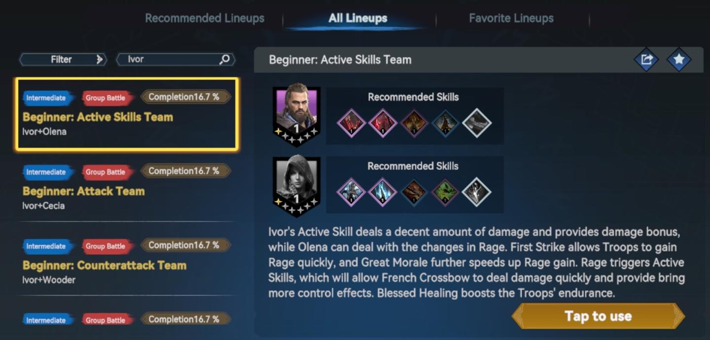
all lineups screen
Description
The UI in the image appears to be from a gaming application related to team lineups, likely for a strategy or role-playing game. Here’s a breakdown of the labels and features:
-
Top Bar:
- Filter: A search functionality to help users find specific characters or skills. This likely allows for quick navigation in larger databases.
- Search Box: A field where users can input the name "Ivor" to locate relevant options or lineups.
-
Lineup Categories:
- All Lineups: Tab to view all available team configurations.
- Recommended Lineups: Indicates teams suggested by the game, which can assist players in constructing effective strategies.
- Favorite Lineups: A section for users to easily access their preferred team compositions.
-
Team Listings:
- Team Title: Each team is labeled with its name (e.g., "Beginner: Active Skills Team") and skill level (e.g., "Intermediate"), making it easy for players to understand their progression stage.
- Completion Percentage: Displays the progress or success rate of each lineup, allowing players to gauge their effectiveness quickly.
-
Character and Skill Information:
- Character Icons: Portraits of the characters (Ivor and Olena) are displayed to help users identify their team members visually.
- Recommended Skills: Icons representing the skills available for each character. This is crucial for players to strategize their gameplay effectively.
- Skill Descriptions: A textual explanation details the abilities and contributions of the characters to the team. This provides context and strategic insight.
-
Action Prompt:
- "Tap to use" Button: A clearly labeled button indicating that players can interact with the lineup to deploy or utilize the recommended team, emphasizing ease of access and user engagement.
Overall, the UI is functional and straightforward, employing a clean design with labels to aid in navigation and comprehension, which enhances the player experience. The use of color and clear distinctions between sections helps in quickly identifying the necessary components for effective gameplay.
Software
Viking Rise
Language
English
Created by
 matej94v
Sponsored
Similar images
challenge details: upgrades are a mystery, but doubled

Mini Motorways
The UI in the image features a clean and minimalistic design, focusing on key promotions associated with the title "Stars in Their Eyes." Central to the layout...
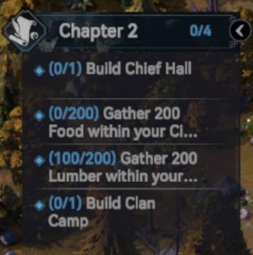
quest: gather resources, build chief hall
Viking Rise
The UI in the image features a task or objective list related to "Chapter 2" of a game. Here’s a breakdown of its elements: 1. Title and Progress Indicator...
Drop 4 gems and your magic shall increase
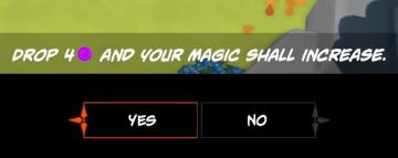
Mages of Mystralia
The user interface (UI) in the picture consists of a prompt asking the player to "DROP 4" of a specific resource (indicated by a purple circle) to increase thei...
settings - confirm changes or reset all to default

Lethal Company
The user interface features three main labels: "Confirm changes," "Back," and "Reset all to default." 1. Confirm changes: This label typically functions a...
alliance patrol report, ok button
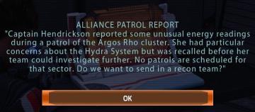
Mass Effect 1
The UI features a dialogue box titled "ALLIANCE PATROL REPORT," indicating its purpose of conveying important information. The text within the box describes a s...
autosave automatic save automatically
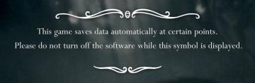
Hollow Knight
The UI design in the image features a centered message set against a dark, slightly blurred background, enhancing readability by contrasting with the text. 1....
全ての記事 未読 all articles unread articles
Inoreader
この画像には、主に次のUIラベルと機能があります。 1. メニューボタン(三本線アイコン): 機能:メニューを開くためのボタンで、他のオプションやページにア...
daily challenge score distribution
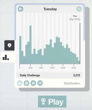
Mini Motorways
The user interface (UI) presented features a clean and organized layout, emphasizing clarity and functionality. At the top, a large label shows "Tuesday," ind...